The relationship between architectural space and its narrative is much like that of the body and the mind. No matter how visually cohesive a space is, if its story lacks depth or fails to engage, users may feel bored or empty. Within Jiechengtang Alley in Longshan District, many small restaurants exist, but none stand out like the house at the alley’s end. This building’s space has been imbued with a healing atmosphere and carries a soul enriched through generations of stories.
Many brands are defined by their unique stories, which shape their public image and can have both positive and negative effects. Sometimes, gaps in brand perception need urgent attention. Although Ottogi has maintained a healthy and approachable image for years, it tends to appear conservative and outdated, lacking a refined or modern edge. To address this, Ottogi aimed to redesign its brand identity to appeal to younger customers in their twenties and thirties. Our proposal was well-received, allowing the project to progress swiftly.
This project encompasses multiple facets of the Roly Poly restaurant, including naming, spatial planning and design, styling, product design, and graphic design. Initially, the space was planned as a 265-square-meter (about 80 ping) catering venue for Ottogi to sell curry and Lamian noodles. However, by utilizing underused areas, the space expanded to 500 ping. What was originally a simple layout dedicated to selling Lamian noodles and curry evolved into a symbolic space with complex functions, aimed at conveying a fresh brand image to consumers in their 20s and 30s. To engage younger audiences without overt brand promotion, the design incorporates metaphorical elements.
In an era where perception can outweigh reality, Ottogi’s image among younger generations has become somewhat stagnant. This project was tasked with overcoming that challenge and projecting the company’s future. By analyzing the brand’s strengths, weaknesses, and gaps, we aimed to create a concept that addresses these issues. The vision embraces timelessness, innovation, excellence, strength, friendliness, and emotional resonance. We believe that a design language characterized by complexity over simplicity, intuition over radicalism, and organic waveforms over rigid digital forms offers a sustainable and enduring solution. Our hope is that this spatial narrative will gently resonate with users as the space evolves over time.
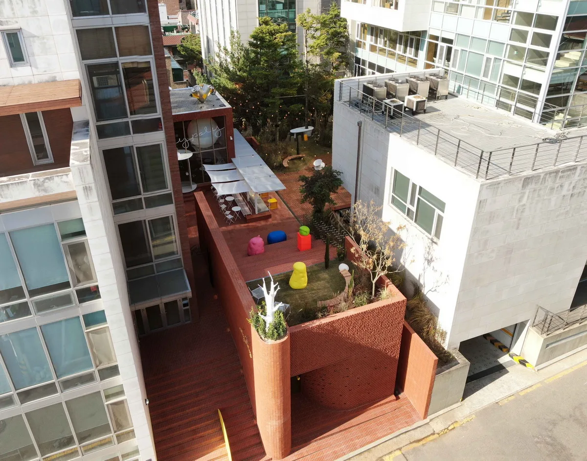
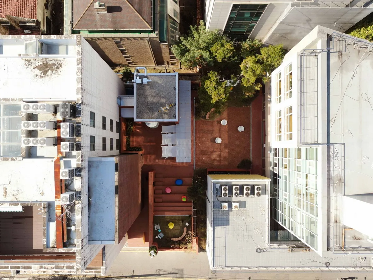
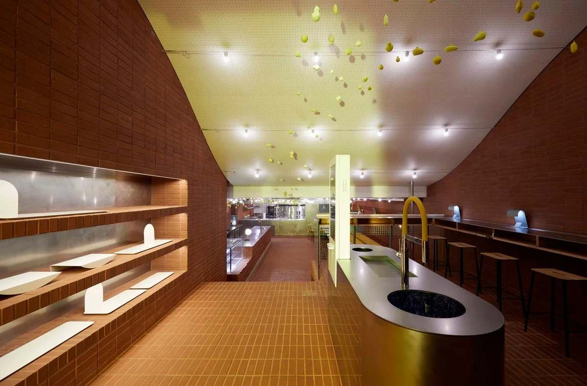
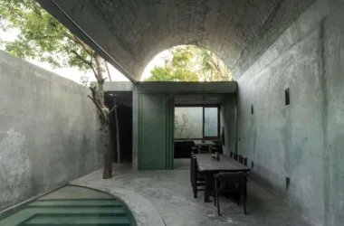
The design’s core lies in integrating a hidden garden between two existing buildings to create the project’s largest space — a transitional area. This central garden connects six distinct spaces, each serving specific functions. The seven combined spaces, ordered as caves, blocks, slopes (mountains), shade, gardens, halls (banquet halls), and pavilions (living rooms), vary in both function and height.
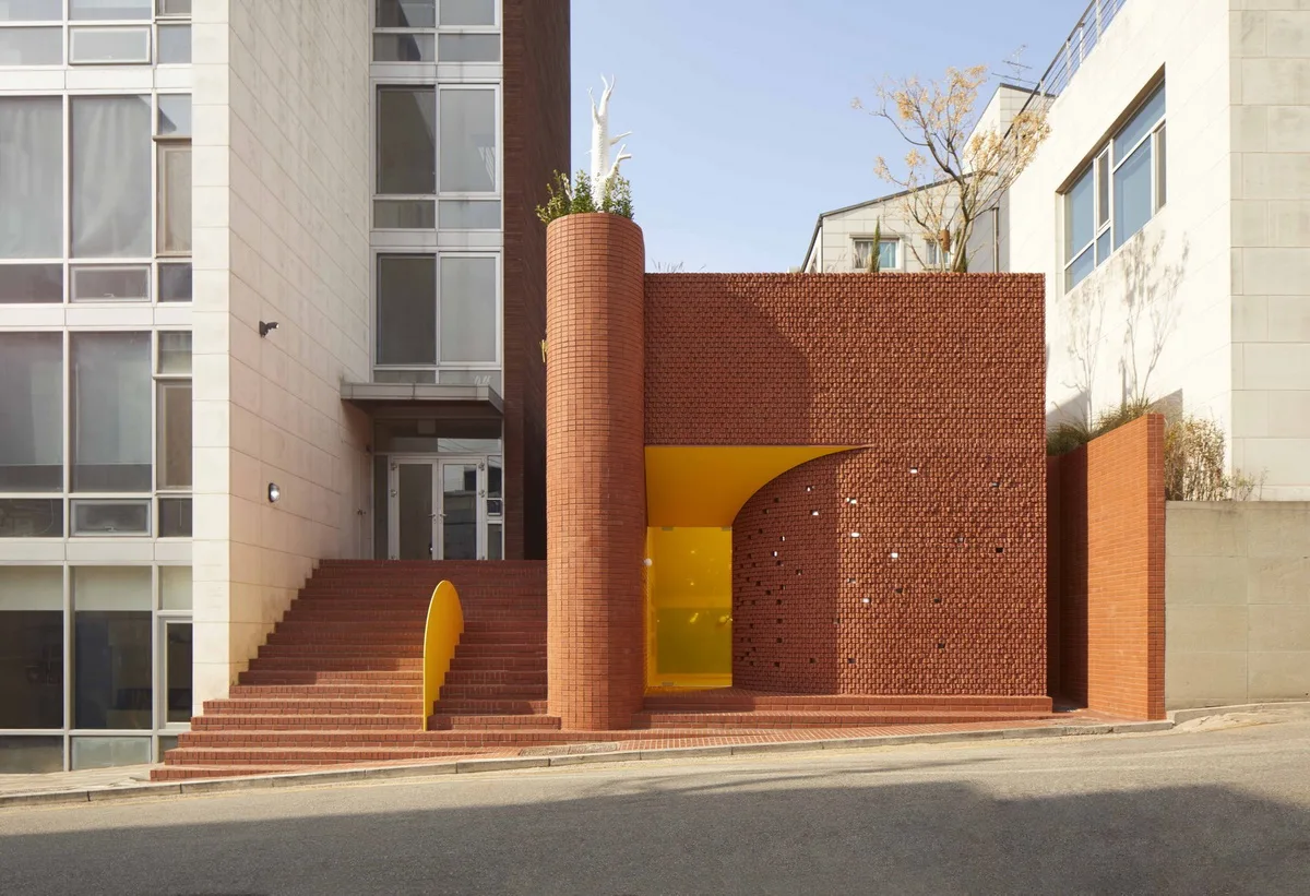
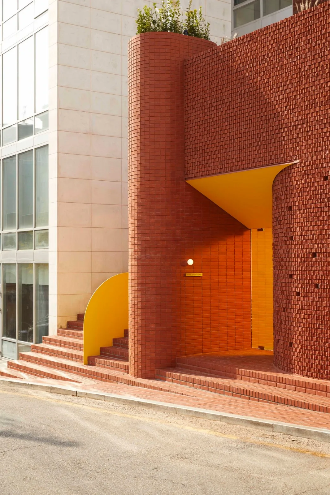
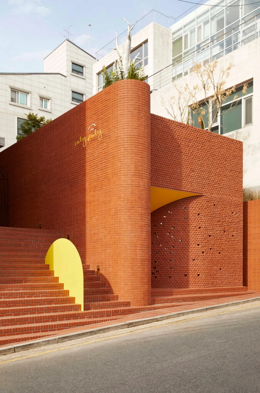
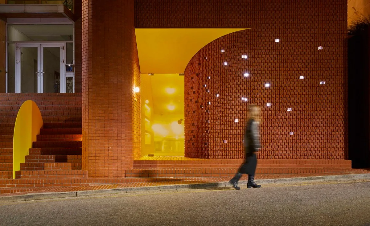
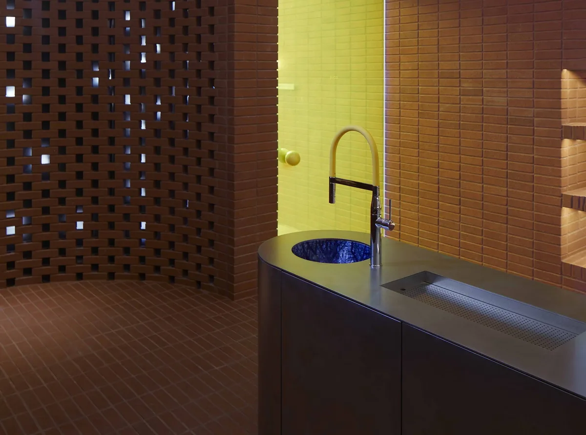
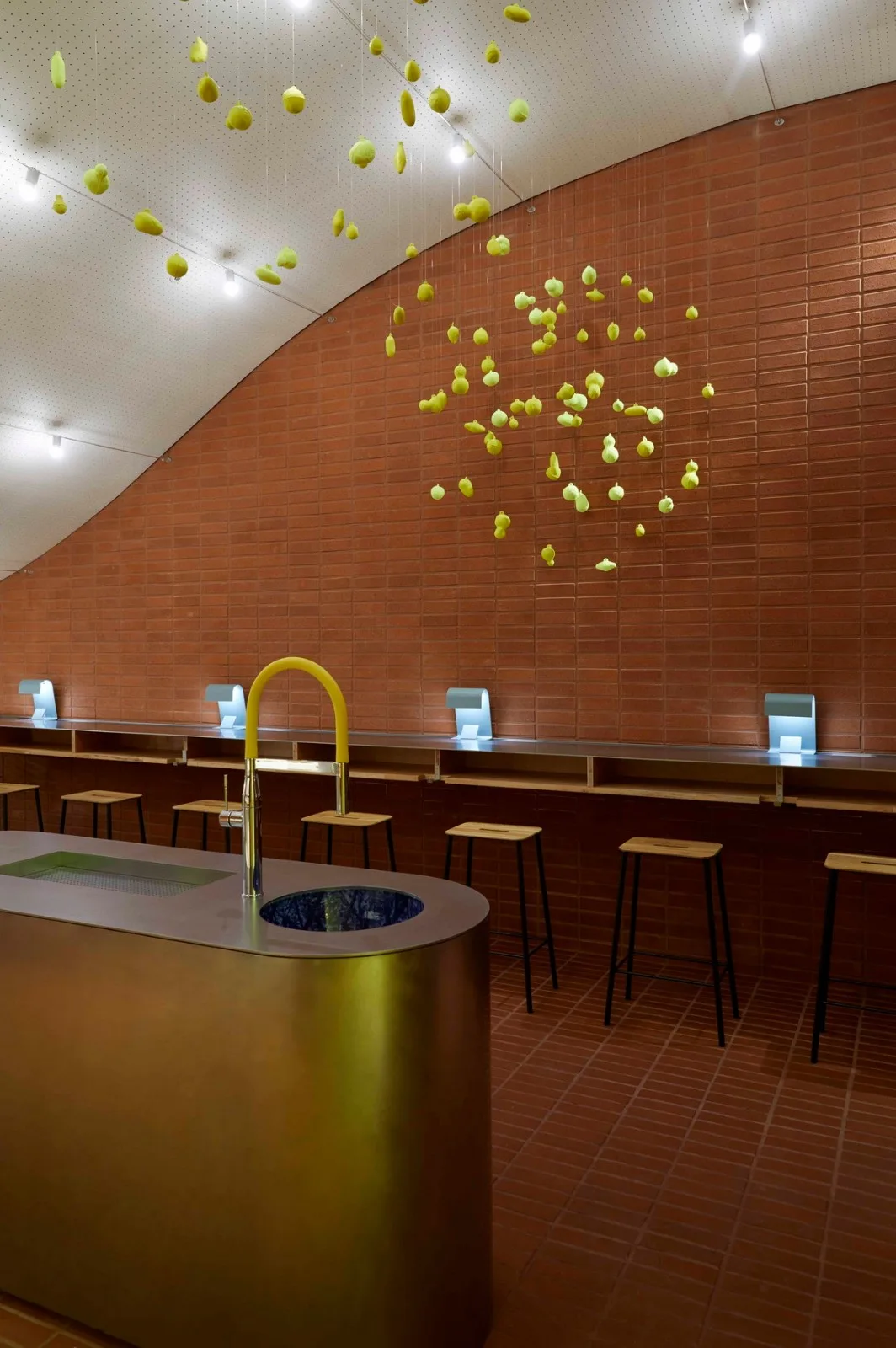
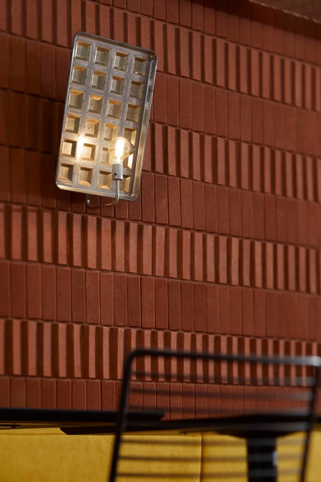
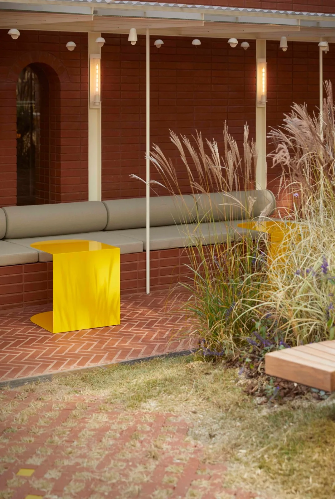
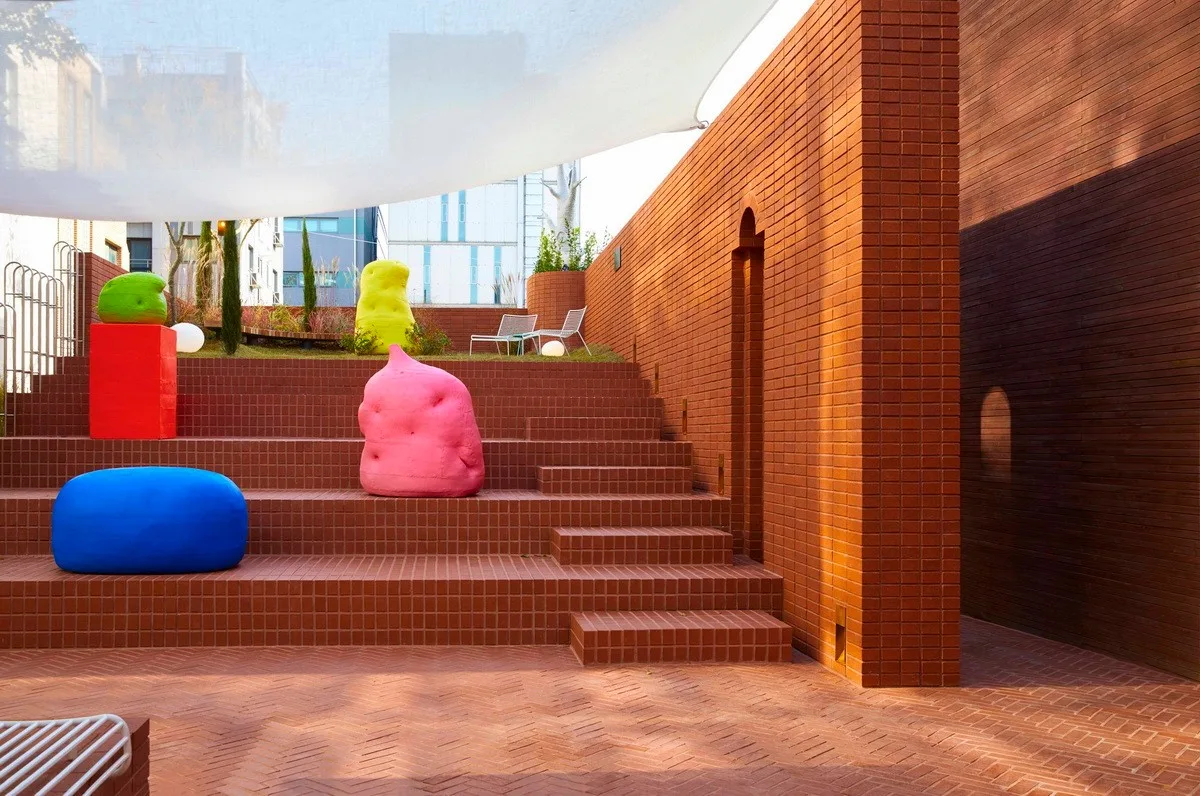
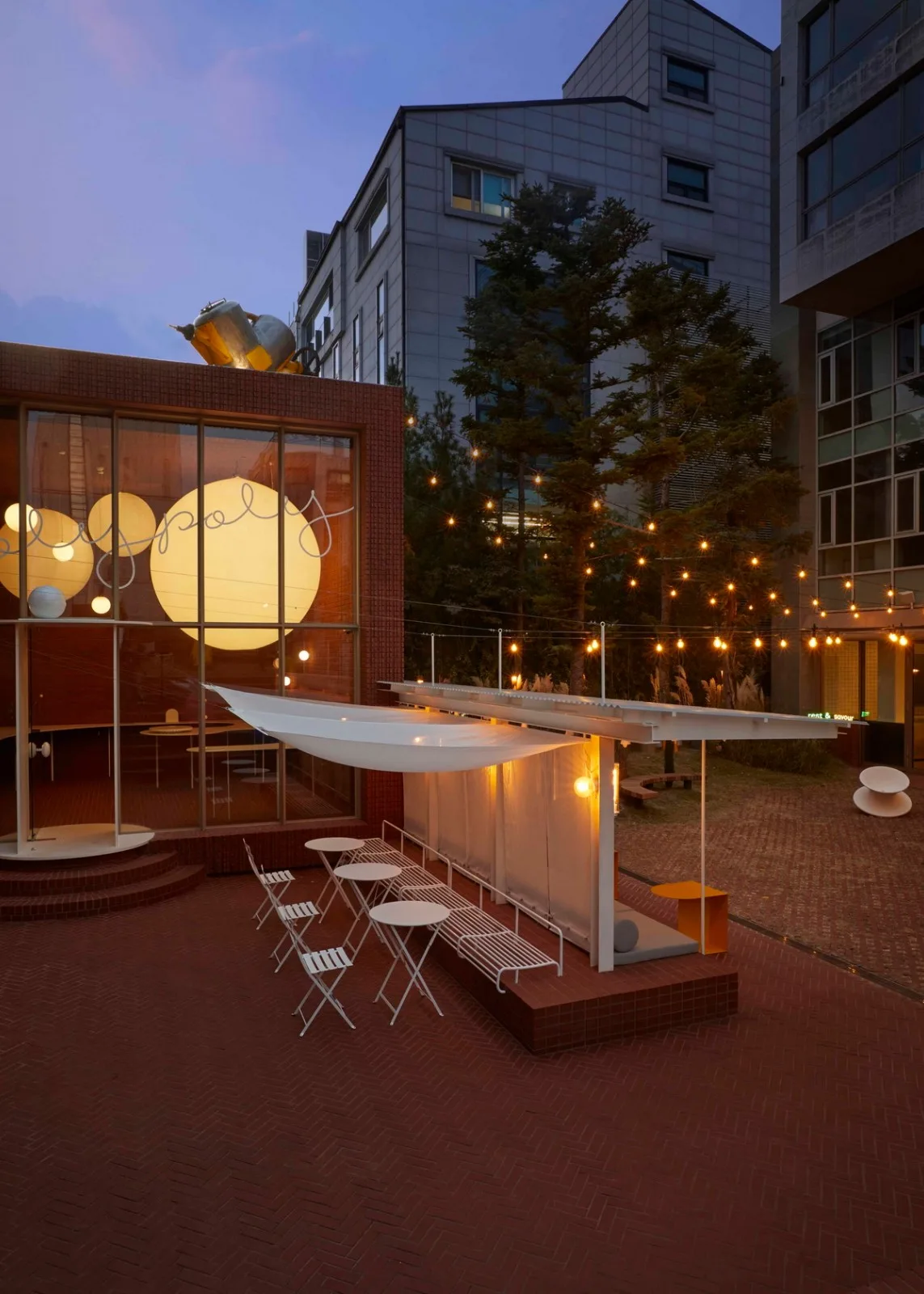
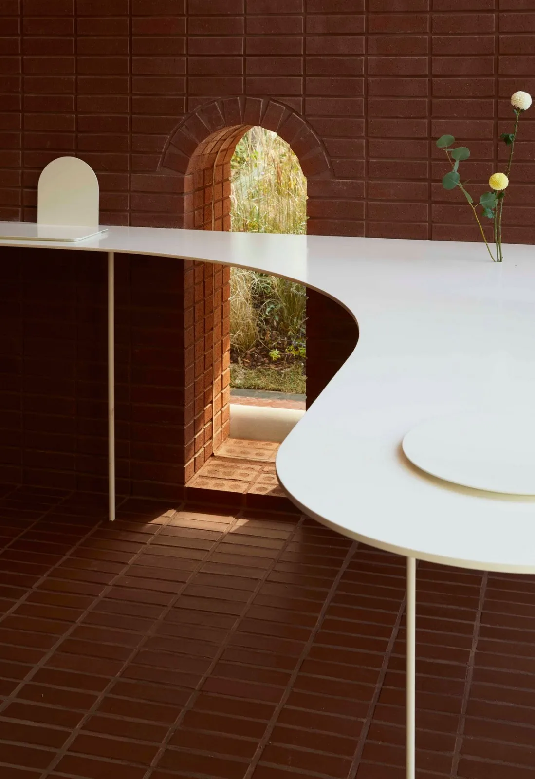
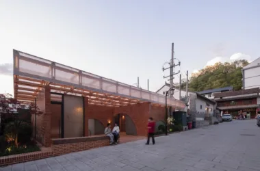
Red bricks serve as the primary building material throughout the space. Approximately 100,000 red bricks compose the walls, symbolizing stability built from small units. Their universality and durability reflect the company’s long history and steady growth. Various brick patterns and construction techniques soften the otherwise conservative material. Yellow, Ottogi’s signature color, is applied in different shades and intensities across the space, conveying a broader range of imagery beyond the brand’s traditional palette. Inside, wood, fabric, and ceramics complement the red bricks, while hand-polished stainless steel accents introduce rhythm and a sense of time through their physical properties.
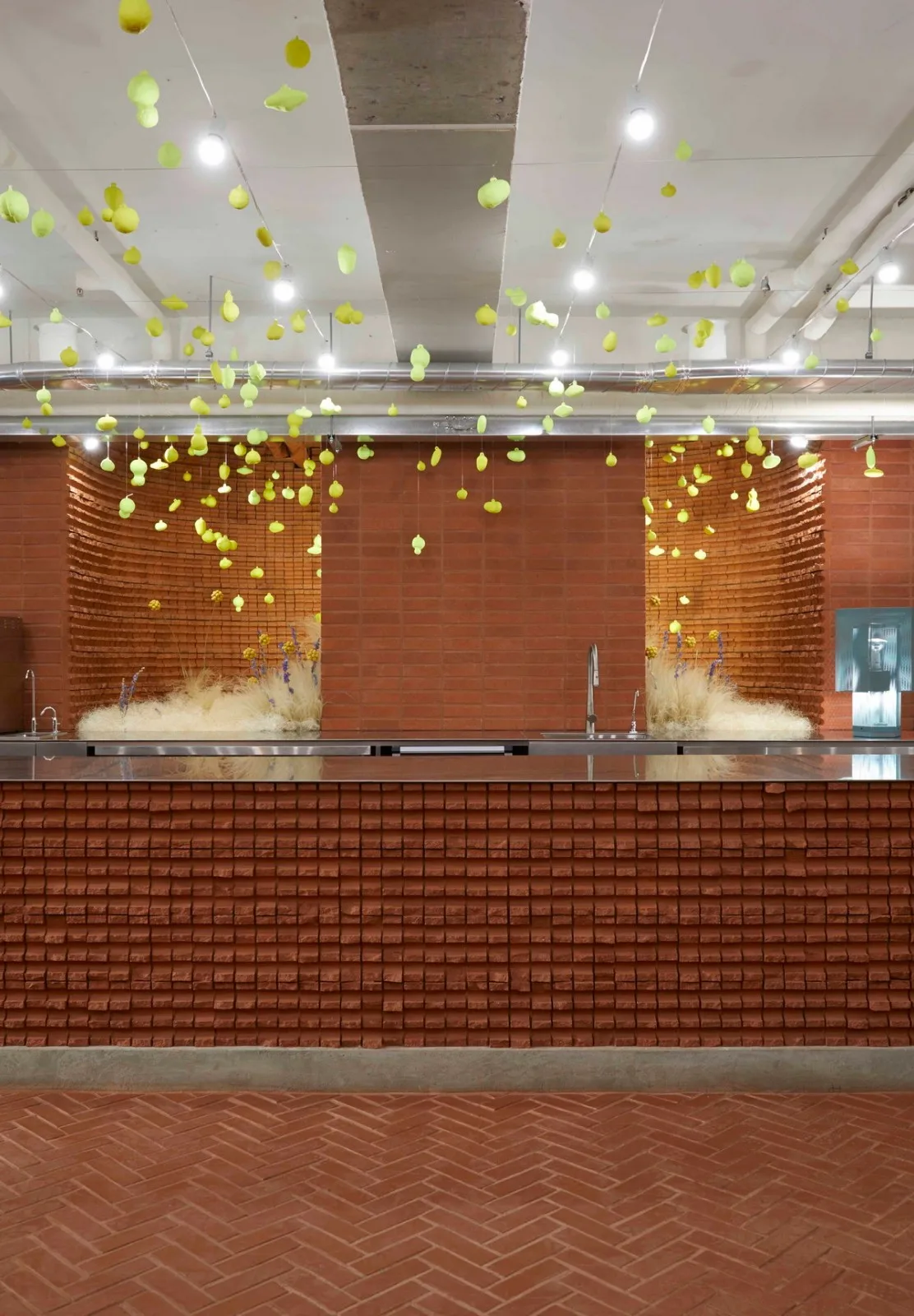
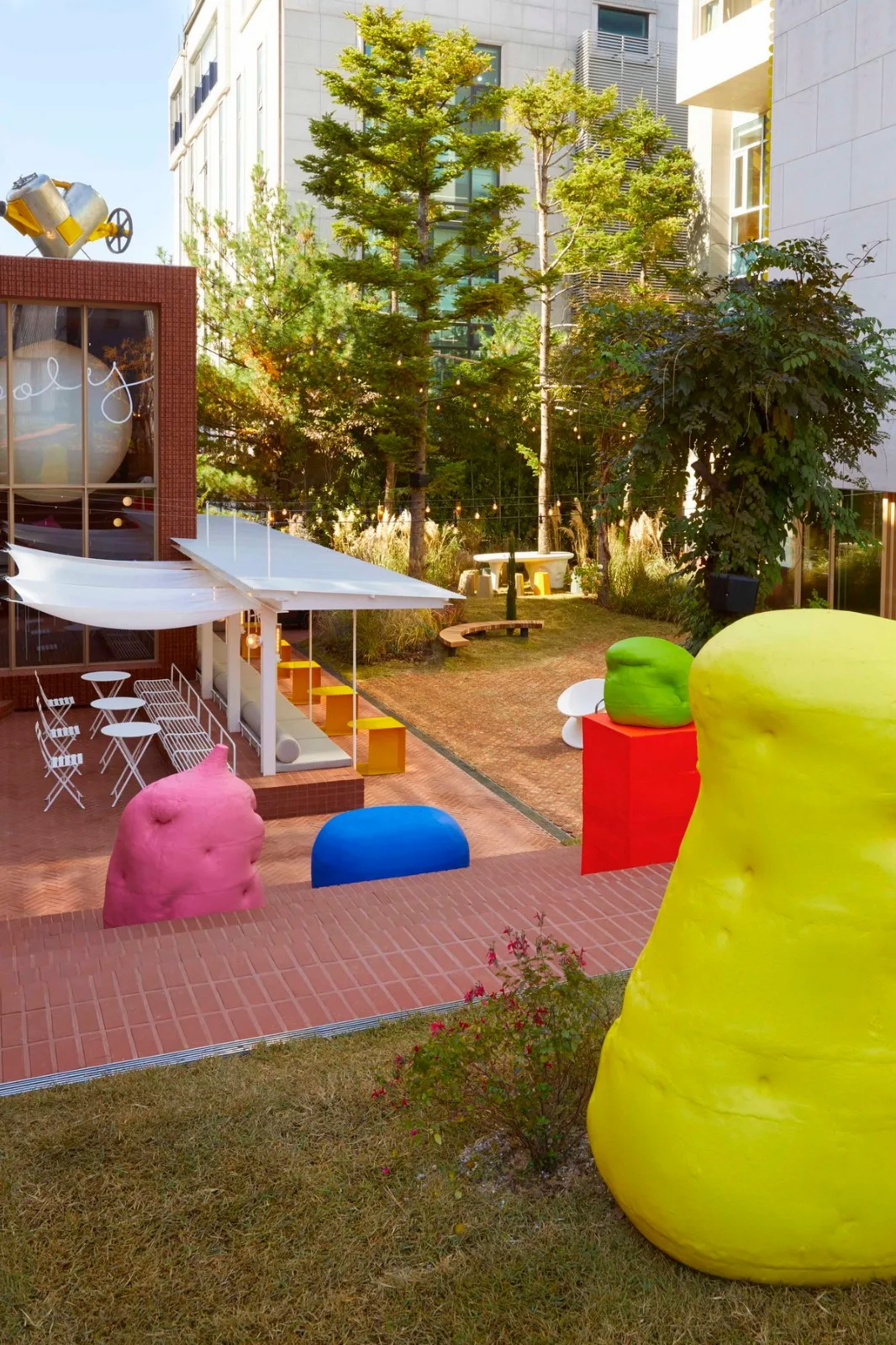
The cave facing the street is an underground, windowless space dedicated to food and beverage sales. Over 400 fluorescent objects hang from the ceiling, visually extending into the garden beyond. The interior features patterned brick walls, an 8-meter-long bar counter, and a display sofa aligned along the narrow space’s axis. From the cave entrance, a narrow vertical staircase leads upward to the slope area facing the block. The cube space sells products developed for this project, with brick walls featuring small gaps that let in light. Inside, a large curved metal display stand floats in the air beneath a ceiling-mounted illuminated balloon, visible even from outside. The stepped brick slope includes movable seating, and a small lawn at the top offers a vantage point over the garden. Ceramic pieces in fluorescent colors, created by artist Li Xianzhen, are placed on the steps for customer interaction.
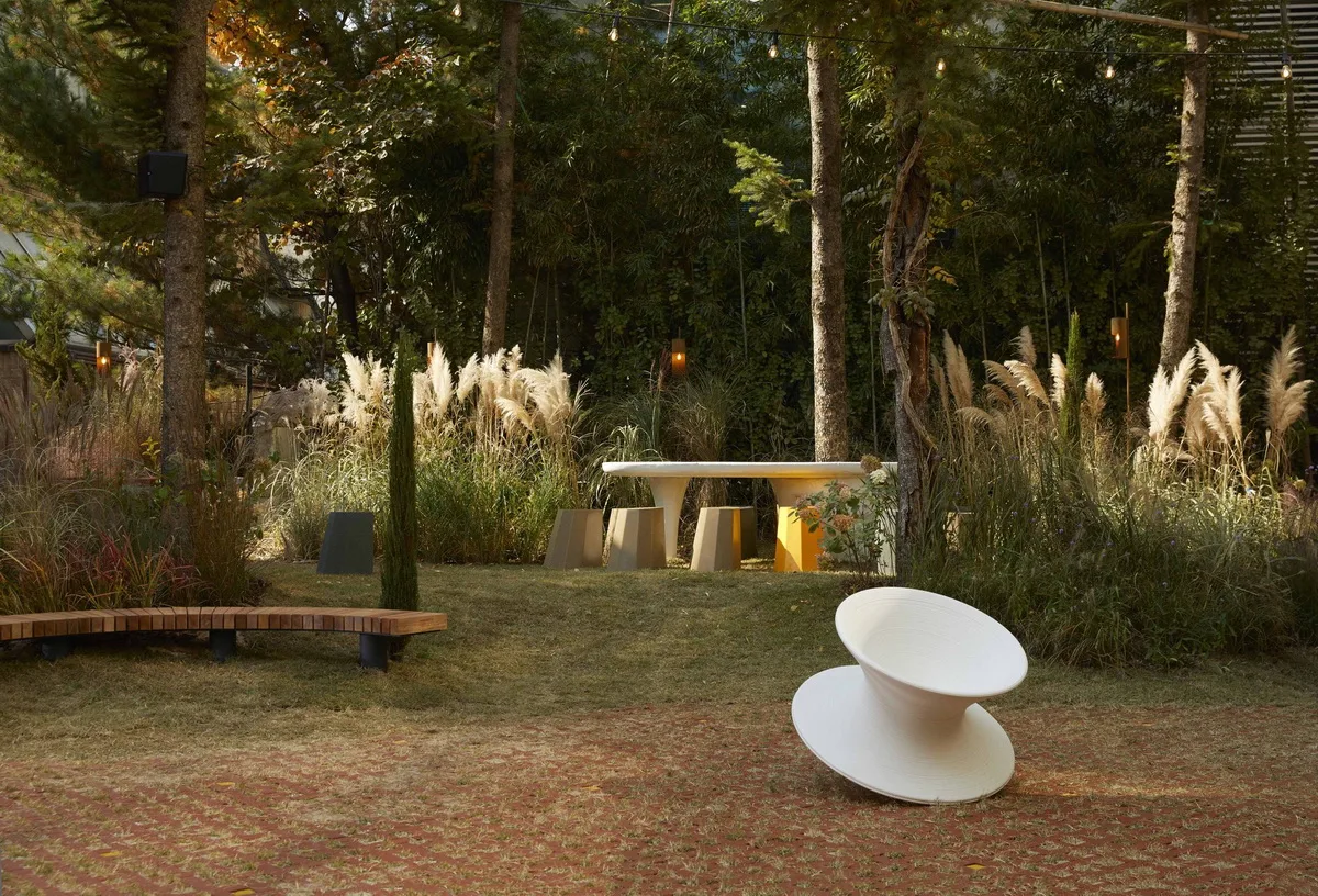
The shade structure attached to the cube is crafted from stamped metal roofing material, allowing sunlight to filter through and softening the cube’s rigidity. This long sunshade divides the garden’s flat surface into two areas, while adding visual depth at eye level. Approximately 40 ceramic bonsai pots are arranged beneath the roof, and the gentle breeze creates a soft rustling sound that lingers throughout the garden.
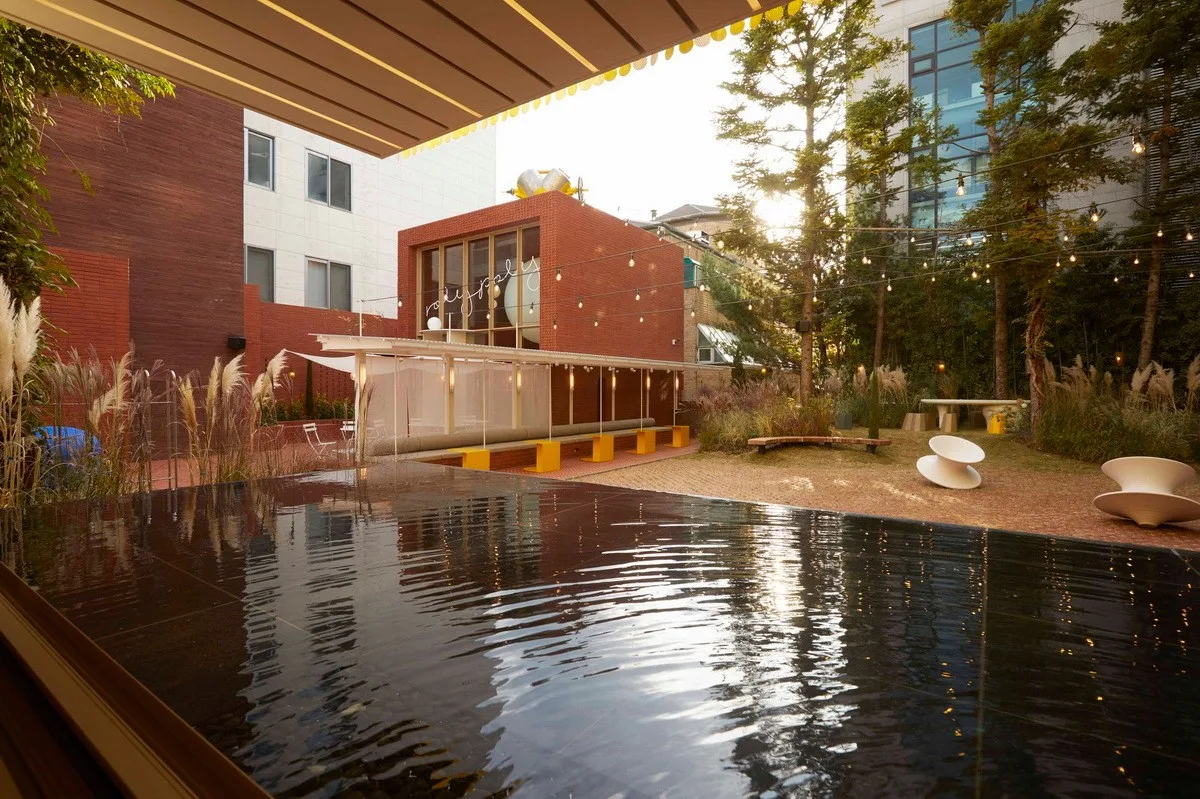
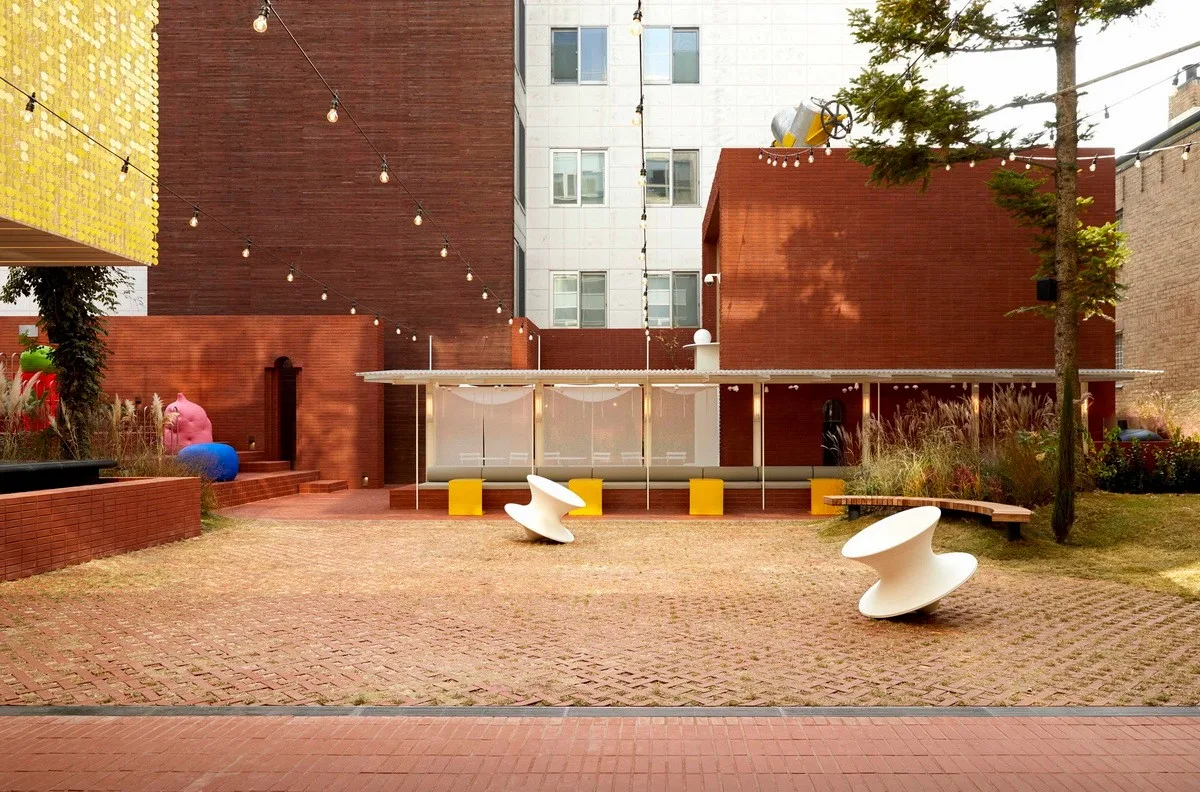
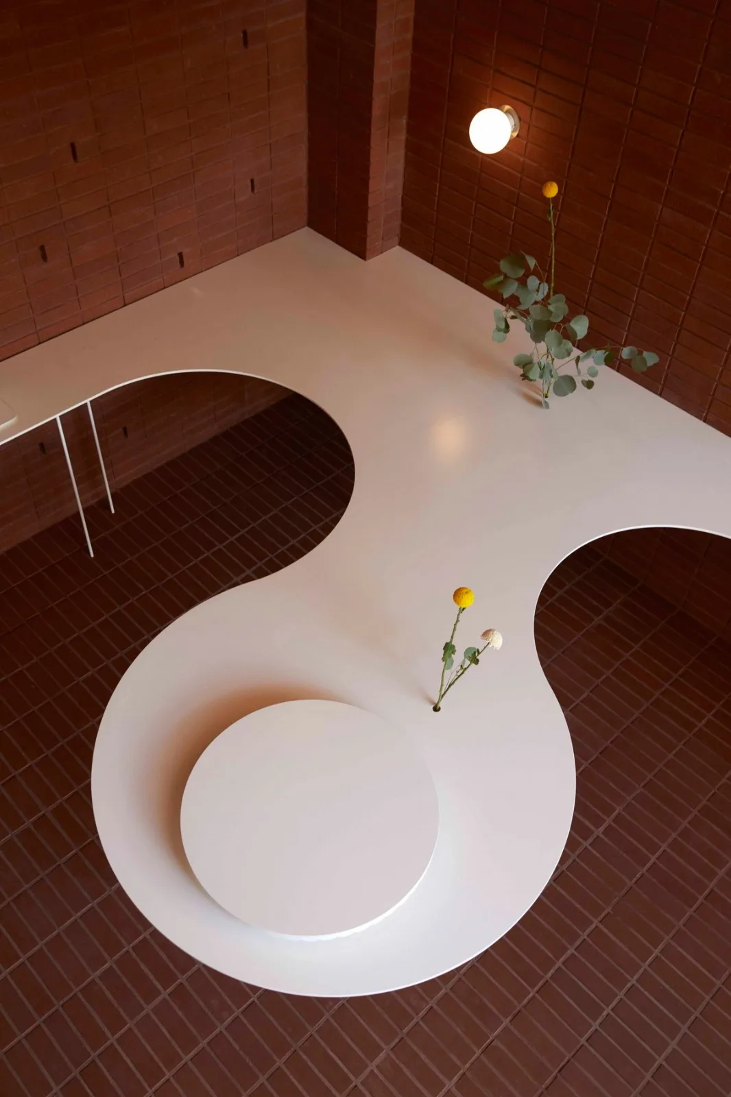
The garden serves as the focal point that all rooms lead to and forms the heart of the entire space. The blooming and falling flowers reflect the changing seasons, providing a soft contrast to the rigidity of the brick walls. A variety of flowering plants harmonize with existing cedar trees within the design. A small hill, formed by the site’s natural elevation change at the garden’s edge, complements the pavilion opposite it. Atop the hill, a ceramic table created by Li Xianzhen is integrated with the cedar trees, creating a unique garden space.
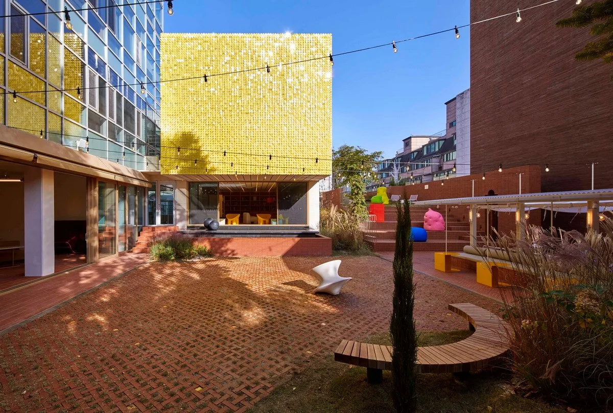
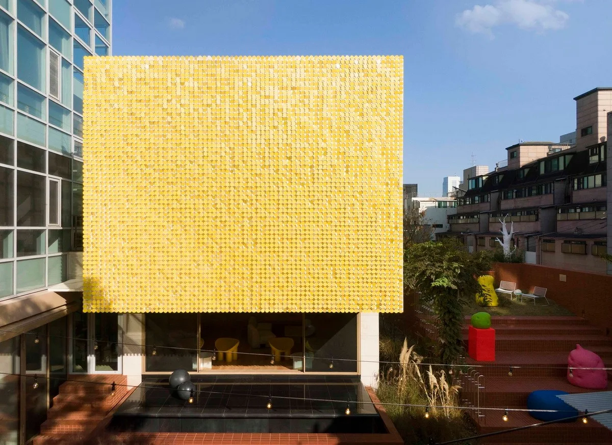
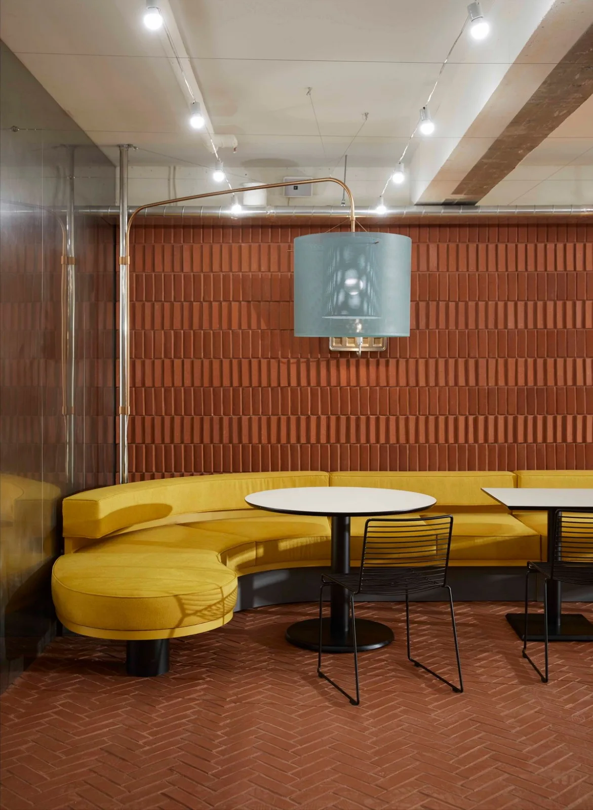
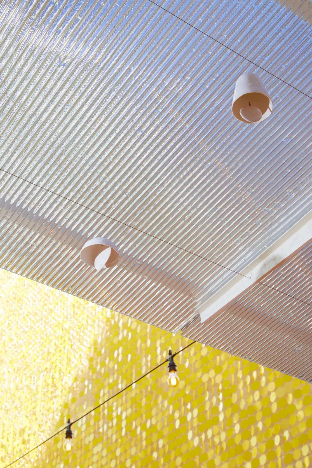
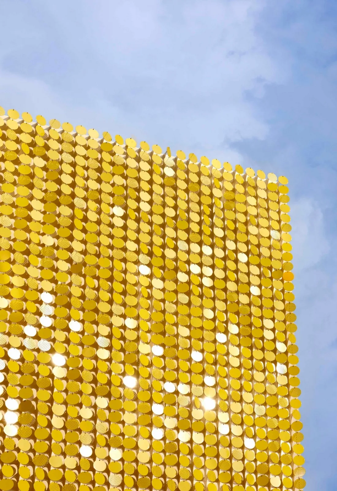
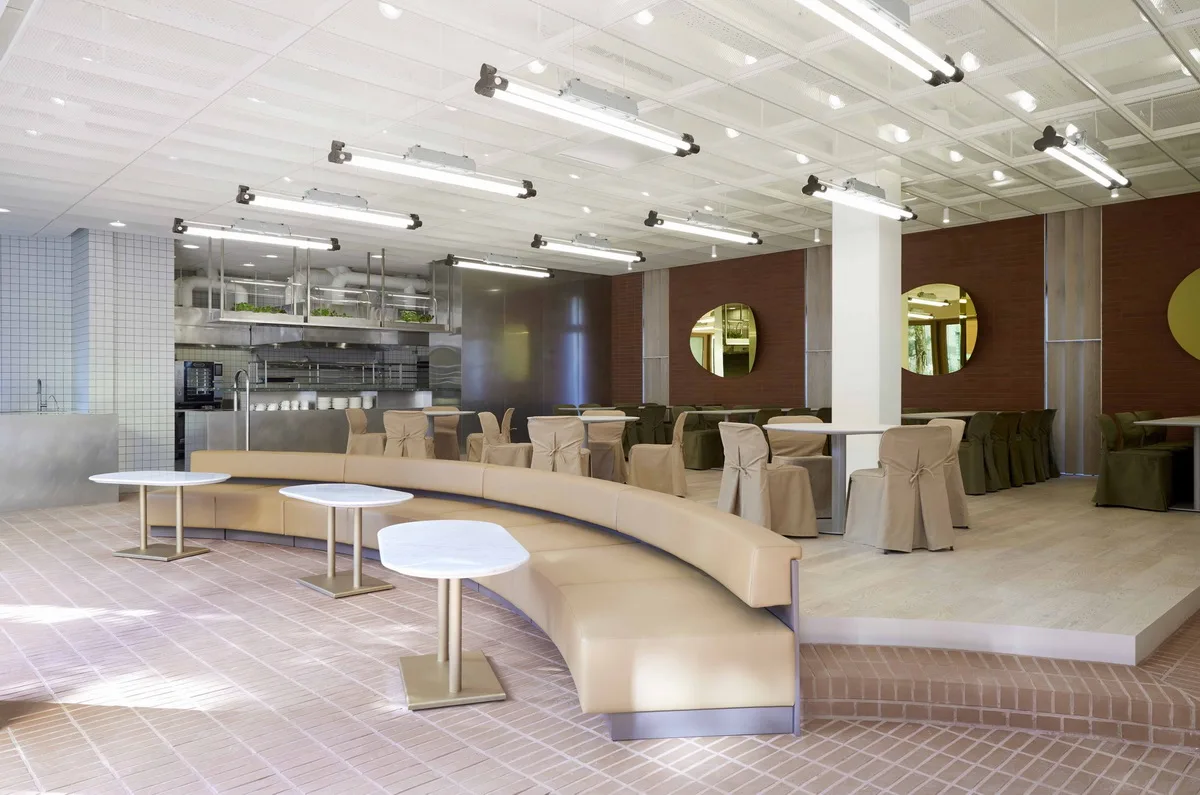
The hall accommodates over 50 people and features an open, multipurpose layout. While currently reserved for corporate and tasting events, it is planned to open to the public in the future. A metal mesh panel on the ceiling conceals lighting, HVAC, and audio equipment. The front of the hall features a large sliding door, approximately six meters wide, which can be opened to connect the hall seamlessly with the garden. The final space, Xie, is a private area not open to the public. However, it faces the garden, where 4,800 yellow sequins shimmer with the movement of wind and light.
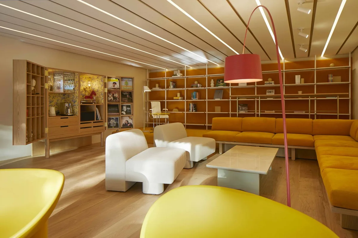
The interior of Xie is designed to be warm and inviting, resembling a cozy living room. The company’s signature yellow is used thoughtfully across different materials to create layered depths of color. Unique furniture pieces resembling treasure chests hide tools and small items for enjoying music, coffee, and red wine, adding delightful surprises for visitors. The entire living room window opens to provide a panoramic view of the garden through a reflective water feature.
Various elements in the garden stimulate visual, auditory, and tactile senses, unifying the dispersed spaces. The building’s soft curves balance the brick walls’ hardness, while different floor levels inside the space allow visitors to better experience and understand the environment. Ultimately, the spatial relationships aim to create both visual enjoyment and a refreshed brand image.
Design Drawings
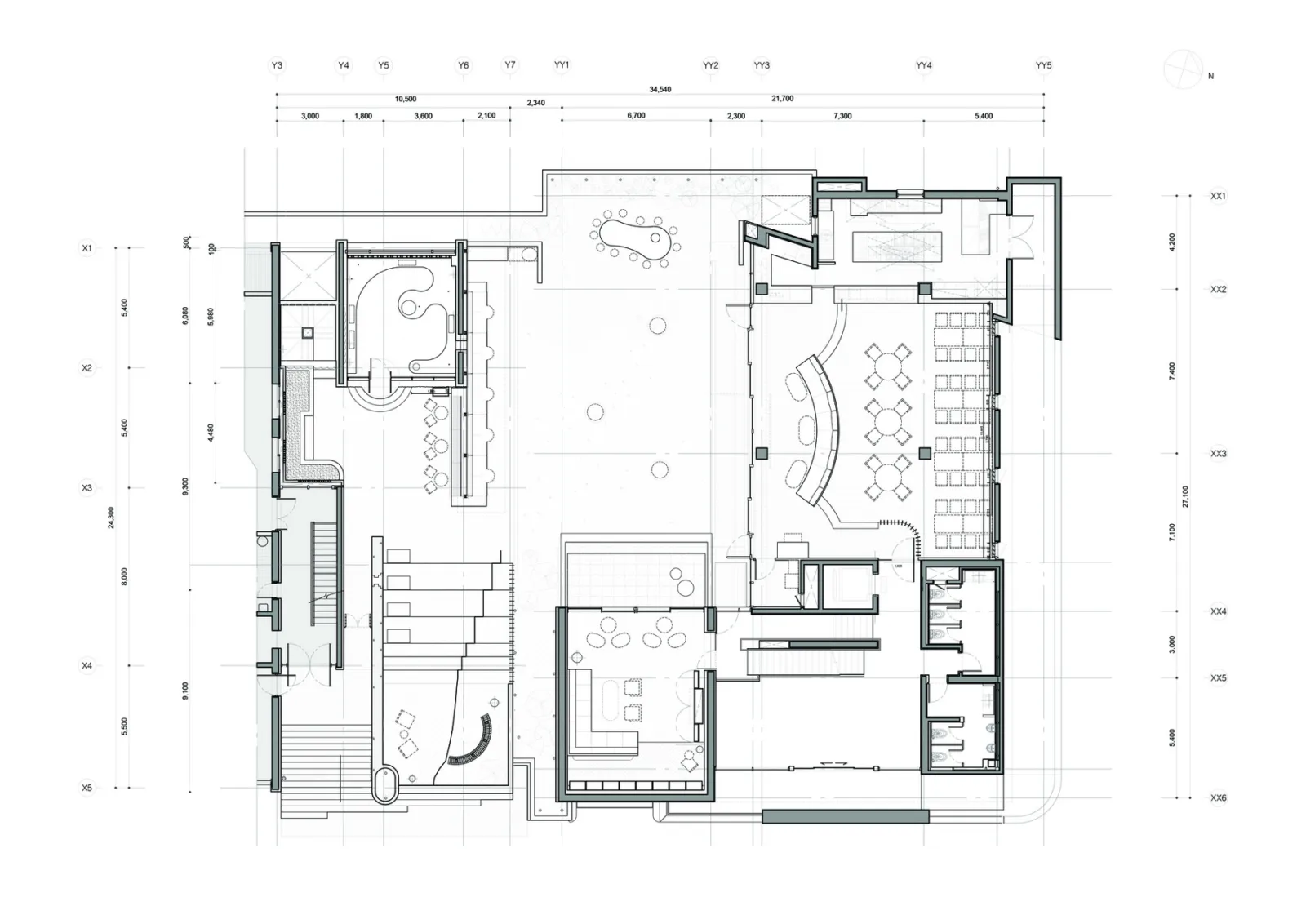
△ Plan View
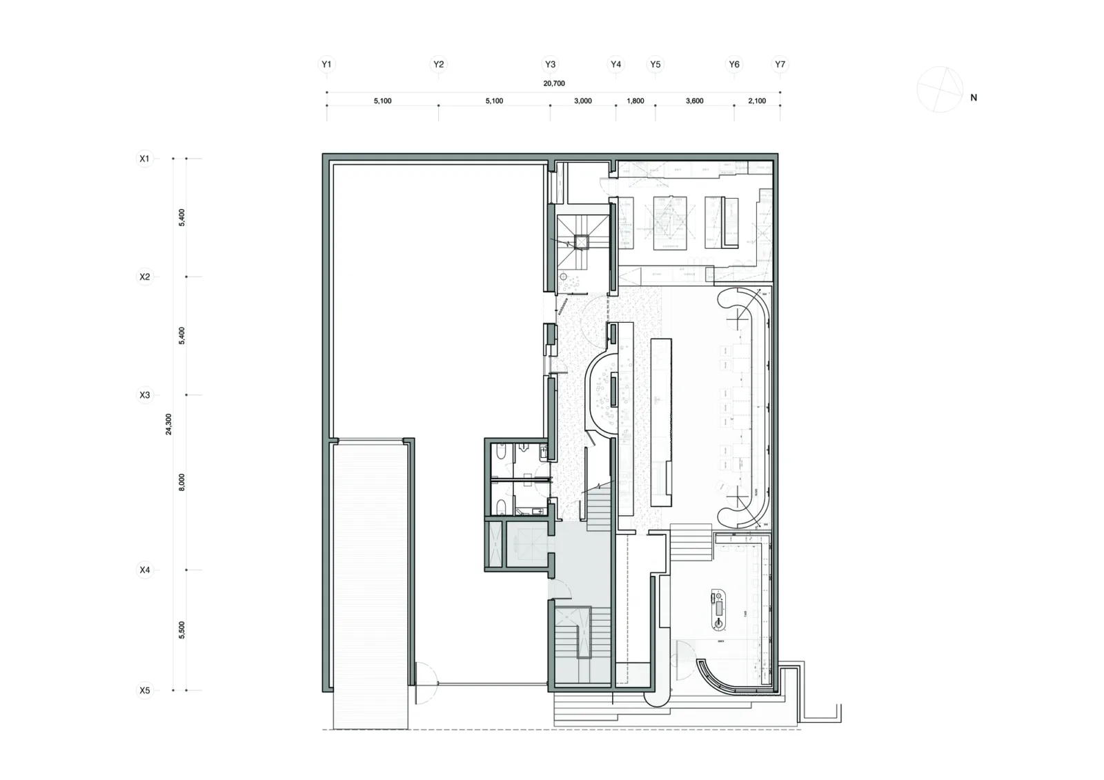
△ Plan View
Project Information
Project Type: Catering Building
Location: Gangnam-gu, South Korea
Architectural Design: Studiovase
Area: 1015 m²
Year: 2020
Photographer: Park Woo Jin
Lead Architect: Jeon Bumjin
Design Team: Studiovase
Construction: Studiovase


Must log in before commenting!
Sign Up