In early 2018, Jiushe Construction Studio was commissioned to design a 200-square-meter reception center for a homestay located in a seaside mountain village in Dinghai, Zhoushan. The client requested a facility that would not only fulfill basic check-in functions but also accommodate breakfast and afternoon tea gatherings for 20 to 30 guests, as well as serve as a temporary exhibition hall.
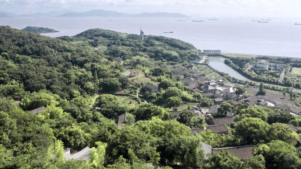
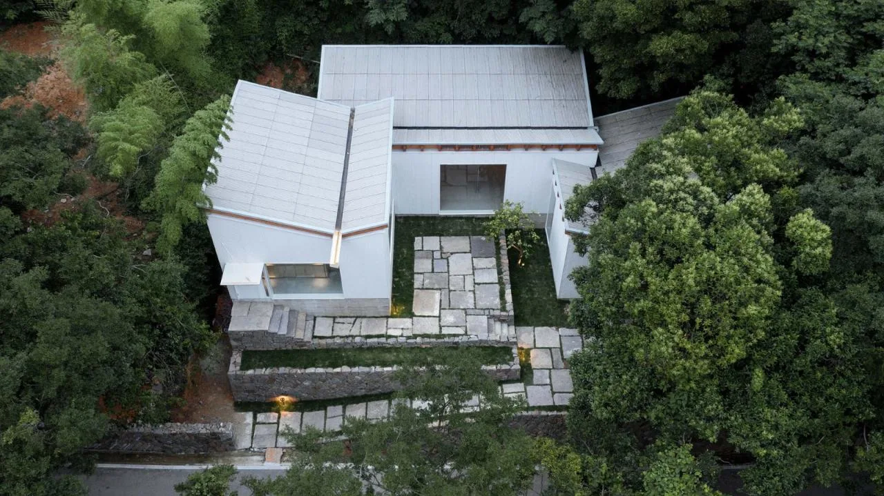
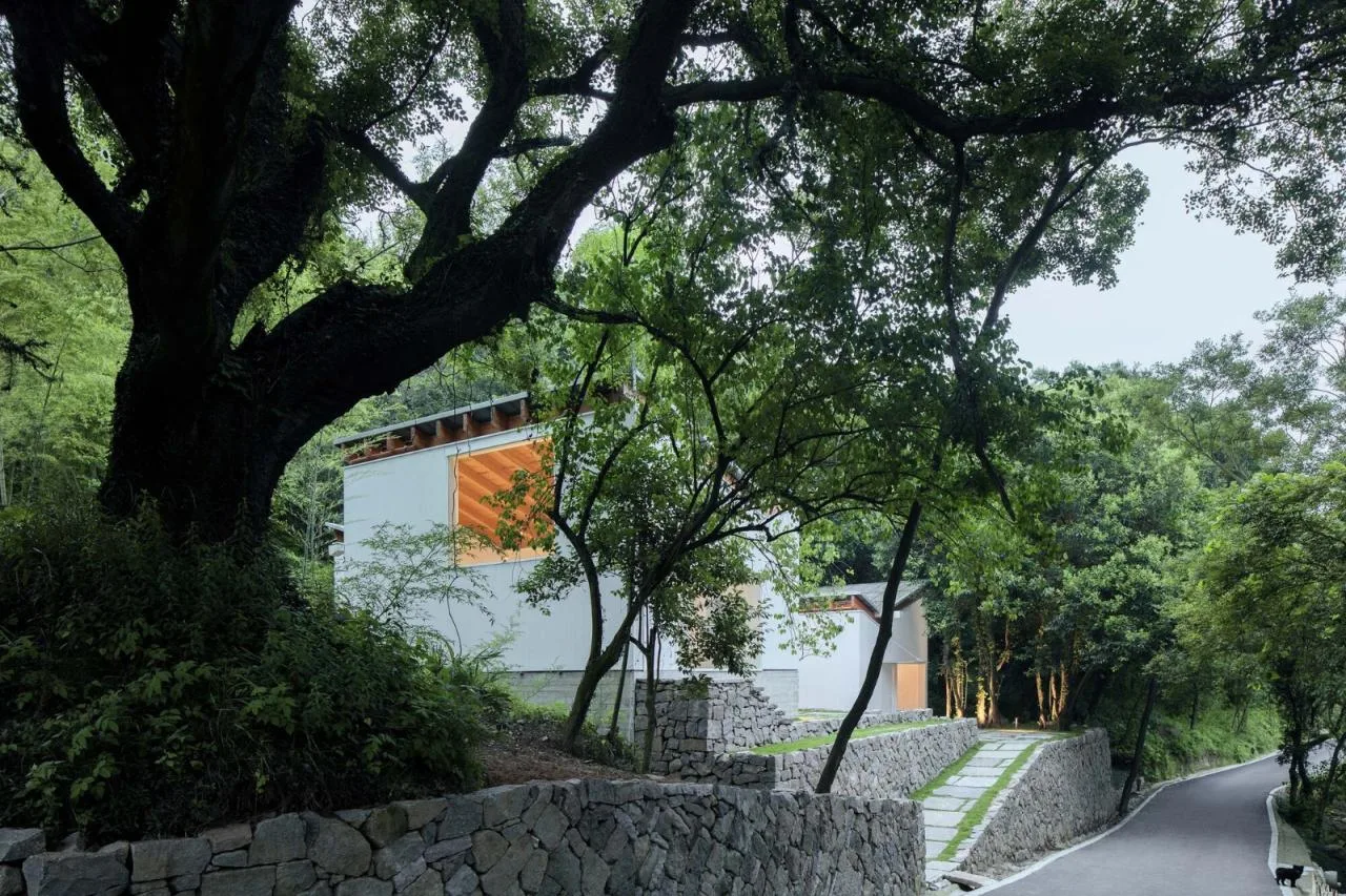
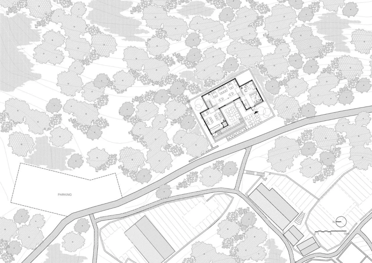
The site is a plateau carved from a northeast-high, southwest-low mountain slope at the village’s highest point. It has a slightly elongated rectangular shape oriented north to south, covering about 400 square meters. Ruins line the northern half of the site, leaving the southern portion flat and vacant. Along the western edge, the site borders a village road running longitudinally, with a height difference of approximately 2 to 4 meters from north to south as the road slopes downward. Access is provided by a ramp extending northward from the southwest corner, connecting the site to the road. A descending path separates the site from the village below.
The tall tree canopy below the road and the neighboring two-story houses nearly block the sea view to the west. Only tree trunks in the southwest corner reveal glimpses of treetops on the lower slope. In all other directions, rolling mountains and dense mixed forests create a natural barrier, enclosing the site and framing the sky. This unique setting gives the site a strong westward orientation toward the road and the distant, hidden sea, while also emphasizing the “stratified” horizontal slicing of the mountain due to its relative elevation changes.
Given the site’s flat base with subtle features and forested surroundings, the challenge was to design a building that fits the site’s spirit and functional needs, offers rich spatial experiences beyond everyday life, and upholds the architectural quality we strive for.
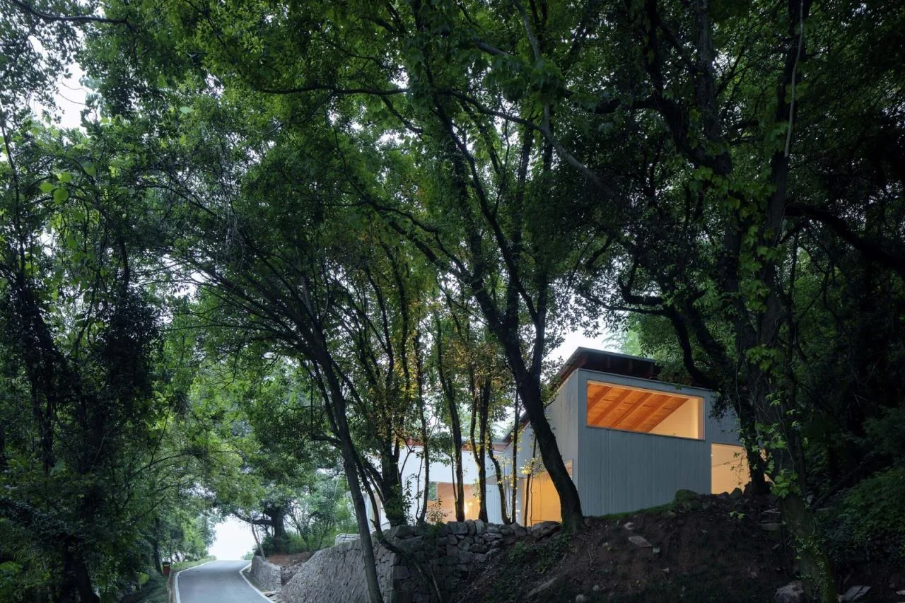
Drawing from previous village construction experience, we aimed to avoid designing a building that would overpower the scale of existing village houses, fostering harmony with the local community during both construction and operation. Our site’s location on the primary access path to the village and its commanding position made the considerations of size and scale critical.
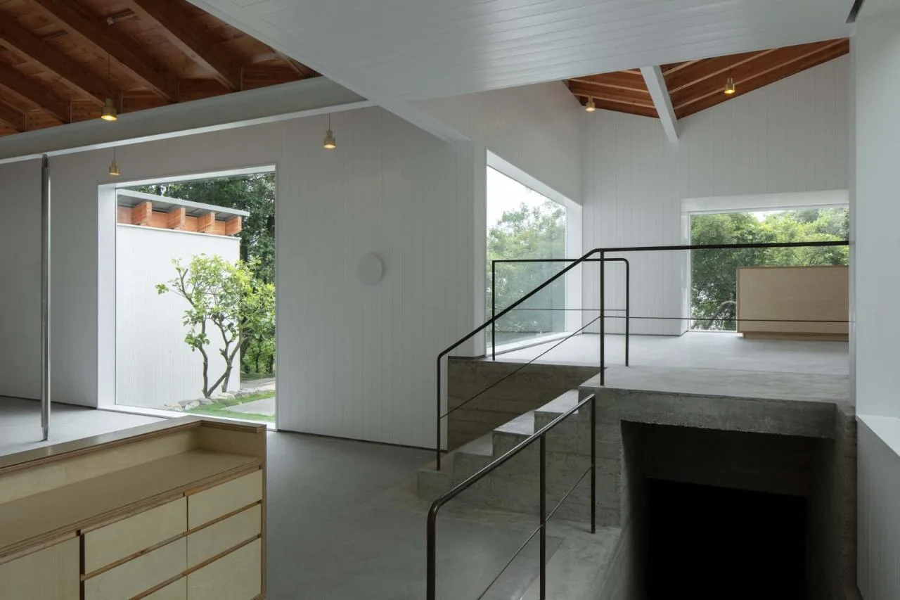
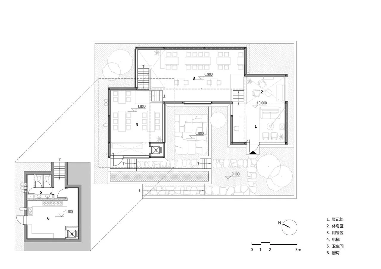
We took advantage of the site’s height difference relative to the road by placing auxiliary functions such as bathrooms and kitchens—which require separation—in lower rooms. The reception, dining, and exhibition spaces, being more flexible in use, were located above, allowing greater freedom in spatial layout and form. This strategy also minimized the building’s footprint and visual bulk on the ground.
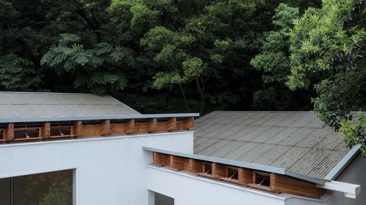
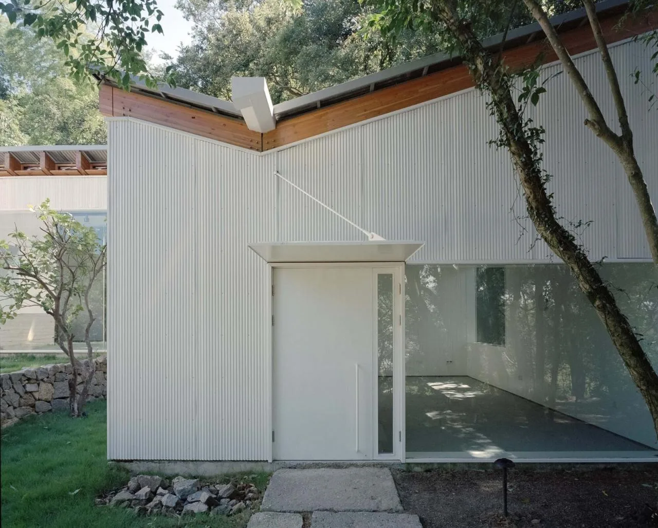
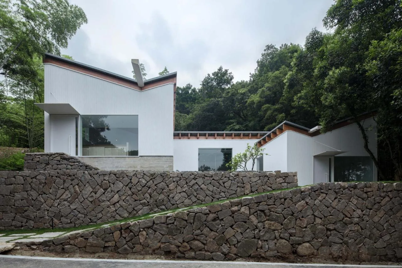
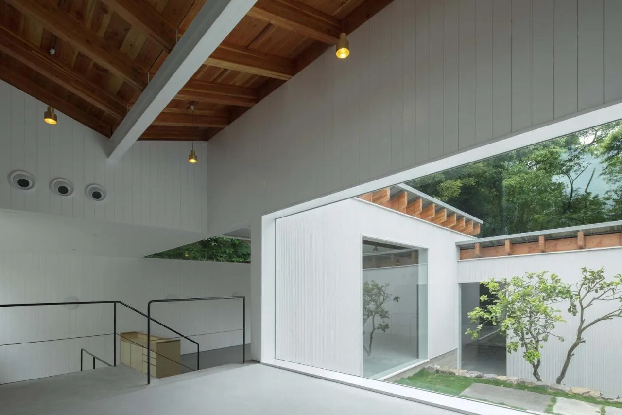
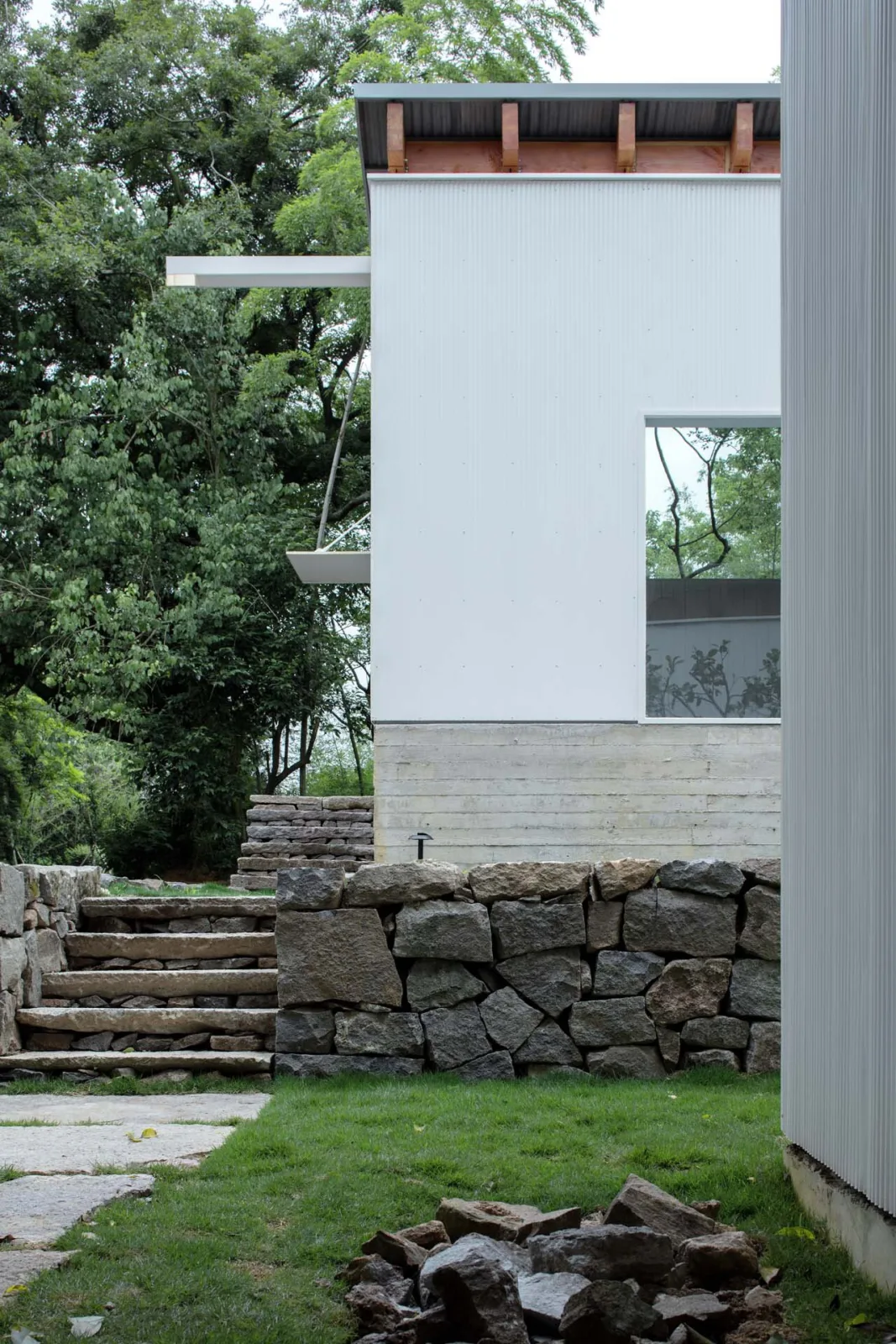
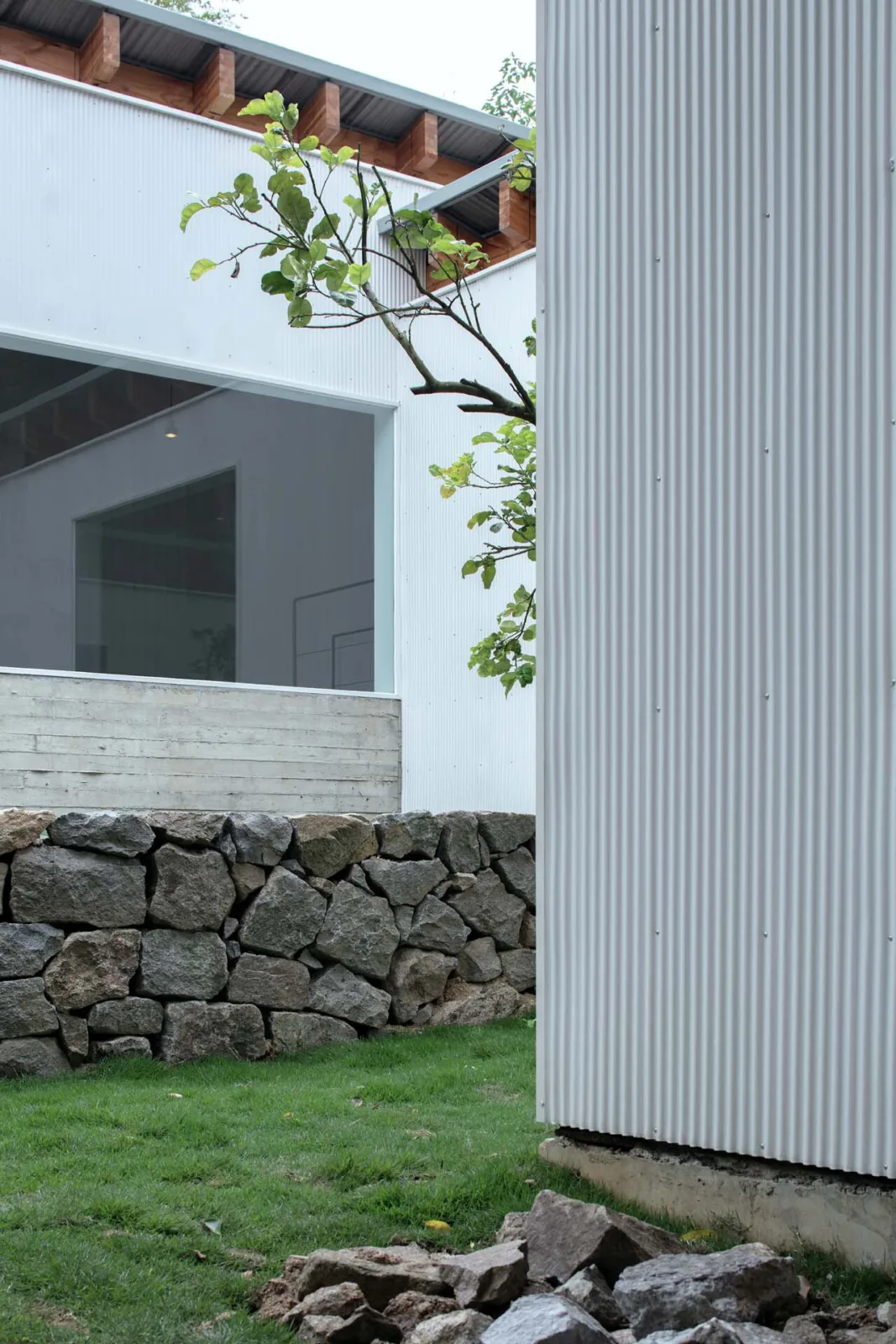
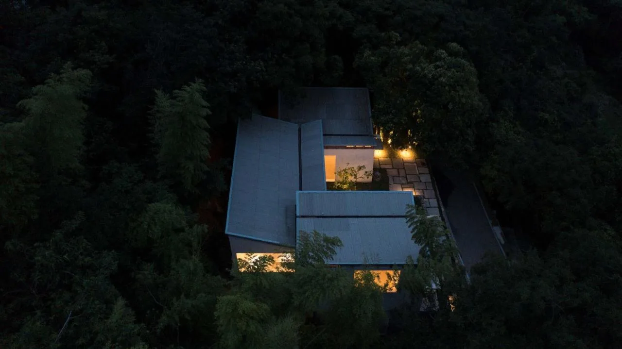
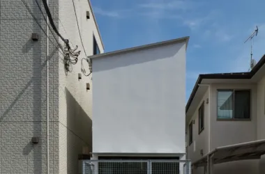
We then divided the upper volume into three smaller rectangular blocks resembling the scale of typical village houses, arranged diagonally to form a connected series. Each block’s footprint is smaller than typical local homes. The facades are clad in vertical metal corrugated panels similar to those found in nearby light industrial areas. The narrow corrugation pattern breaks the common perception of industrial buildings, lending a refined, multi-layered visual texture.
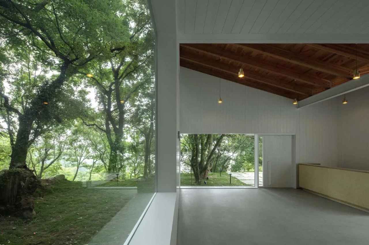
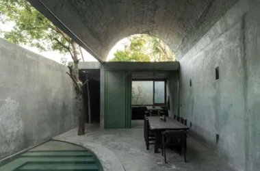
The three blocks protrude north and south while retreating centrally to create an “empty courtyard” facing the western sea, defining the building’s main orientation. The southern volume is set further back than the northern one, preserving a row of miscellaneous trees that blend with the original ramp to form an entrance and exit space. This “biting” configuration adds complexity to the building’s outline, enriching views of the previously flat forest landscape from inside.
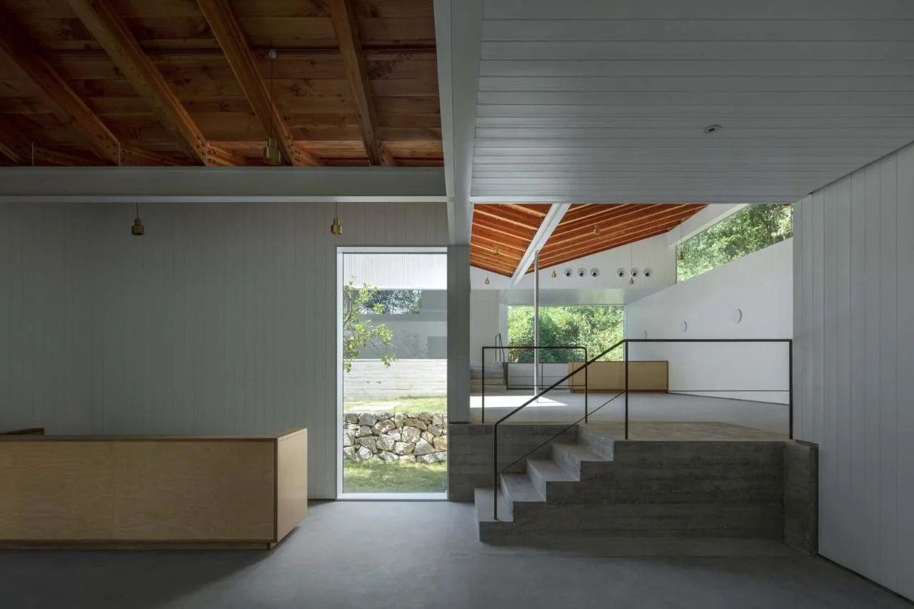
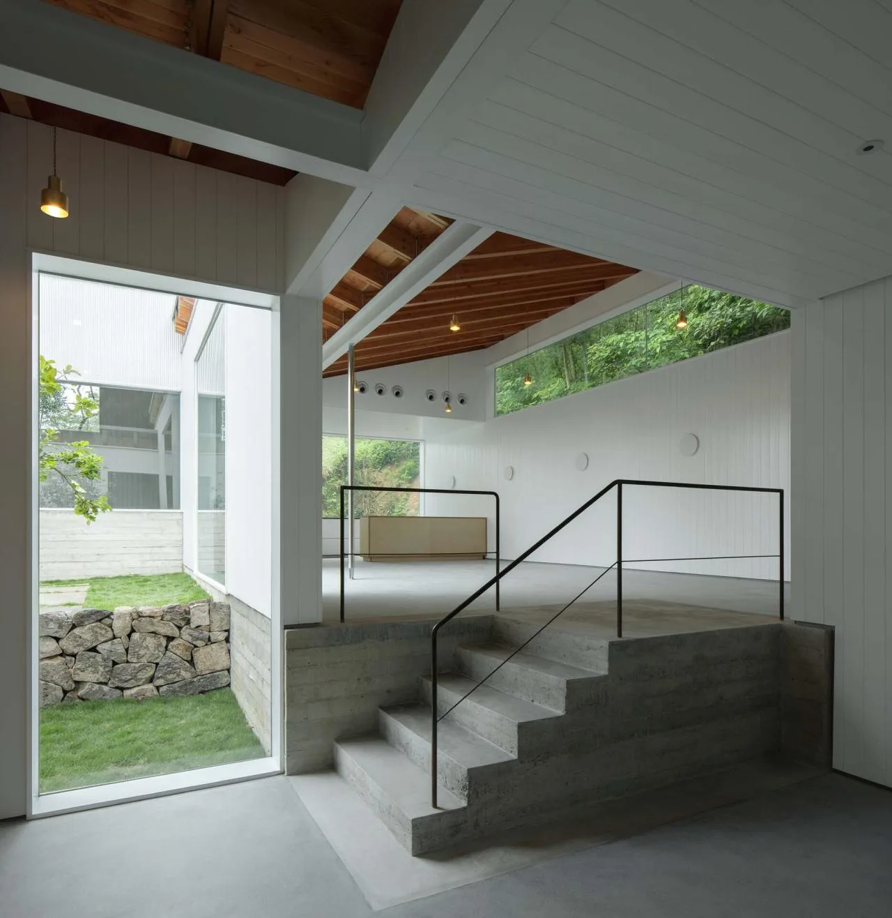
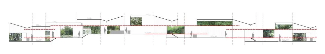
Vertically, the three blocks are arranged on terraces at different elevations. Horizontal concrete forms on the inner platforms highlight the mountain’s stratified layers. Below the highest terrace lie the kitchen and bathrooms, hidden within the base. Steps connect the plateaus at their intersections, while external rubble-built terraces feature stepped edges forming a continuous “mountain road.” Each terrace’s elevation corresponds directly with interior spaces, extending the site’s geological character indoors and out. The gradual rise of the terraces from south to north reduces the original steep slope’s height difference and allows more light and broader views for the upper volumes.
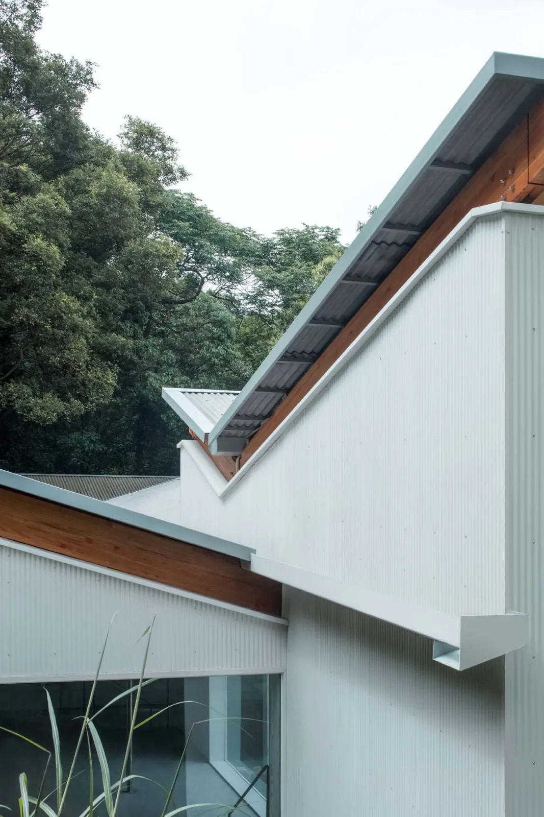
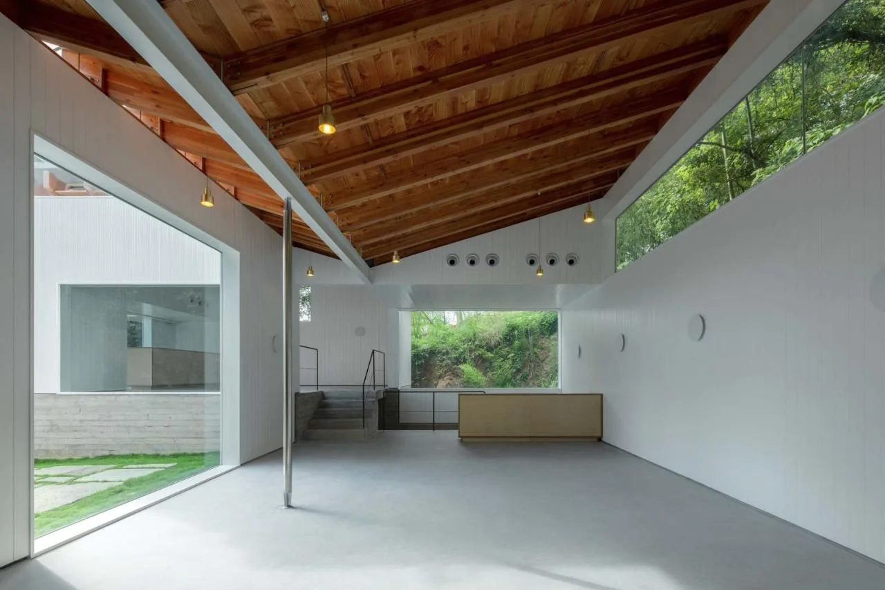
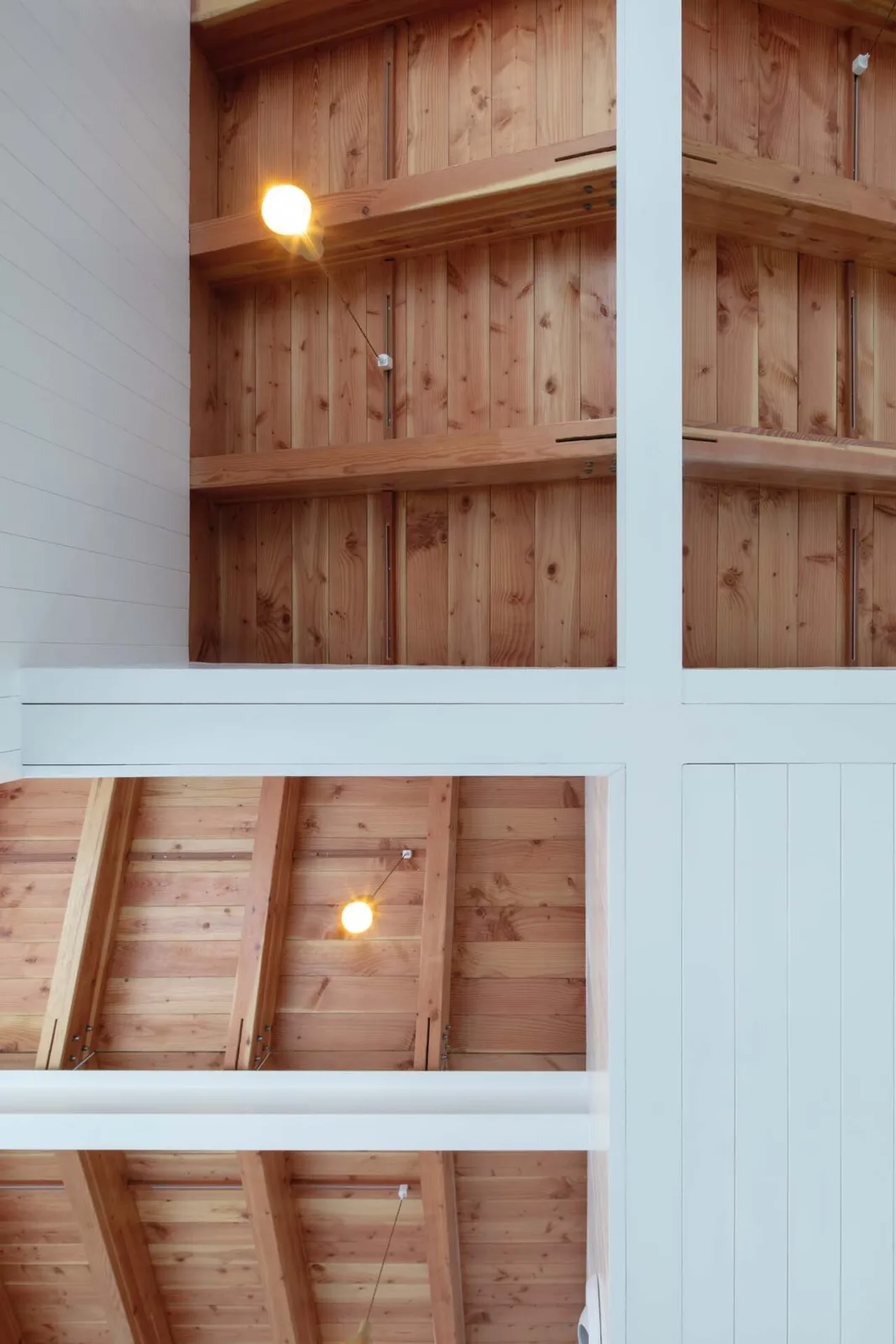
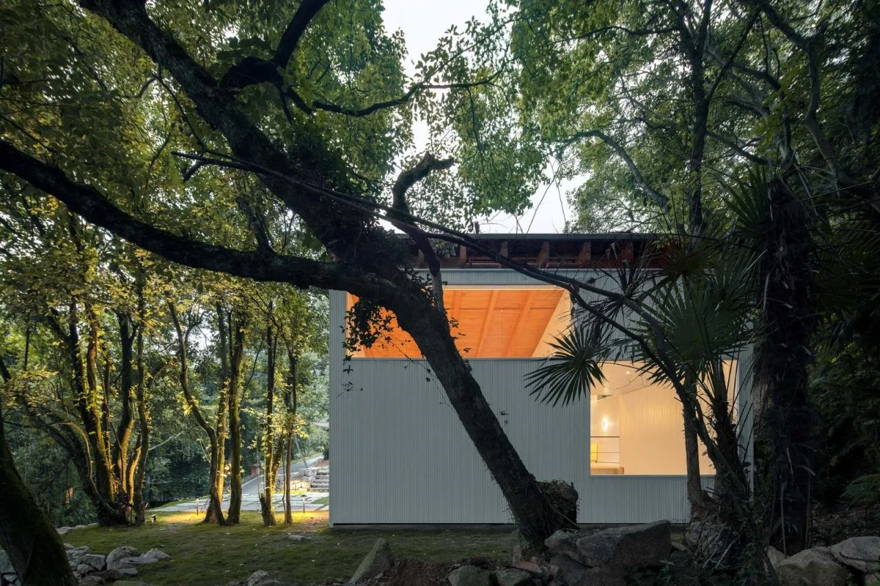
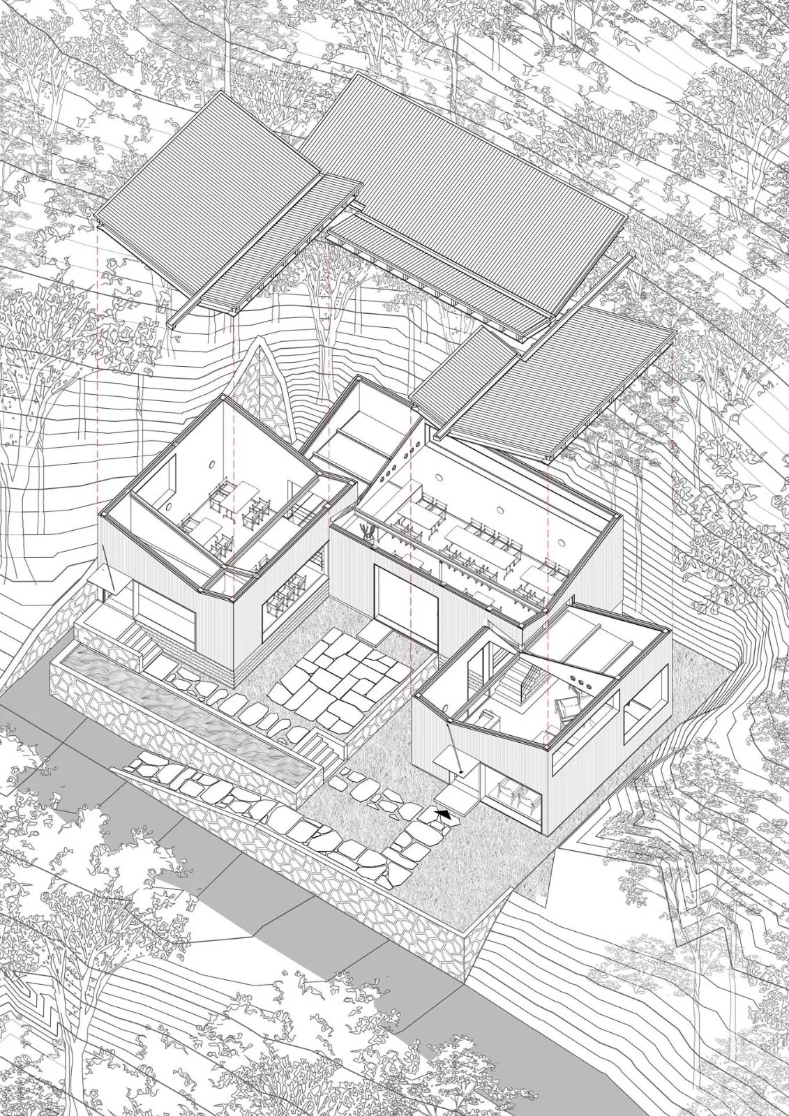
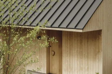
The “reverse double sloping roof” concept emerges from the three volumes’ interlocking plan and section, offering more than just an exterior form. We sought a structural strategy that integrates interior and exterior spatial experiences holistically. This roof type creates a distinct, recognizable external silhouette, making the building’s image memorable.
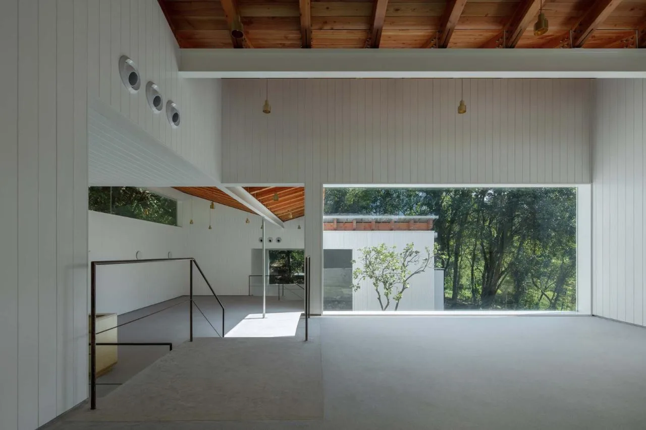
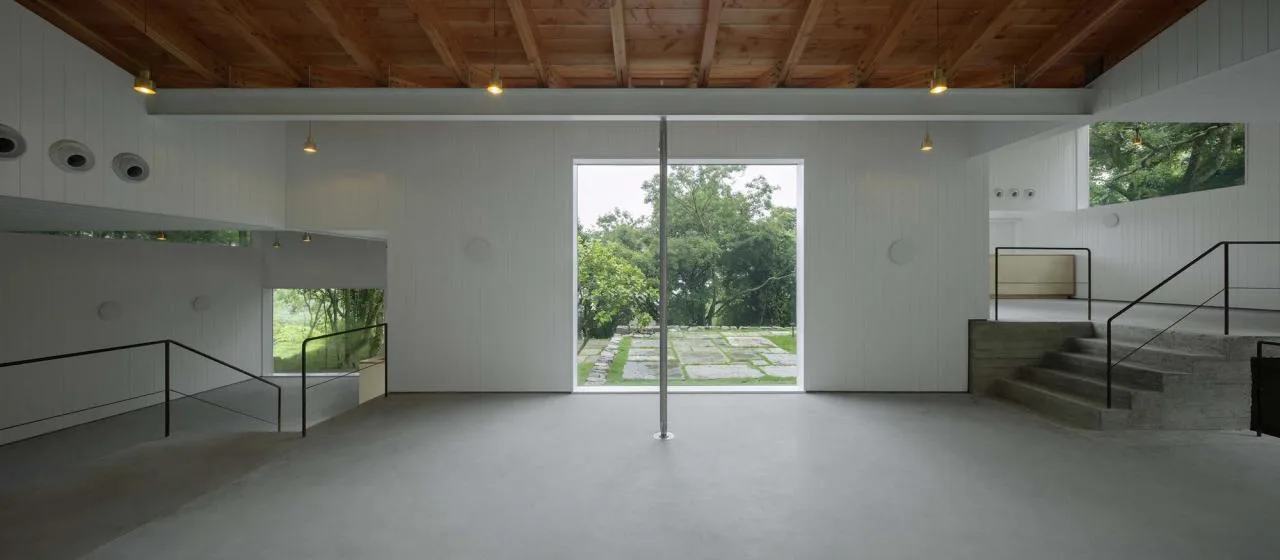
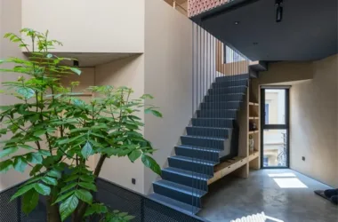
Inside, the reverse double slope roof unfolds along the length of each volume, with a ridge beam extending downward through the space. Continuous diagonal glued laminated wooden beams flank the ridge, paired with wooden observation panels, becoming the space’s most striking visual element within the bright, white interior.
Unlike traditional inward-sloping roofs that create a sense of enclosure, this design reverses that sensation, expanding outward toward the front and rear facades. As the three volumes interlock longitudinally, their roofs appear to rotate, blending courtyard landscapes with the surrounding mountains and forest, forging a powerful indoor-outdoor connection.
We further aligned the longitudinal beams inside the spaces with the contours of adjacent volumes. In every pair of neighboring volumes, the lower internal longitudinal beam extends into the facade wall of the higher volume. A vertical beam in the adjacent space combines with the longitudinal beam to form a ceiling that encloses HVAC equipment within the facade. This beam also extends into another facade wall of the higher volume. By integrating these linear beams with the exterior walls, the interior and exterior spaces are more intricately connected.
 Hole opening method
Given the multifunctional nature of the spaces, facade openings are designed with great freedom, allowing for complex and rich internal-external interfaces. However, richness alone is insufficient; each element’s purpose and the clarity of their relationships are crucial. We believe that the more complex the simple elements, the more engaging the spatial experience becomes.
We began by positioning doors and windows approximately according to the relationship between interior spaces and the surrounding terrain and views. We then refined the size, position, and proportion of openings using a modular grid and the site’s height variations.
Vertically, the 0.9-meter height difference between the three volumes corresponds to the height of fixed furniture like bar counters and dining islands, as well as window sills and railings. The longitudinal beam and ceiling height are set at 3 meters. At intersections between high and low volumes, the beam height rises from 2.1 meters to 3 meters with the steps, creating a strong sense of spatial interaction.
Based on these elevations—0.9m, 2.1m, and 3m—we established five vertical rules for facade openings: floor-to-ceiling doors and windows at 2.1m or 3m, window sills at 0.9m, window tops at 3m, tall windows ranging from 2.1m sills to tops, and tall windows from 3m sills to tops. These varying ground levels create a rich correspondence among surfaces, railings, sills, ceilings, and beams.
Horizontally, a 1.5-meter modular grid controls the boundaries of all exterior openings and internal layouts, helping visitors perceive alignment relationships among spatial boundaries during movement.
The vertical elevation control and horizontal modular alignment integrate seemingly irregular facade openings into a subtle, hidden network of order. Visitors become aware of distant echoes and discover new visual layers within the simple volumes, enhancing their spatial experience.
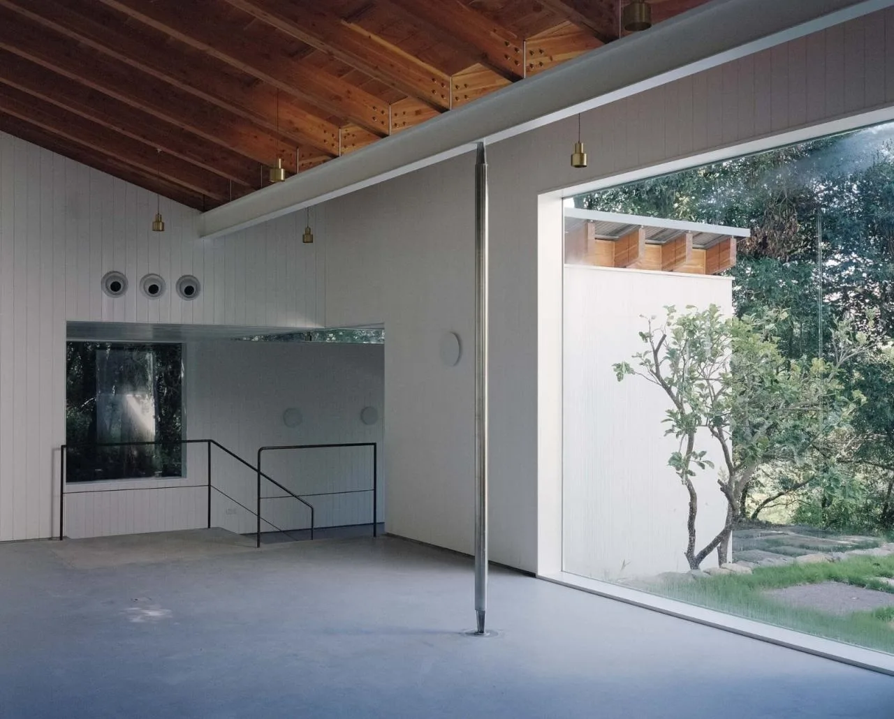
To emphasize these openings, we removed the conventional ventilation function, replacing it with electric fans housed above the upper wooden beams. The fixed glass panels were refined to minimize their visual presence, making the glass nearly invisible and creating a seamless indoor-outdoor connection.
Although walls retain thickness, the interplay of window edges and suspended ceiling volumes causes the walls to appear as abstract white “panels.” This overlapping relationship among walls, roofs, and floors diminishes the openings themselves, making them residual spaces formed by the intersections of wall panels. The simple exterior volume suddenly disappears upon entering, creating a striking contrast. Inside, the space feels exceptionally light and transparent, blurring its true depth.
The building’s primary structure is a steel frame, with simple single-span, single-story volumes that allow most beams and columns to be concealed within multiple layers of facade materials and walls.
However, each upper space features two steel beams spanning horizontally in both the long and short directions—the short direction serving as the main beam and the long as the secondary. While similar in width, the beams differ significantly in height. We designed their bottoms to align flush, so the ceiling bottom is level with them, and the joints are painted uniformly white.
The secondary beams are fully exposed inside, while the main beams’ sides are hidden behind white wall panels integrated with suspended walls and equipment enclosures. This reverses the expected structural hierarchy visually: the main beams vanish into the walls and ceiling, revealing only their bottom surfaces, while the secondary beams dominate the space, elongating and expanding the room’s perceived scale.
This approach transcends pure structural concerns, abstracting and refining the structural form and materials to weave new meanings into the spatial experience.
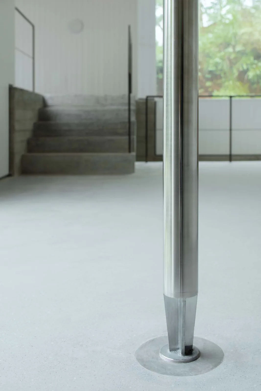
Supporting the longest beam in the center of the volume is an ultra-slim solid stainless steel column. This “swing column” not only carries structural loads safely—including during typhoons—but also connects the overhead beam with the occupant’s physical experience, transforming abstract structural elements into tangible touchpoints.
Significantly, this column aligns with the only square fixed window on the facade. When facing this window and the column, visitors look toward the sea partially obscured by the tree canopy, enhancing the connection between interior space and the landscape.
Project Drawings
△ General layout plan
△ Plan view
△ Axonometric diagram
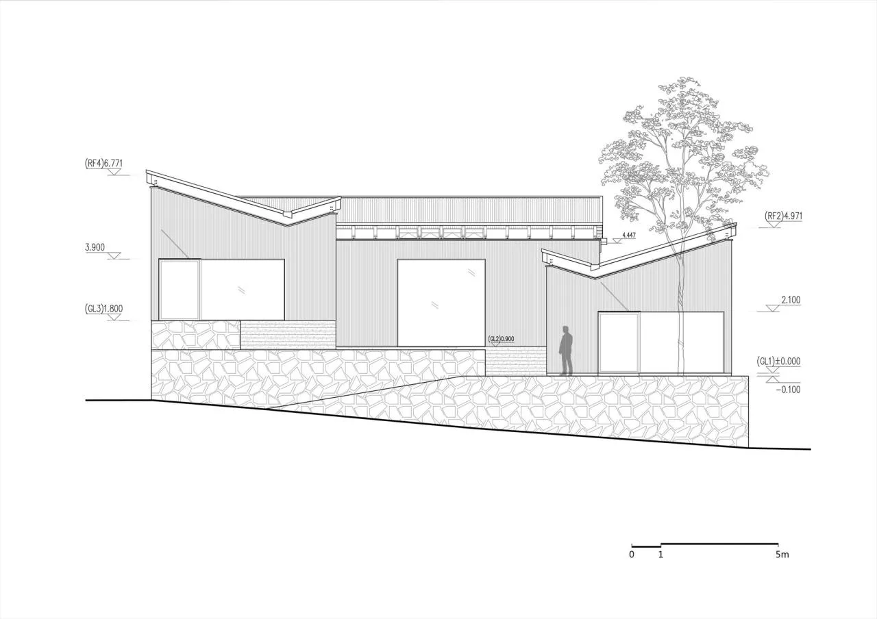
△ Elevation drawing

△ Section diagram
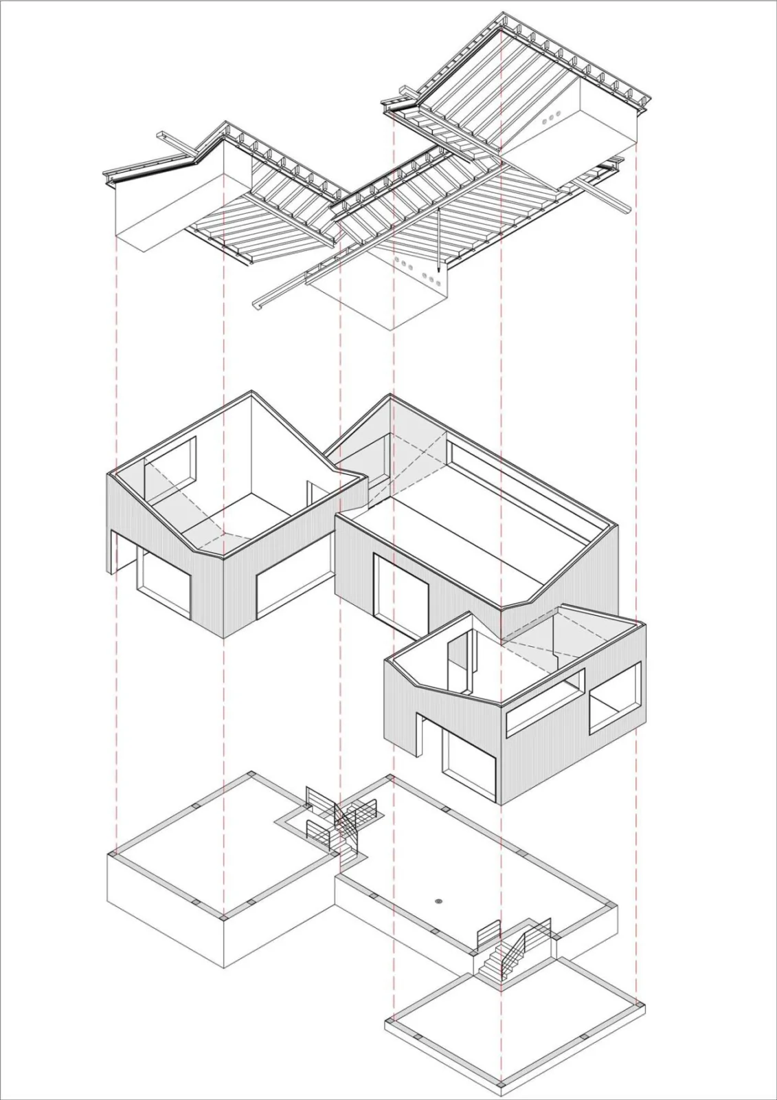
△ Exploded diagram
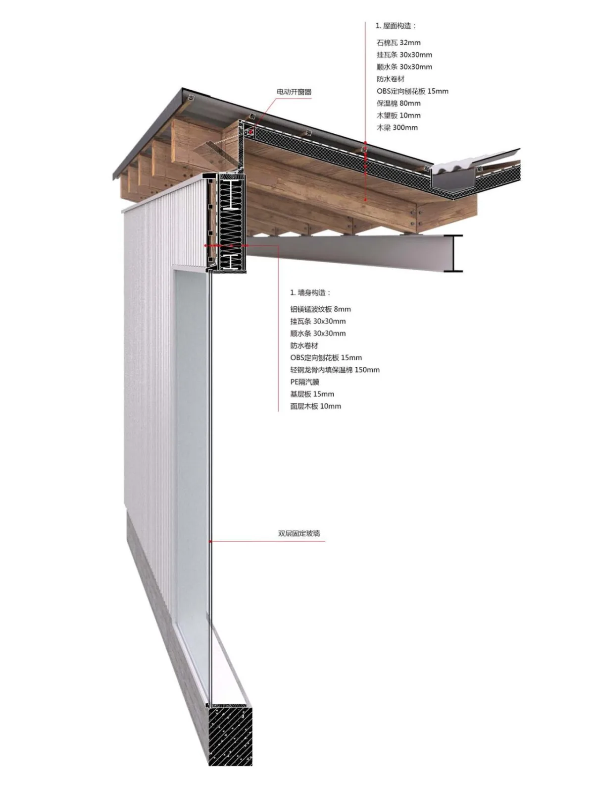
△ Detailed drawing
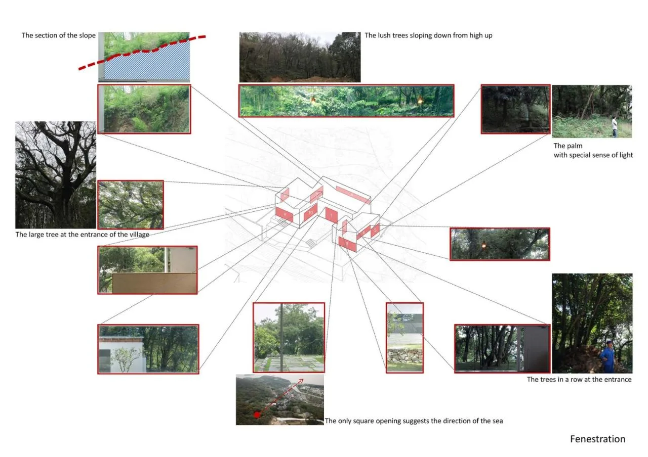
△ Analysis chart
Project Information
Architect: Jiushe Construction Studio
Area: 208 m²
Year: 2020
Photography: Summer Solstice, Sun Haiting
Lead Architects: Fan Jiujiang, Zhai Wenting
Design Team: Fan Jiujiang, Zhai Wenting, Yang Xiaowei, Yu Hongyi, Huang He, Zhang Yingying, Wang Shengtao
Structural Design: Zhou Jinjiang’s Team
MEP Engineers: Hua Yonggang (Water), Li Chunjiao (Electric), Wang Chaowei (HVAC)
Resident Architects: Yu Hongyi, Wang Shengtao
Location: Zhoushan


Must log in before commenting!
Sign Up