SAMO is a premium men’s clothing brand under the Jiangnan Buyi Group. Its design inspiration stems from the ancient Greek concept of the “Palimpsest.” Historically, a palimpsest referred to sheepskin scrolls where original text was scraped off and overwritten, leaving behind layered traces of different writings over time.
△ Building block concept featuring distinct functional zones © Ding Yuhao
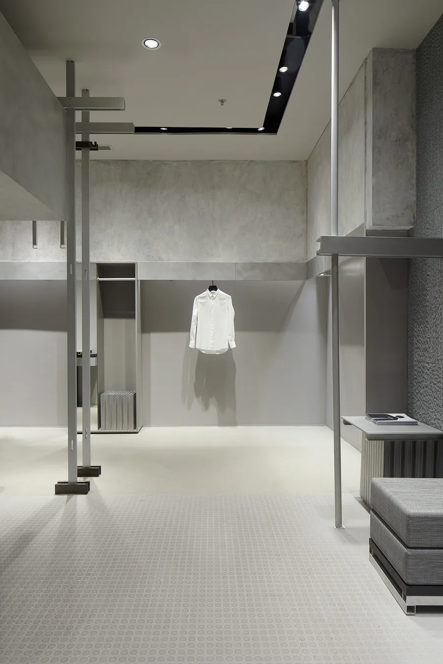
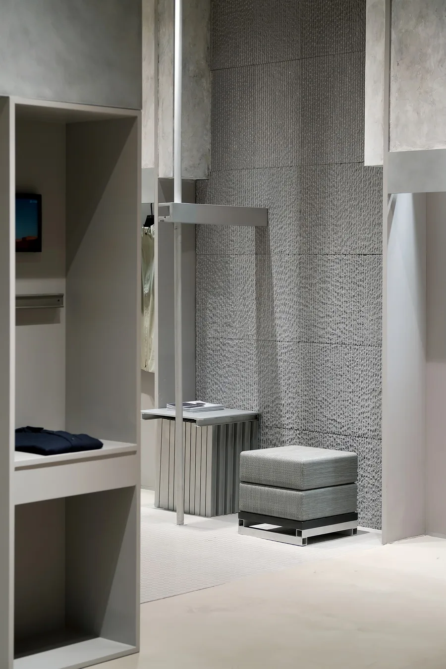
So Studio draws inspiration from the idea of “traces,” aiming to imbue the brand with a sense of time passing. This concept gave rise to several design elements, beginning with the “half-half” and “Old School” themes. The “half-half” concept involves spatial segmentation: the space is divided vertically into two sections within a 2.2-meter height limit. The lower section is recessed for clothing displays, while the upper section features rough artistic paint to convey a sense of texture restoration.
Meanwhile, the “Old School” theme reflects SAMO’s brand attitude—blending contemporary design with postmodern elements.
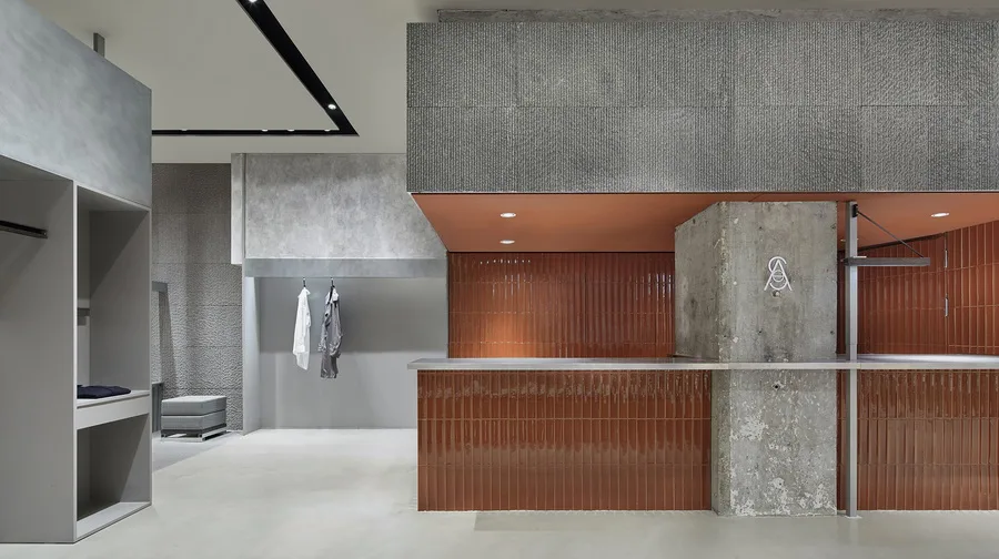
The contrasting use of gray materials with vibrant orange glazed tiles and rough granite © Ding Yuhao
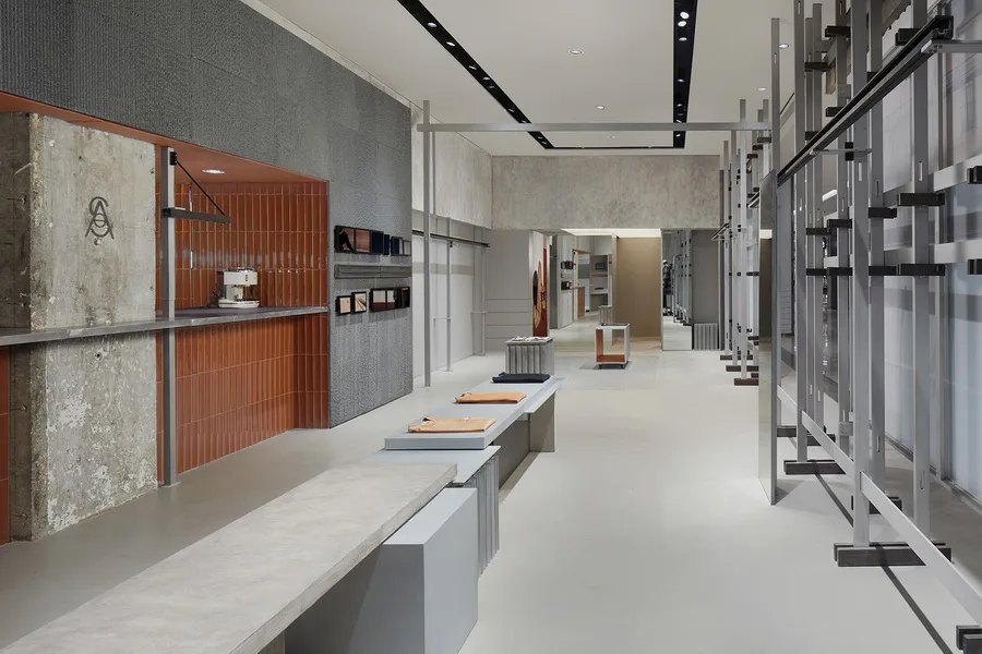
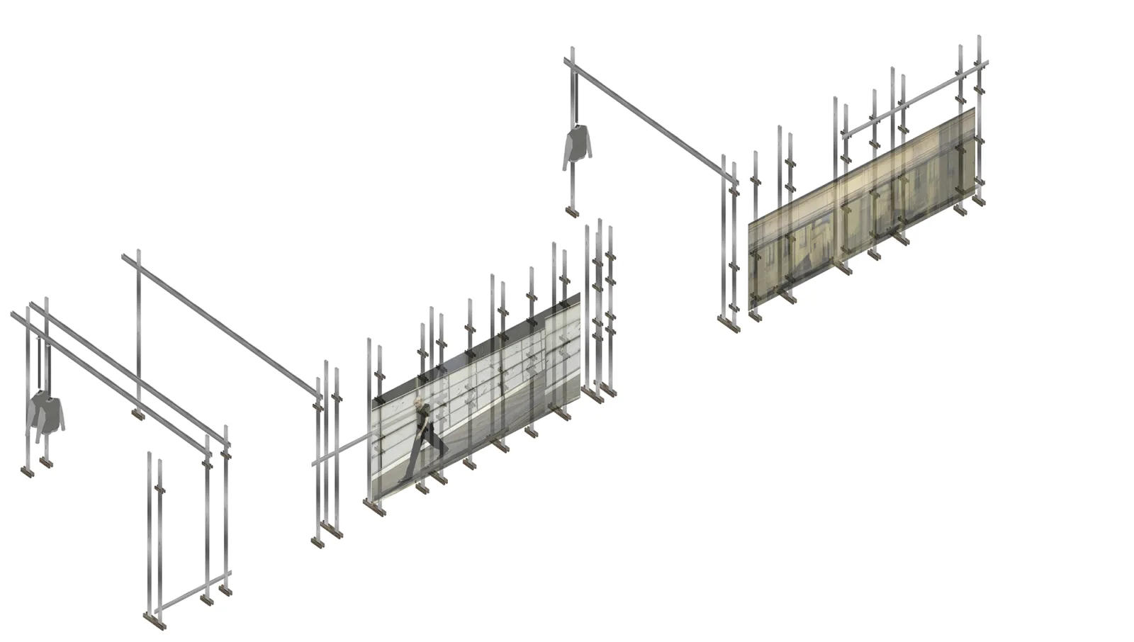
△ Relationship between indoor display system architecture and spatial block composition © Ding Yuhao
The second element is also inspired by the palimpsest concept, illustrated by the work of artist Rachel Whiteread. Known for her large-scale public casting art, Whiteread captures everyday objects through smaller sculptures, allowing their traces to be expressed via alternative mediums. Similarly, this design integrates everyday structures into the space.
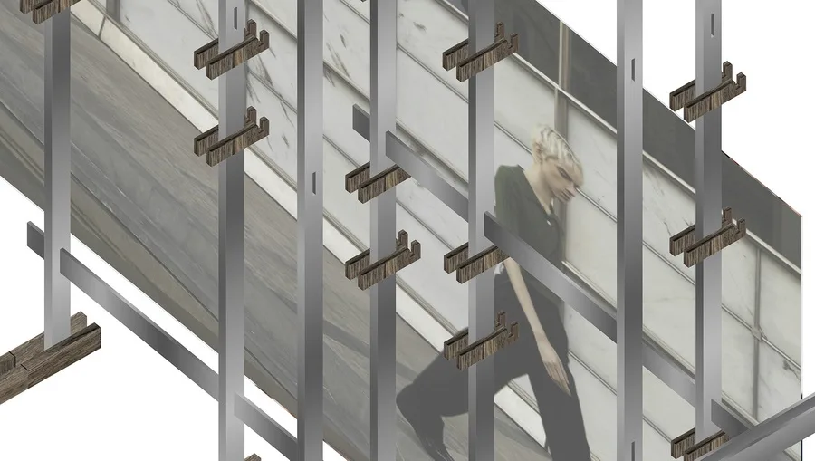
For example, the Nakajima fitting room is crafted by assembling individual cabinets, while some center island props mimic collages of various objects. Additionally, metal components within the space are repeatedly replicated in the shape of the Chinese character “gong,” creating a unique pattern.
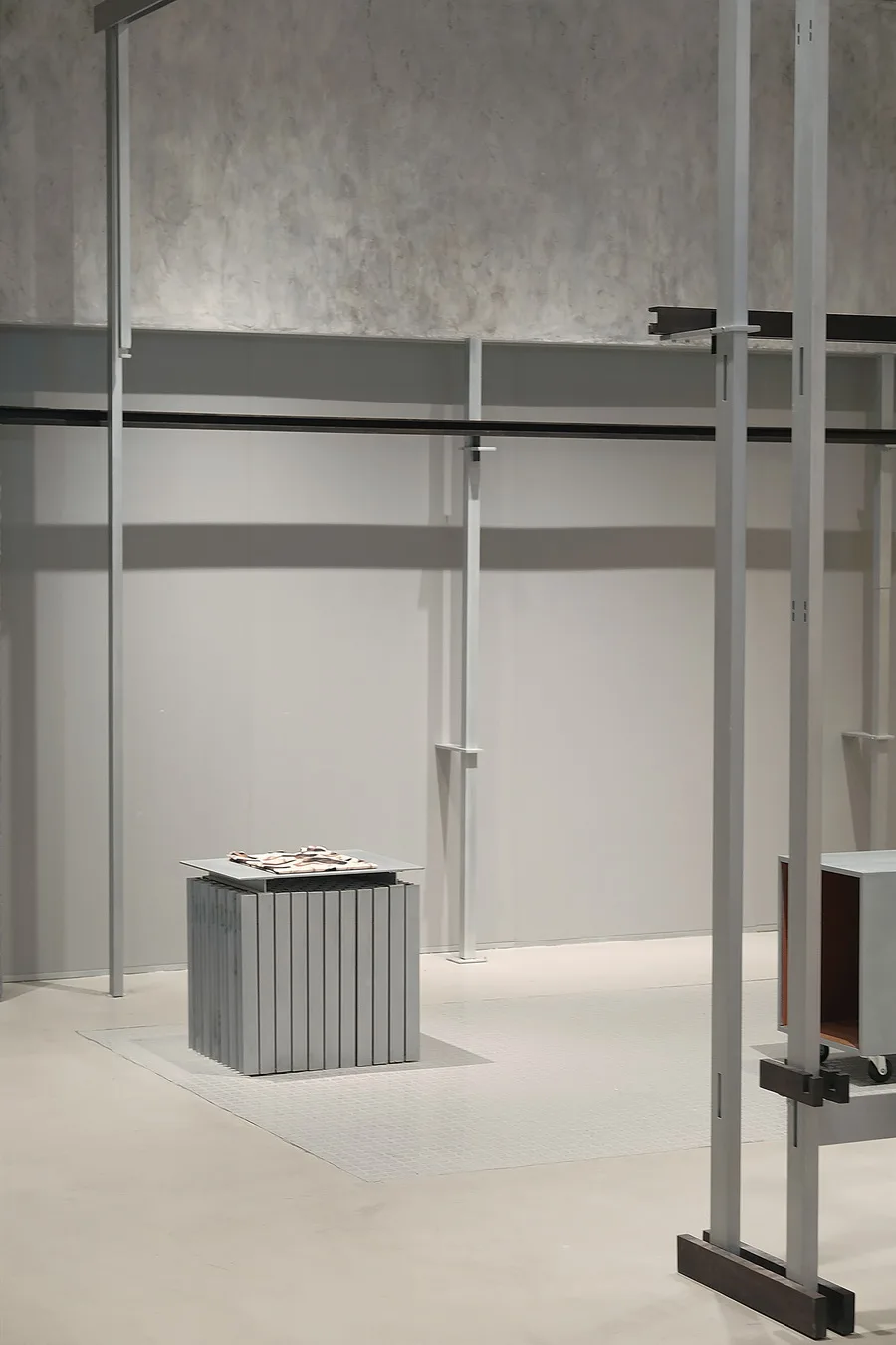
Interior perspective showcasing various prop combinations © Elbe
Another interior view with diverse prop arrangements © Elbe
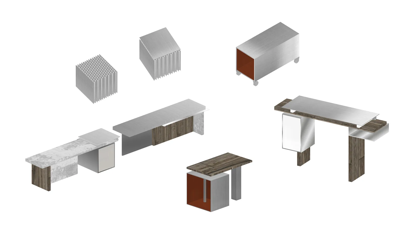
△ Custom furniture pieces © So Studio
The project features two notable material choices. First, a combination of slotted granite stone, vintage orange glazed handmade bricks, contemporary polka dot adhesive, and textured metal aluminum. These materials are spliced, reassembled, and juxtaposed to create distinct spatial qualities.
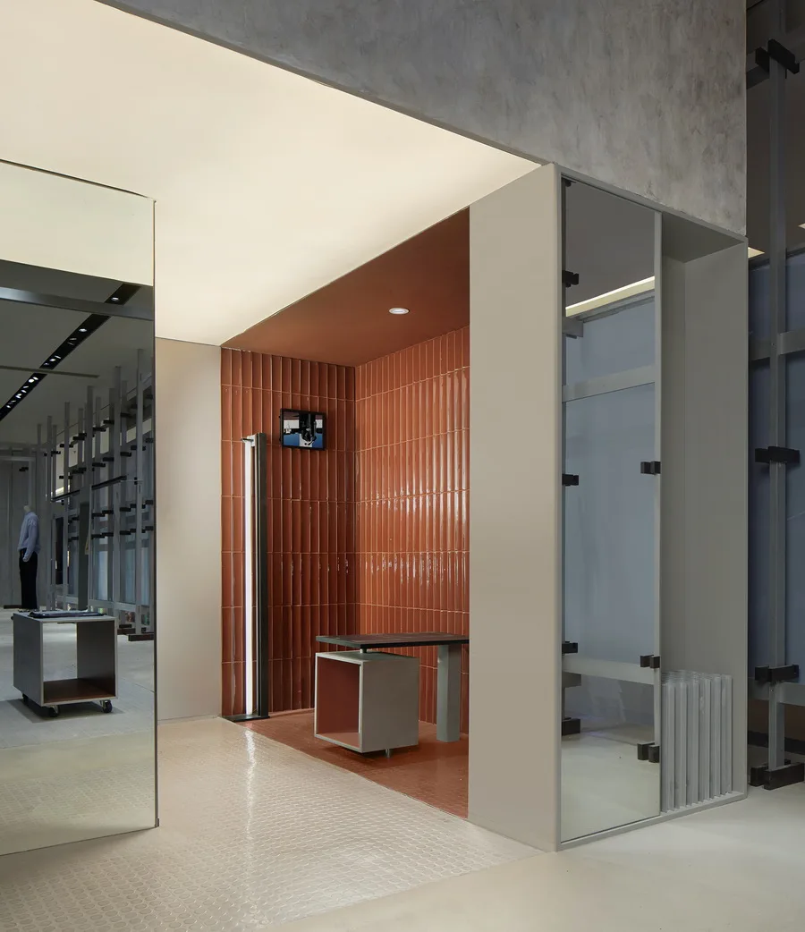
△ Entrance to the fitting room featuring orange glazed tiles © Ding Yuhao
Secondly, the entire facade is designed as an integrated system resembling an unconventional oversized easel or an unfinished architectural frame. This facade framework supports large posters while simultaneously allowing views into the store through structural gaps.
Through this approach, materials and structural spaces are reinterpreted via disassembly and reorganization, offering fresh perspectives on spatial definition and brand identity.
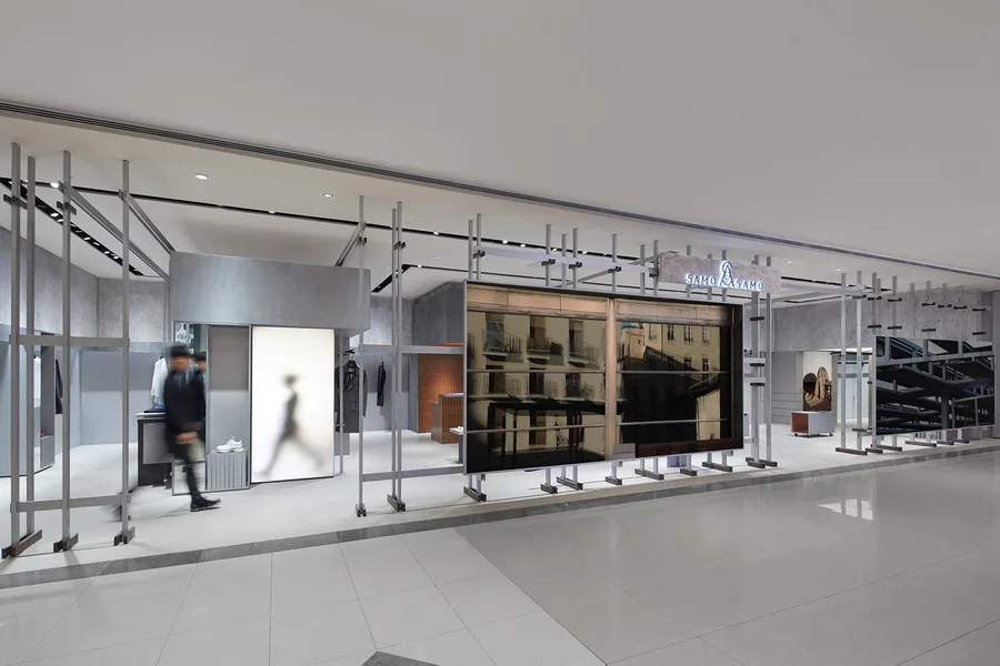
The facade’s easel system allows easy replacement of large brand posters while dividing the entrance into two sections © Ding Yuhao
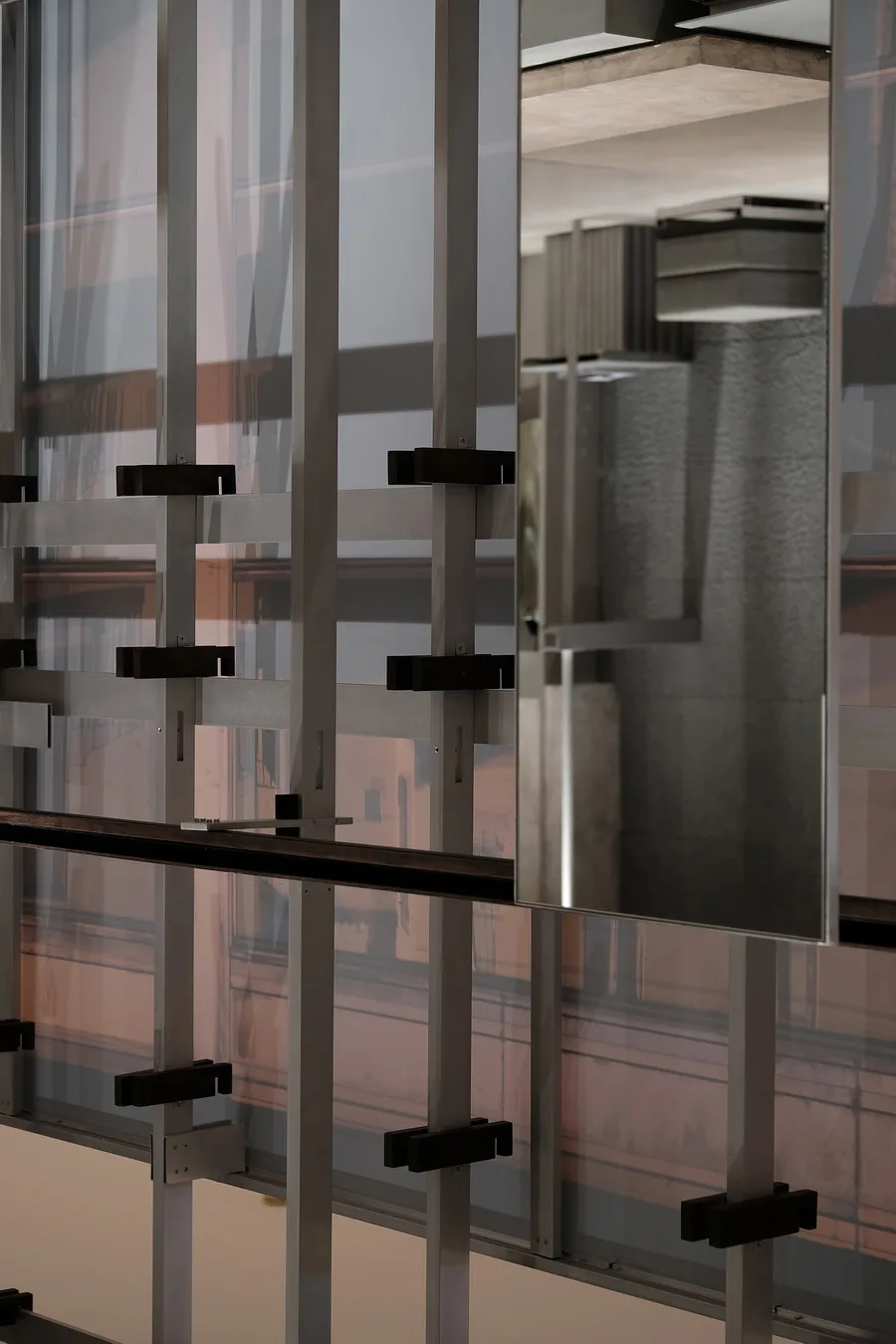
Close-up details of the facade easel system © Elbe
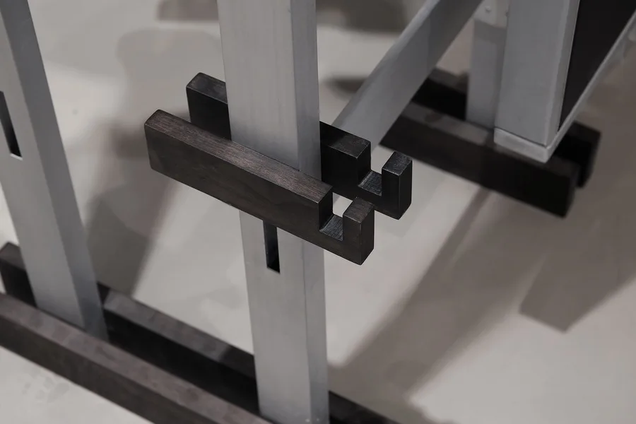
Additional details of the facade easel structure © Elbe
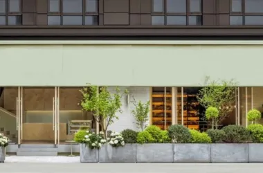
△ Facade overview © So Studio
△ Exterior facade details © So Studio
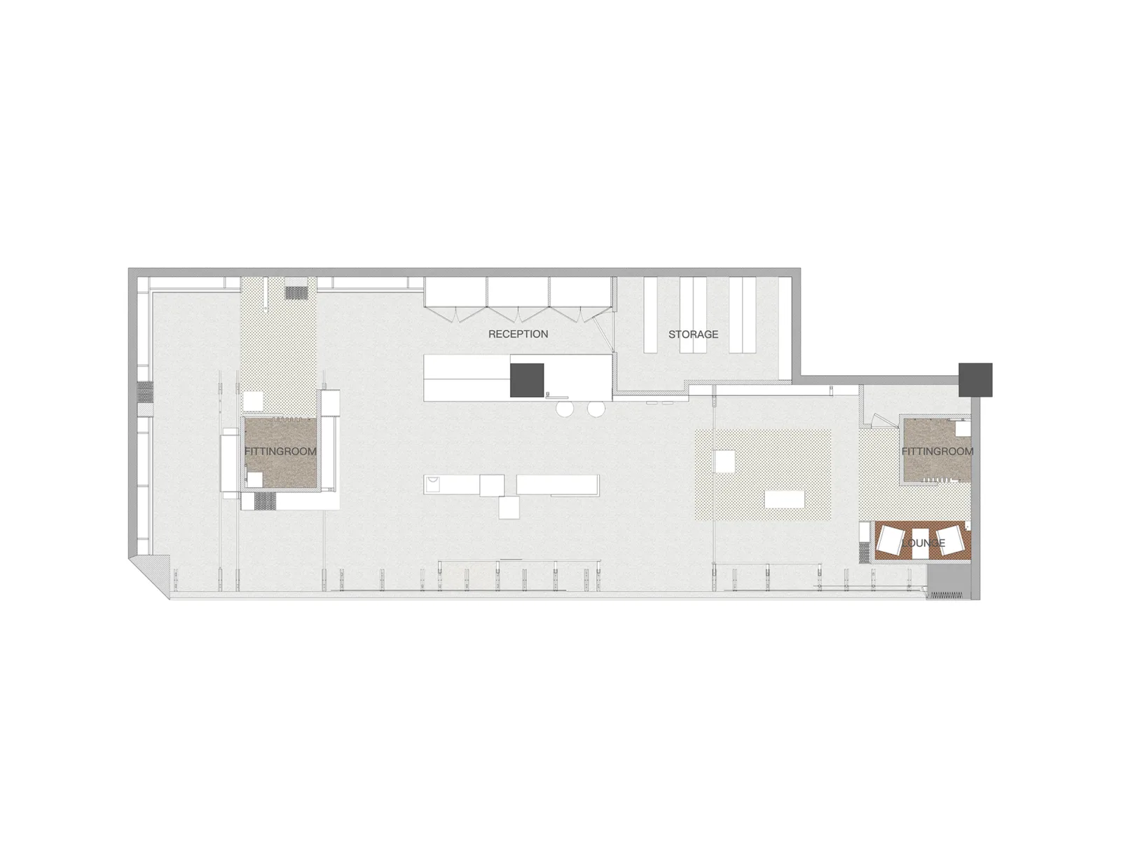
△ Floor plan © So Studio
Project Information
Project Name: SAMO Image Store
Concept: Rewrite
Area: 120 square meters
Location: L1 Tian Street, Beicheng, Guanyin Bridge, Chongqing
Client: Jiangnan Buyi Group
Completion Year: 2019
Design Firm: So Studio
Website: http://sooostudio.com/
Design Team: Liu Mengjie, Wu Yifan, Li Yufei
Image Production: Muyi Production
Photographers: Ding Yuhao, Elbe


Must log in before commenting!
Sign Up