BIM Q&A | Why Does Lumion 6.0 Pro Renderings Look Less “Realistic”?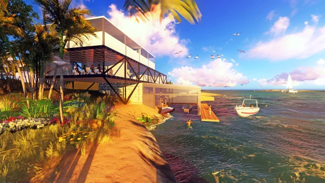
Lumion’s real-time rendering is known for its speed, but the results often lack a truly “realistic” feel. While it aims to replicate photo-quality effects, the materials sometimes appear less transparent and natural. This gives the renderings a distinct animation or video game look. In my experience, the edges of objects tend to feel too sharp or “hard”.
Instead of relying solely on Lumion, I find it more effective to adjust the transparency of plants in Photoshop and layer them to achieve a more artistic and atmospheric effect.
I’m curious—how do Lumion experts create lighter, more natural renders during post-production? Do they rely more on adjusting materials and lighting early on, or on post-editing techniques?
Note: The image above is a test render I created as a Lumion beginner. Setting aside architecture and landscape design, I focused on the overall mood—aiming to capture a sea view at sunset. However, I felt the scene was too crowded and lacked focal points. The sky looked unnaturally blue, the ground appeared stiff and monotonous, and the water seemed heavy. There was little variation between foreground and background elements, which left the composition feeling off, though I couldn’t pinpoint exactly why.
In Photoshop, I only adjusted curves, shadows, and natural saturation without altering the content. How would you recommend improving this either within Lumion or through Photoshop? Thank you!


Must log in before commenting!
Sign Up