
Unlike traditional office buildings designed for a single function, corporate headquarters serve as multifaceted spaces that integrate research and development, corporate image presentation, brand value communication, and foster employee interaction and collaboration. In today’s competitive market economy, an increasing number of large and medium-sized enterprises invest in building their headquarters, turning them into new arenas of soft power competition.
From an architectural perspective, the challenge lies in using design and spatial language to tailor an enterprise’s image and quality, reflecting corporate values throughout all phases—from spatial planning to detailed construction. This has shaped our approach to empowering such projects. — Meng Fanhao
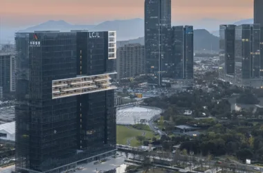
Weixing Intelligent, a high-tech company specializing in smart gas instrument products, went public in 2017. While passing by their first building in Xixi, Hangzhou, the owner contacted us, inspired by the aesthetic form and architectural quality, and commissioned us to design their new headquarters.
Like many non-real estate clients, the owners initially provided only vague ideas for their future headquarters, without specific requirements. As our discussions deepened, it became clear that industrial intelligent manufacturing enterprises seek practicality, economy, and a sense of quality, alongside positioning themselves within rapidly developing internet cities. Keywords such as “practical,” “precise,” and “economic” gradually emerged.
We translated these abstract demands into architectural language: embracing functionalism, abandoning complex exteriors, meticulously refining spatial details, and infusing a sense of contemporary technology. This process shaped a distinctive image for an industrial intelligent manufacturing listed company.
The client entrusted us with considerable design freedom, without external constraints. After four years of integrated teamwork across architecture, interior, landscape, curtain wall, structure, and mechanical and electrical engineering, the Weixing Intelligent Headquarters was successfully realized.
#01 Volume Strategy: Separation
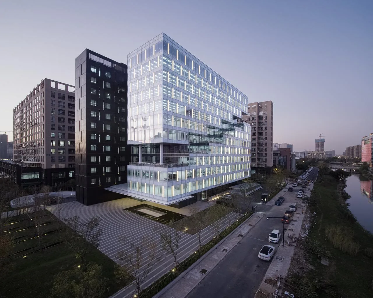
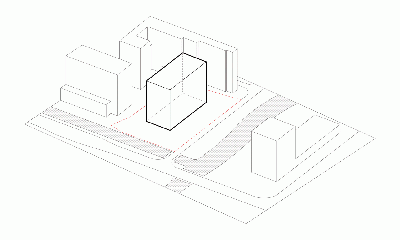
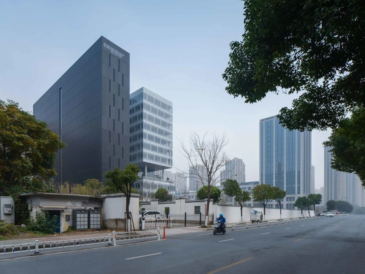
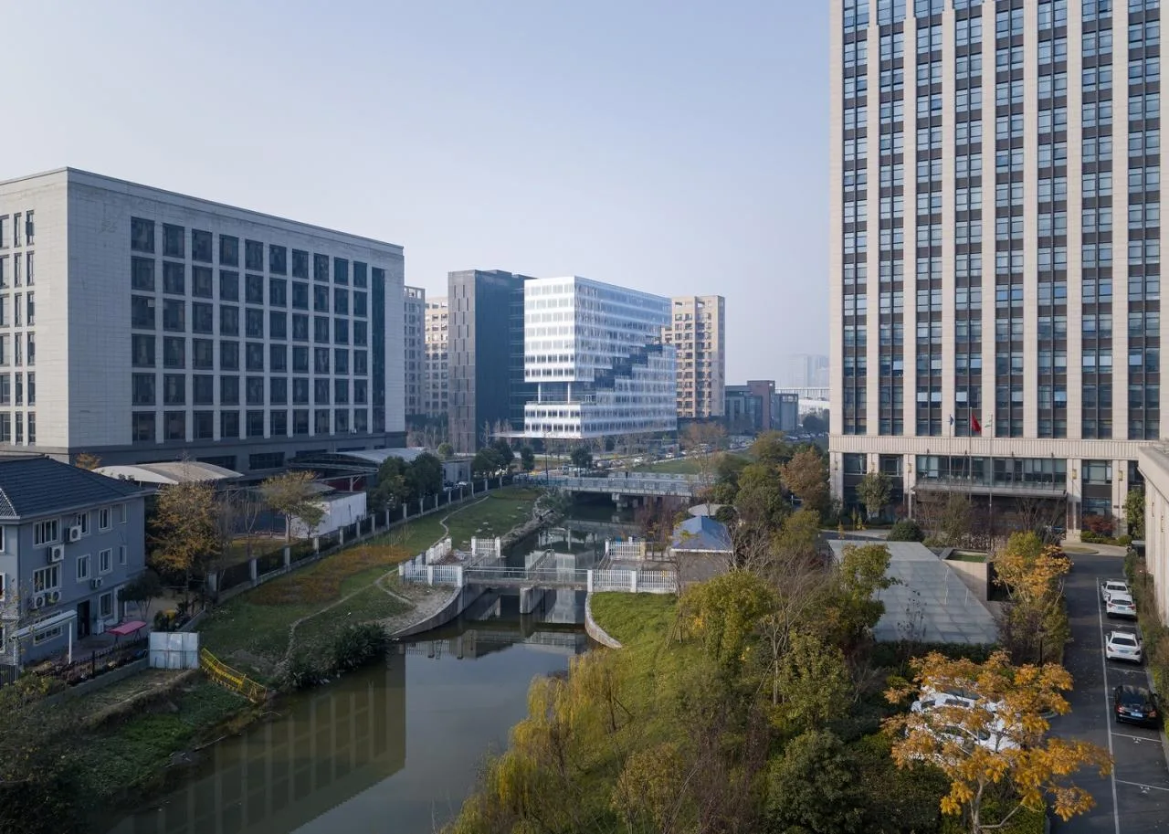
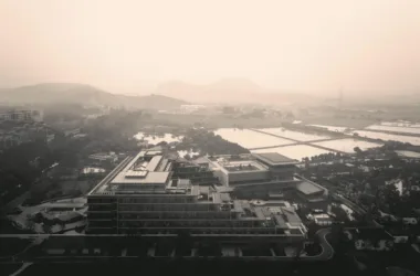
The site is located in the former Hangzhou Shangcheng Industrial Park, established in 1993, which houses many high-tech companies including Weixing Intelligent. The plot is 8,599 square meters with a floor area ratio of 2.5, a density of 30%, a height limit of 50 meters, and a rectangular shape approximately twice as long as it is wide, oriented east-west. The surroundings are a complex mix of industrial plants, offices, natural landscapes, and urban life.
The west and north sides face pressure from high-rise buildings, creating cramped spaces. The south side borders an urban branch road and serves as the main pedestrian flow direction. To the east lies an open interface facing canal tributaries. These distinct site characteristics informed our design approach, seeking strategies that respond to and transform the site’s features into architectural qualities.
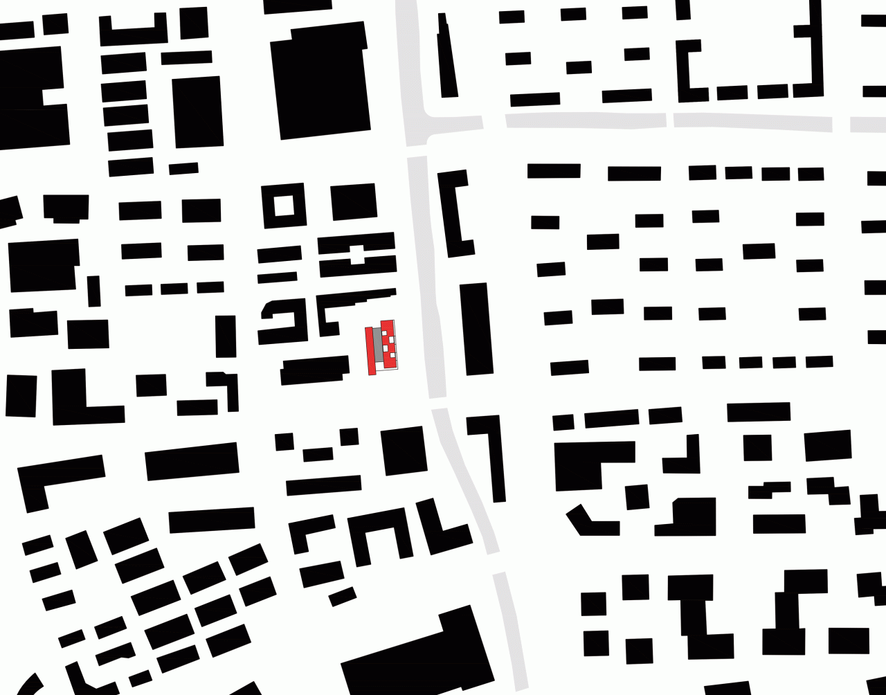
△ Location Map
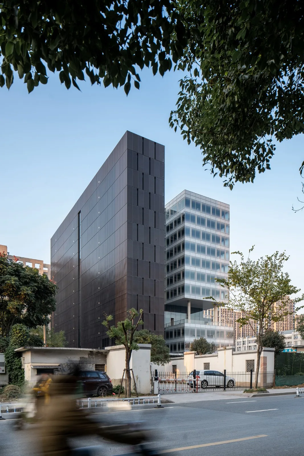
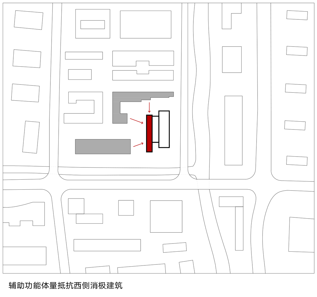
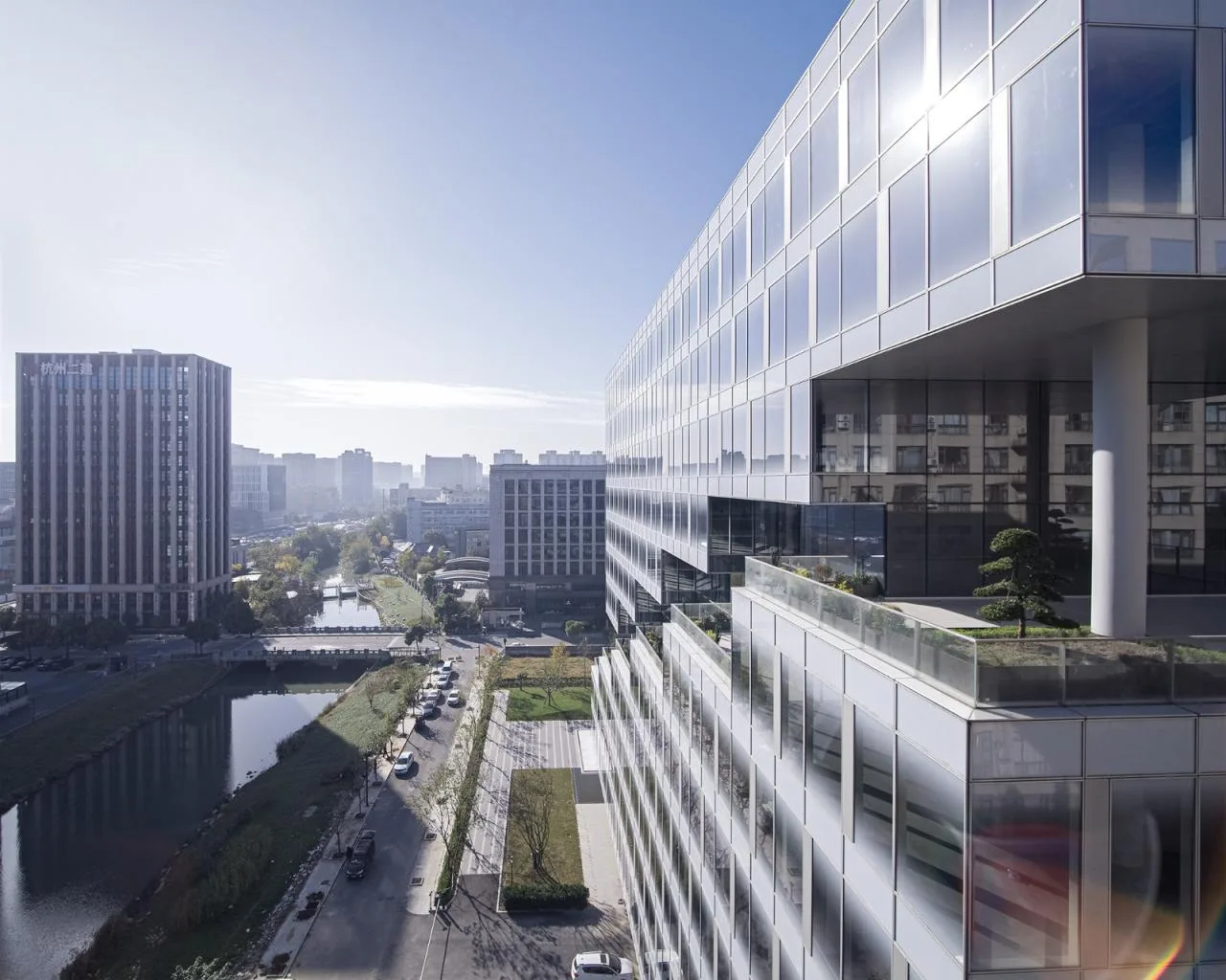
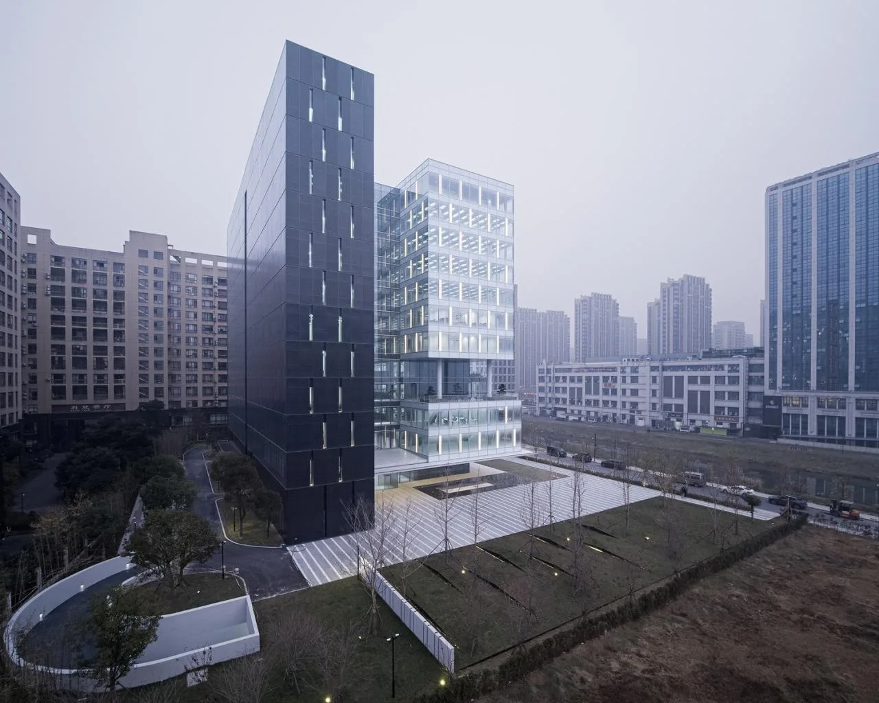
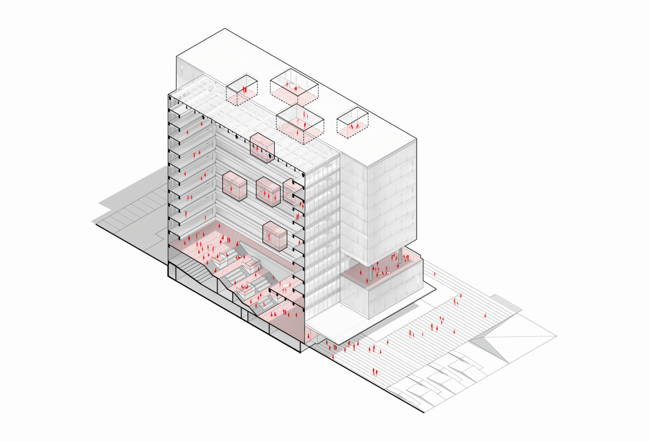
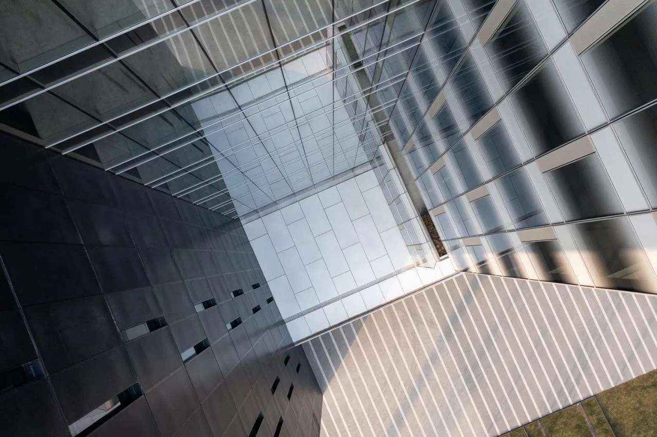
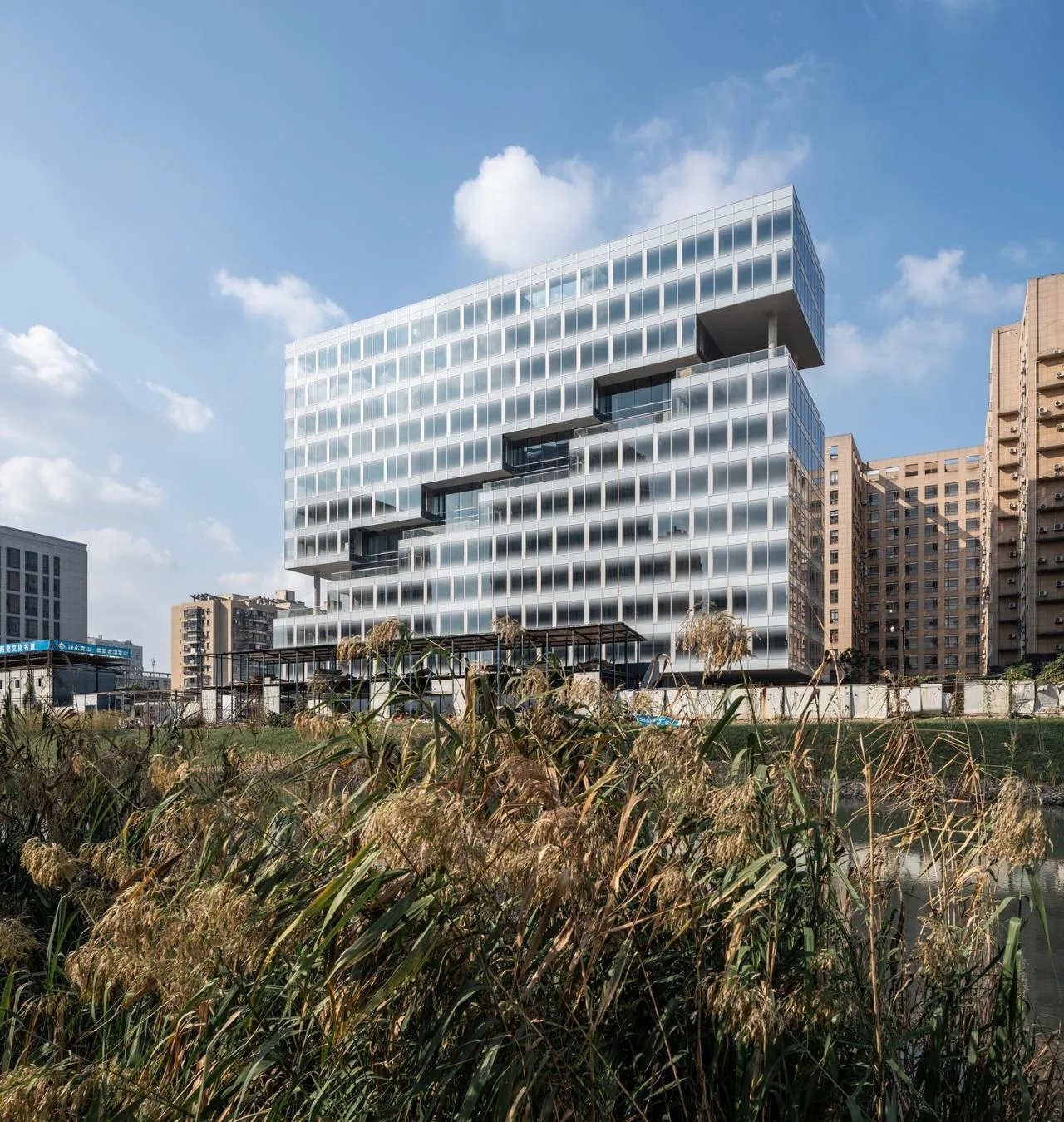
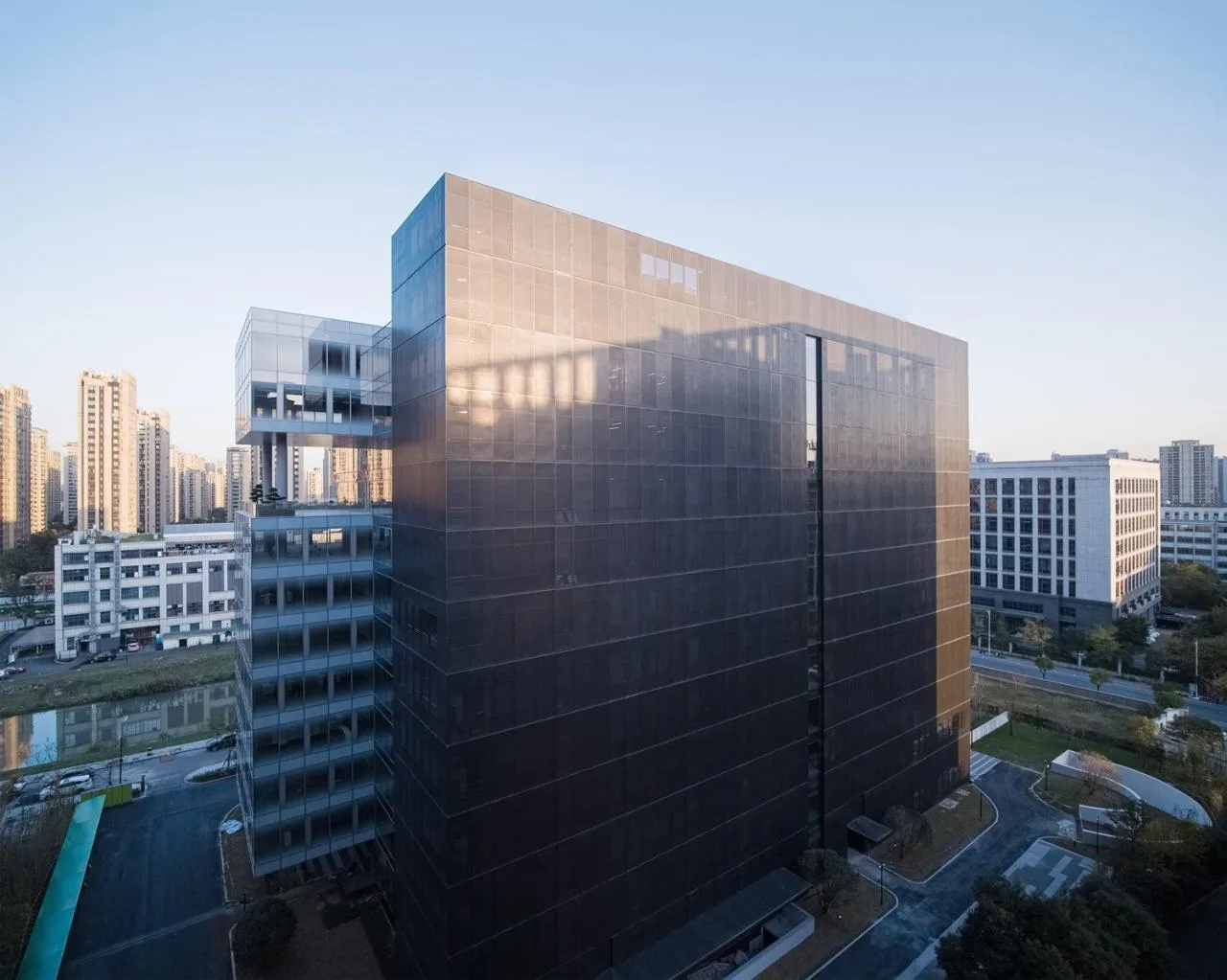
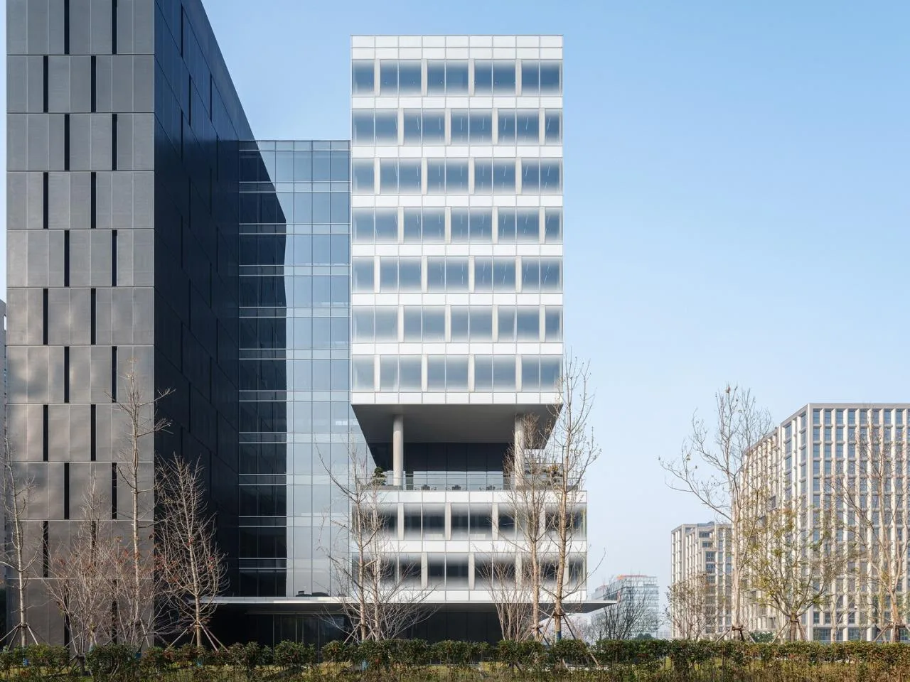
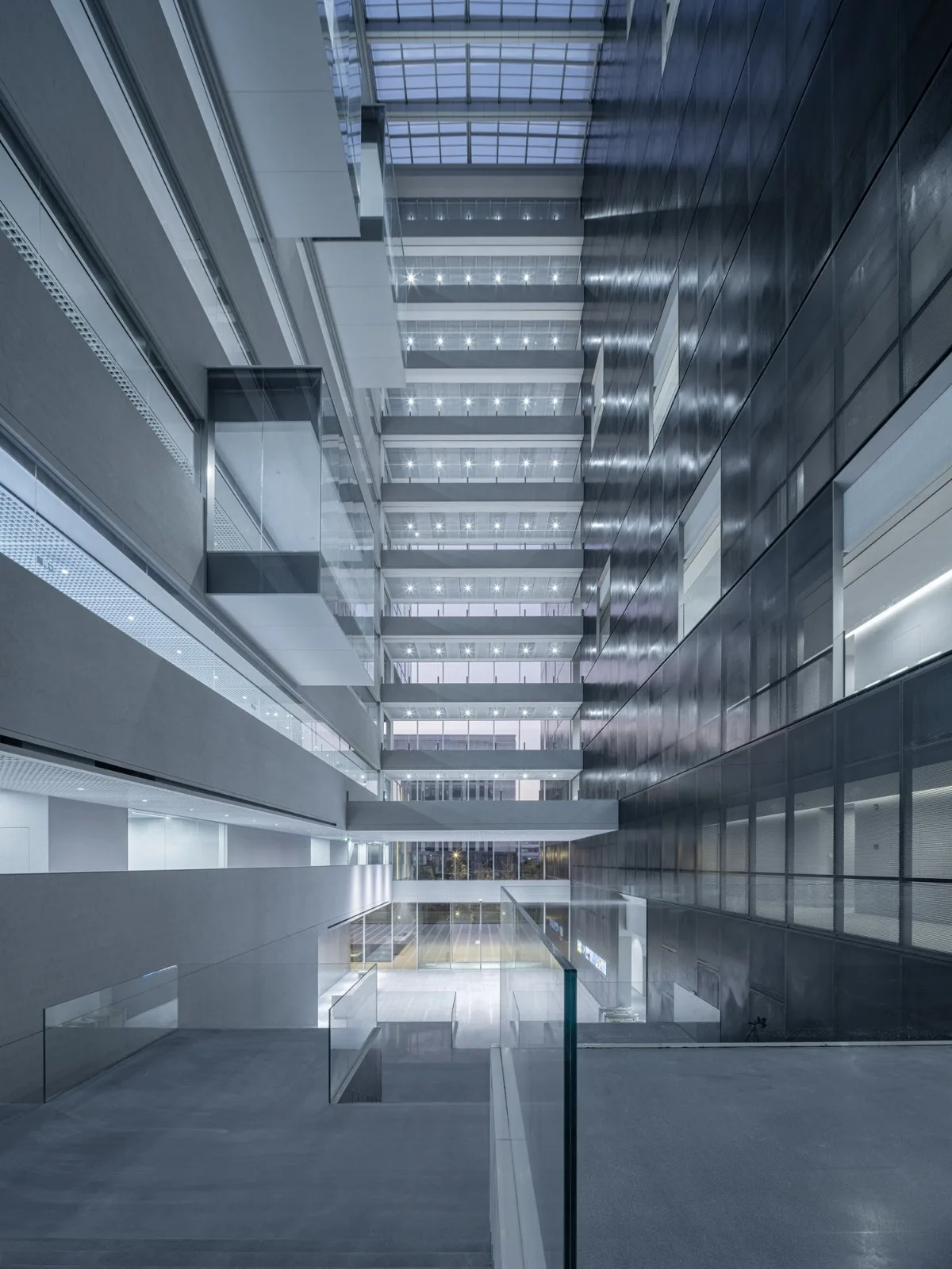
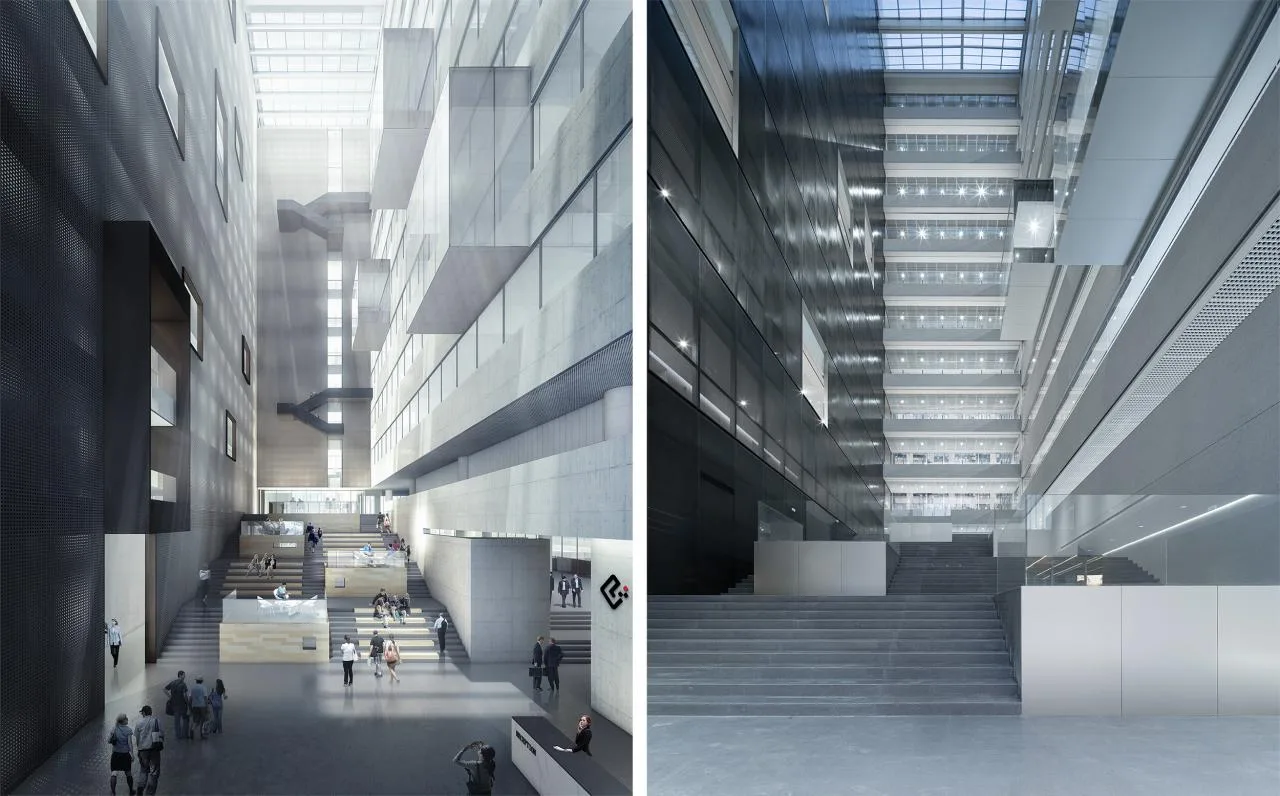
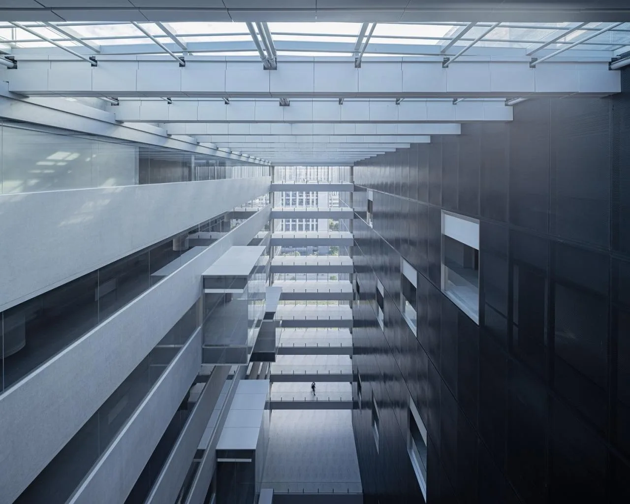
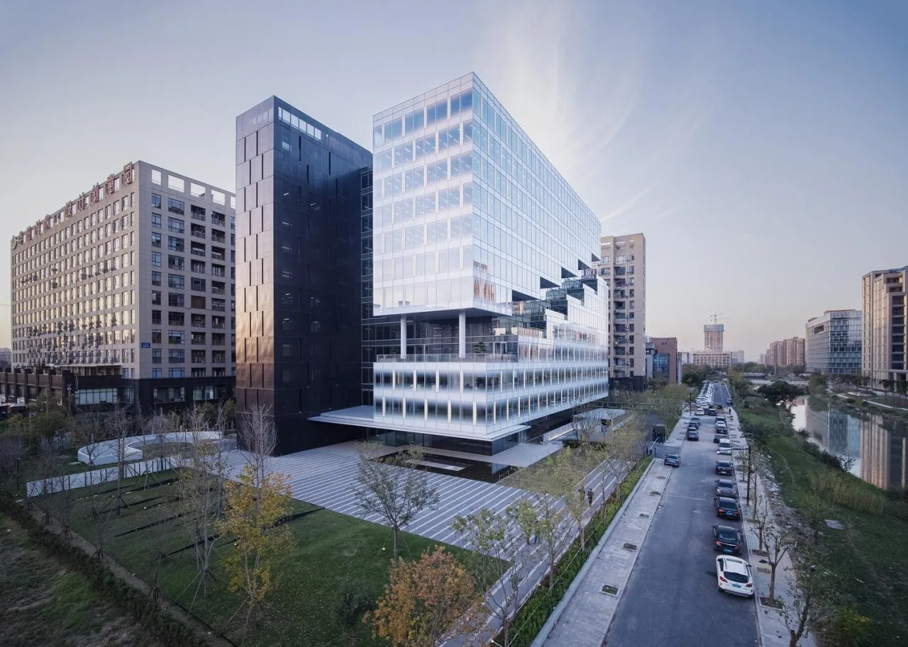
We adopted a “separation of traffic cores” spatial layout strategy to directly address the site conditions. Auxiliary functions such as vertical circulation, restrooms, and equipment rooms were consolidated into a dedicated service volume on the west side—an inward-facing “black box” mitigating adverse site conditions. The office volume opens eastward towards the landscape as an outward-facing “white box.” A 50-meter-tall shared atrium connects and separates these volumes, featuring a transparent interface engaging with the city.
△ Form Generation Diagram
△ Conceptual Model
This form establishes an isomorphic relationship between “site, volume, and function,” embedding functionalist architectural space within the site context. This relationship underpins the volume strategy’s rationale and facilitates a clear, concise, and orderly layout, setting the headquarters building’s tone.
△ Floor Plan Analysis
#02 Formal Strategy: Abstraction
Building on the isomorphic relationship of “site, volume, and function,” we further developed the building’s external form, interior space, and skin texture to express the enterprise’s unique character through abstract formal language—a key step to resonate with the client during design.
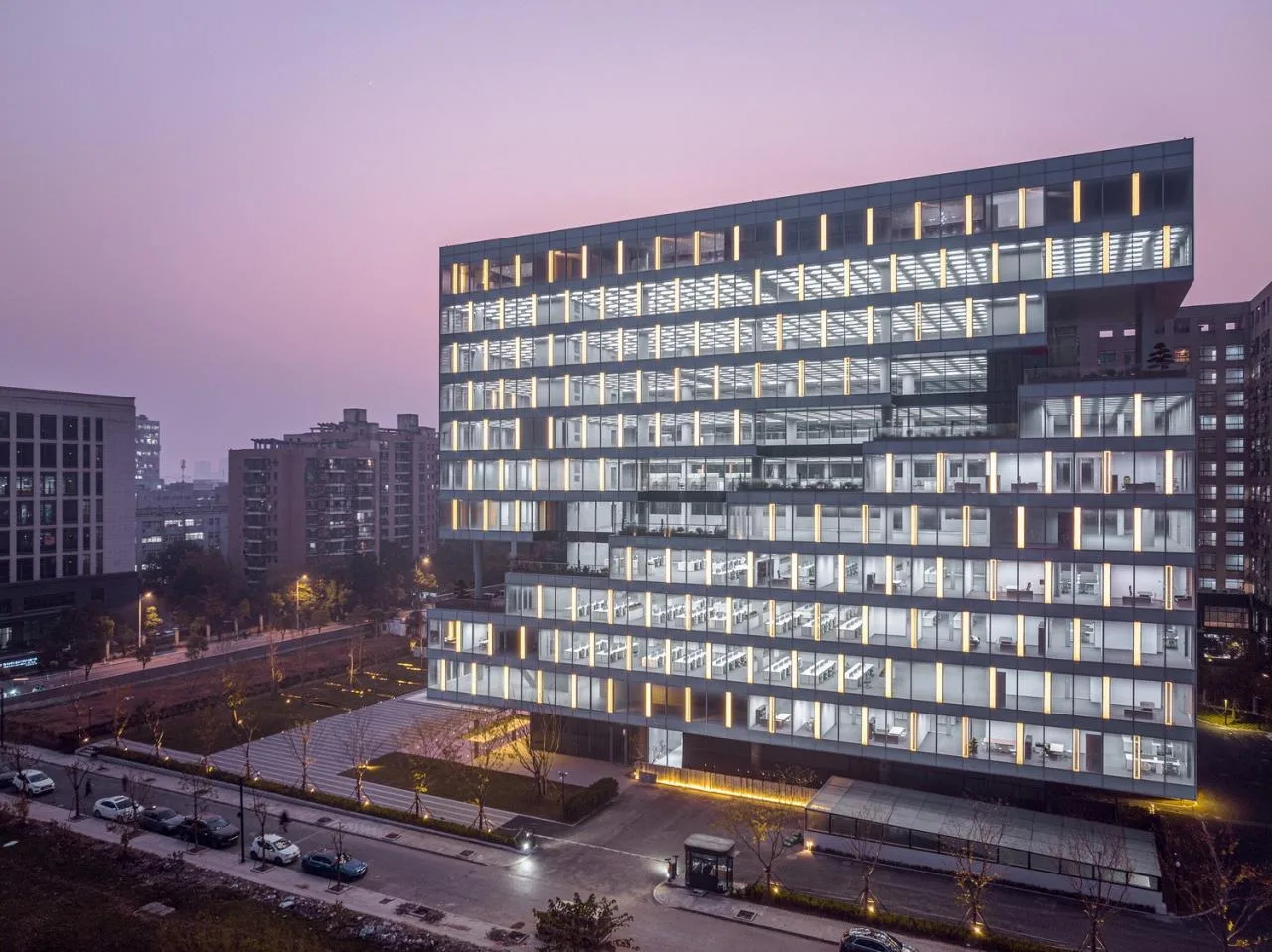
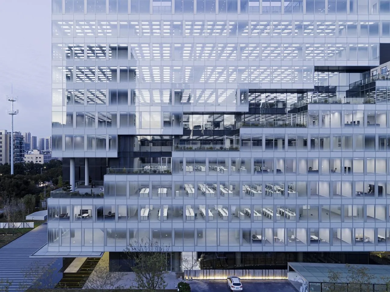
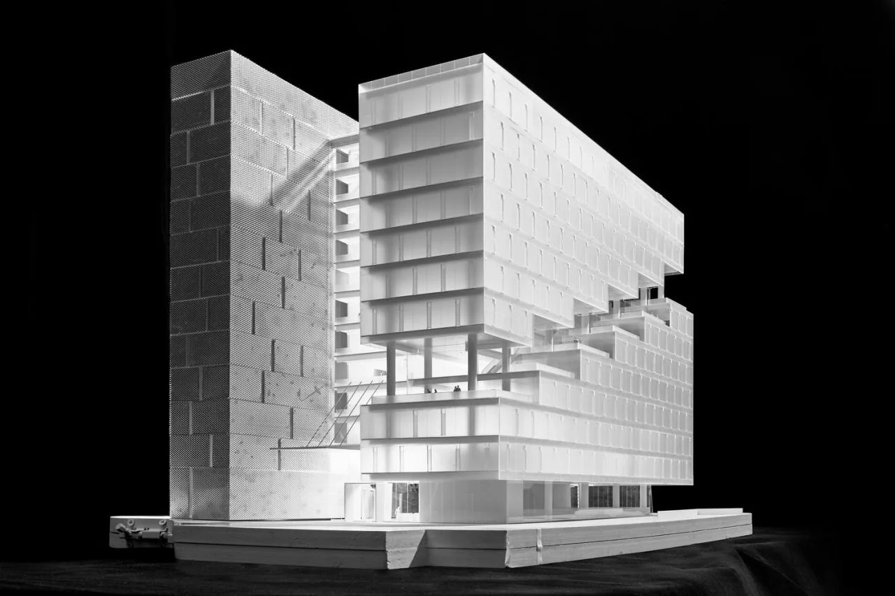
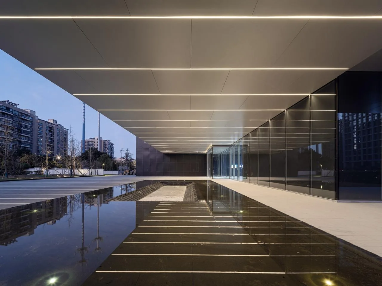
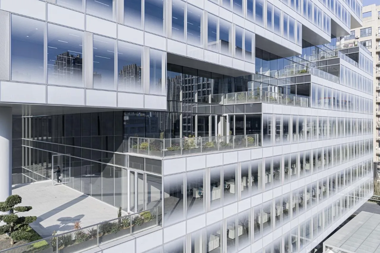
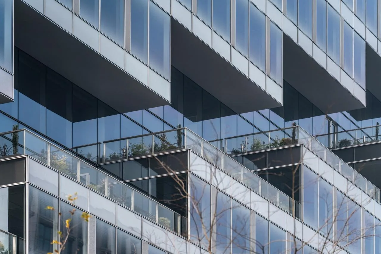
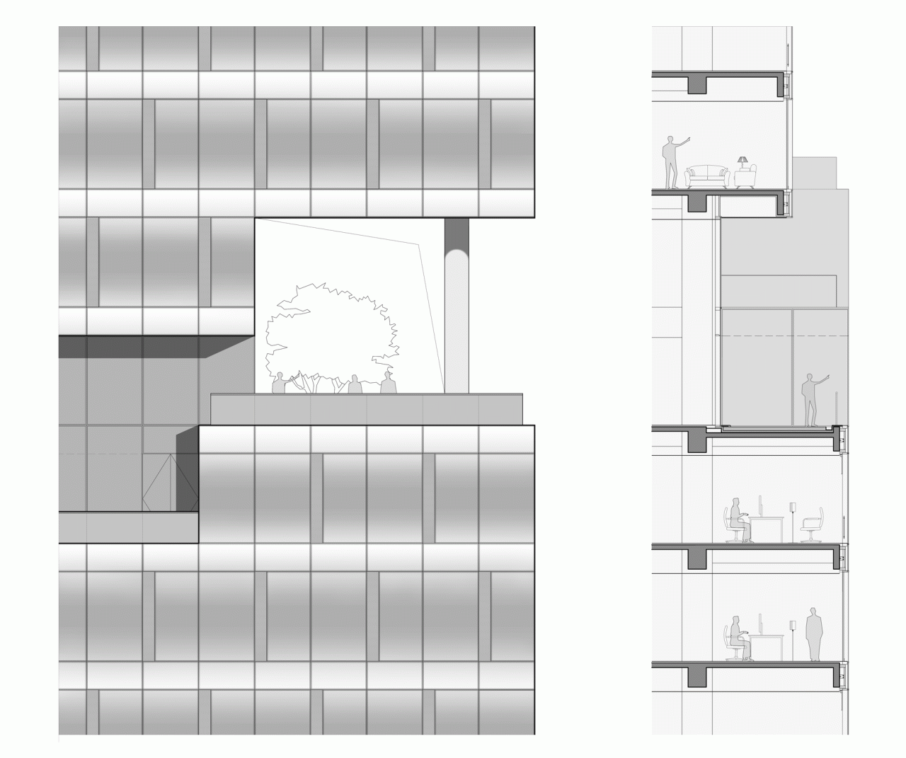
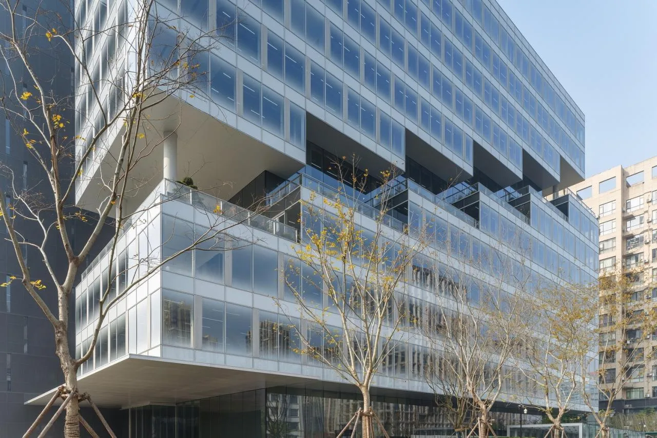
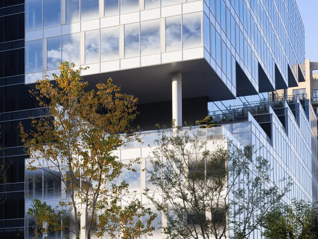
The east office volume’s panoramic views and high spatial flexibility are showcased by elevating the rectangular office volume to the second floor and creating overhangs on the south, east, and north sides of the first floor. This design opens a large, unobstructed public space at ground level, enhancing openness.
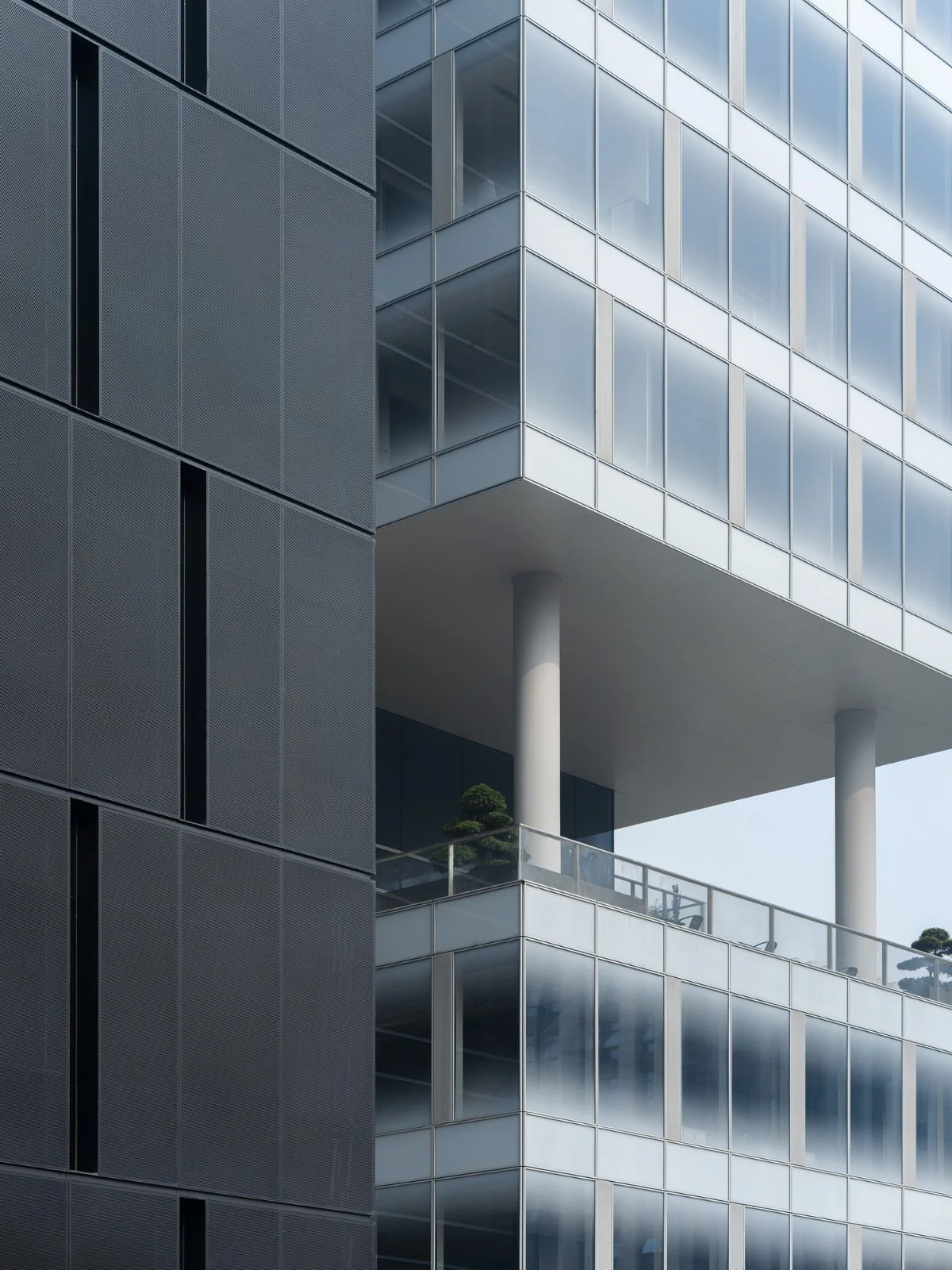
Due to height restrictions, the east facade’s 4:3 proportion and rectangular plan were deemed too rigid and monotonous. To address this, a continuous serrated cantilever platform spans floors 4 through 10, breaking vertical monotony and creating an aerial extension for communication and spatial expansion.
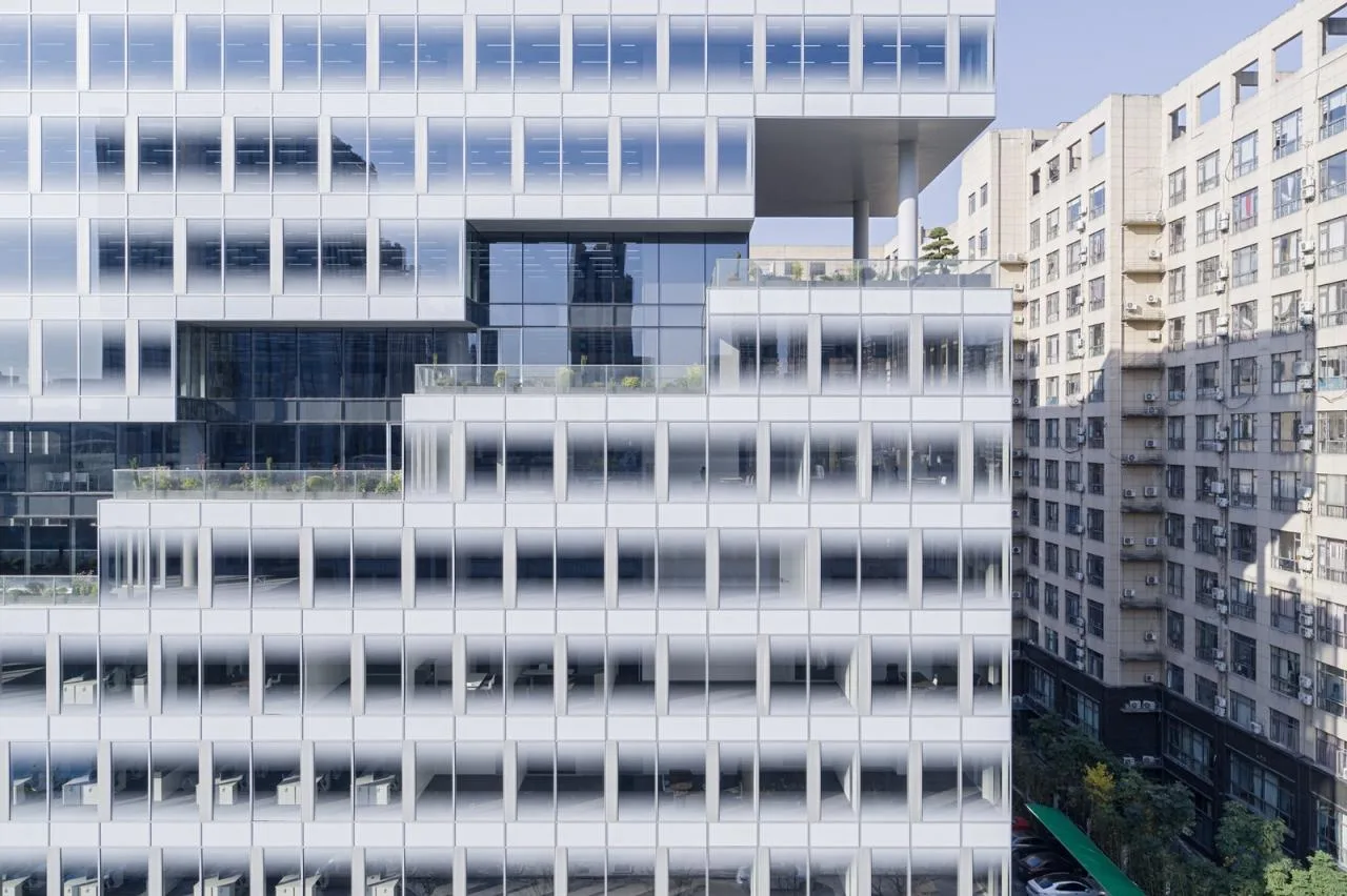
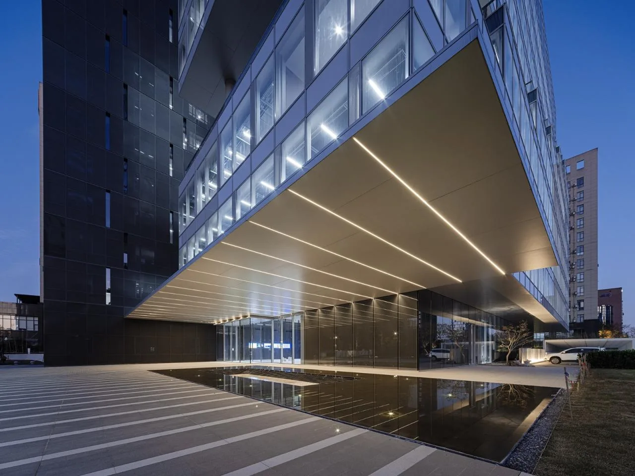
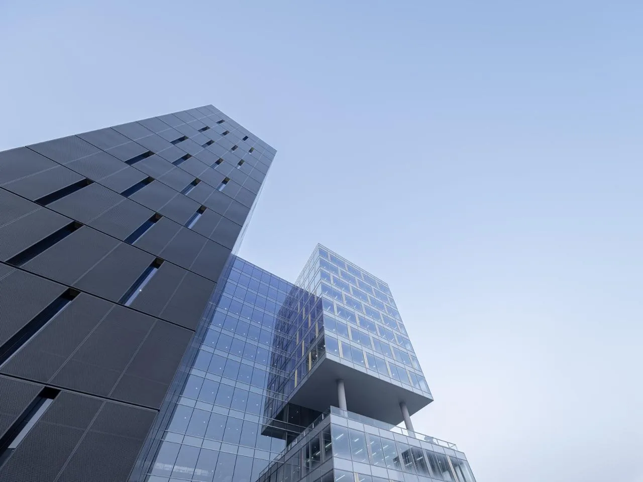
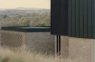
The auxiliary volume on the west side is shifted southwards and elevated above the east office volume, enclosing the ground floor entrance plaza. Wrapped in dark perforated metal panels, this introverted form counters the unfavorable western environment while creating dynamic visual tension between volumes.
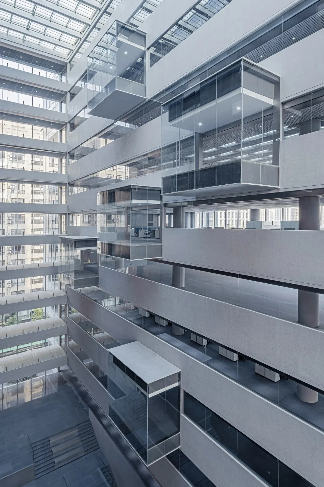
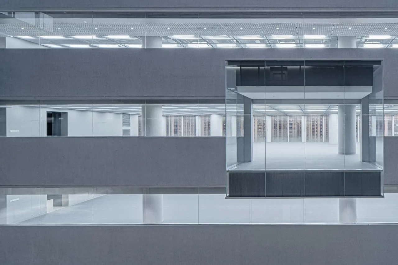
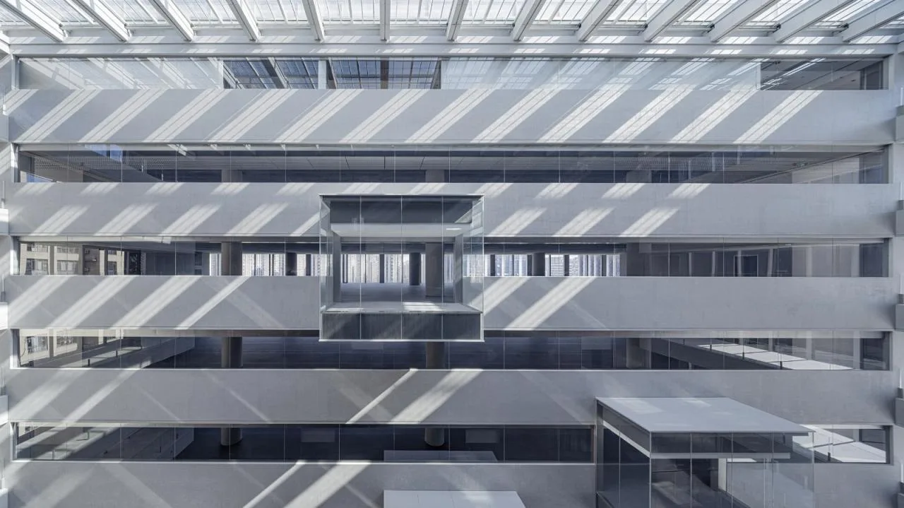
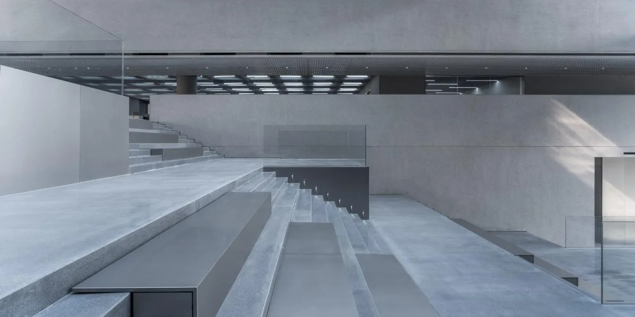
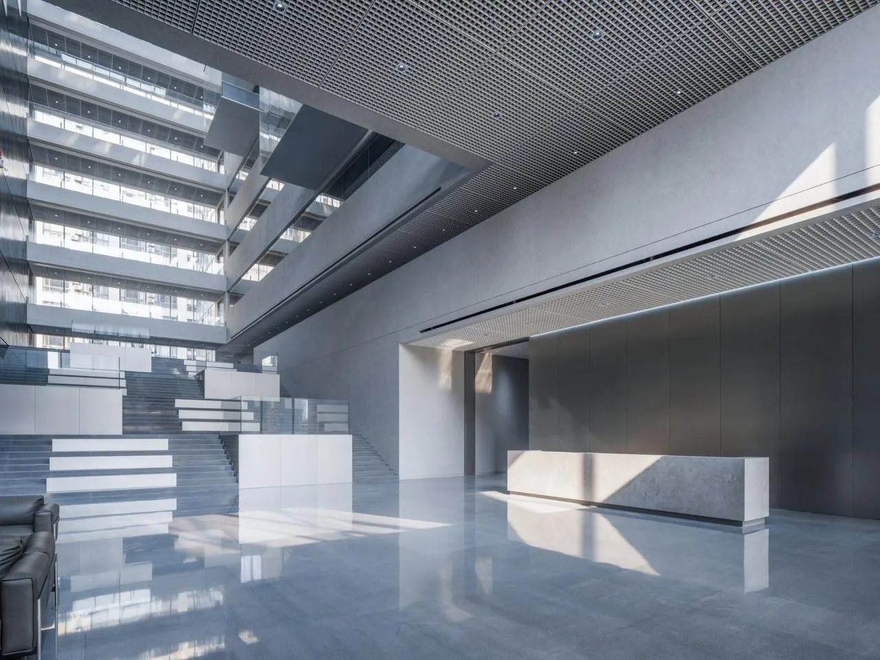
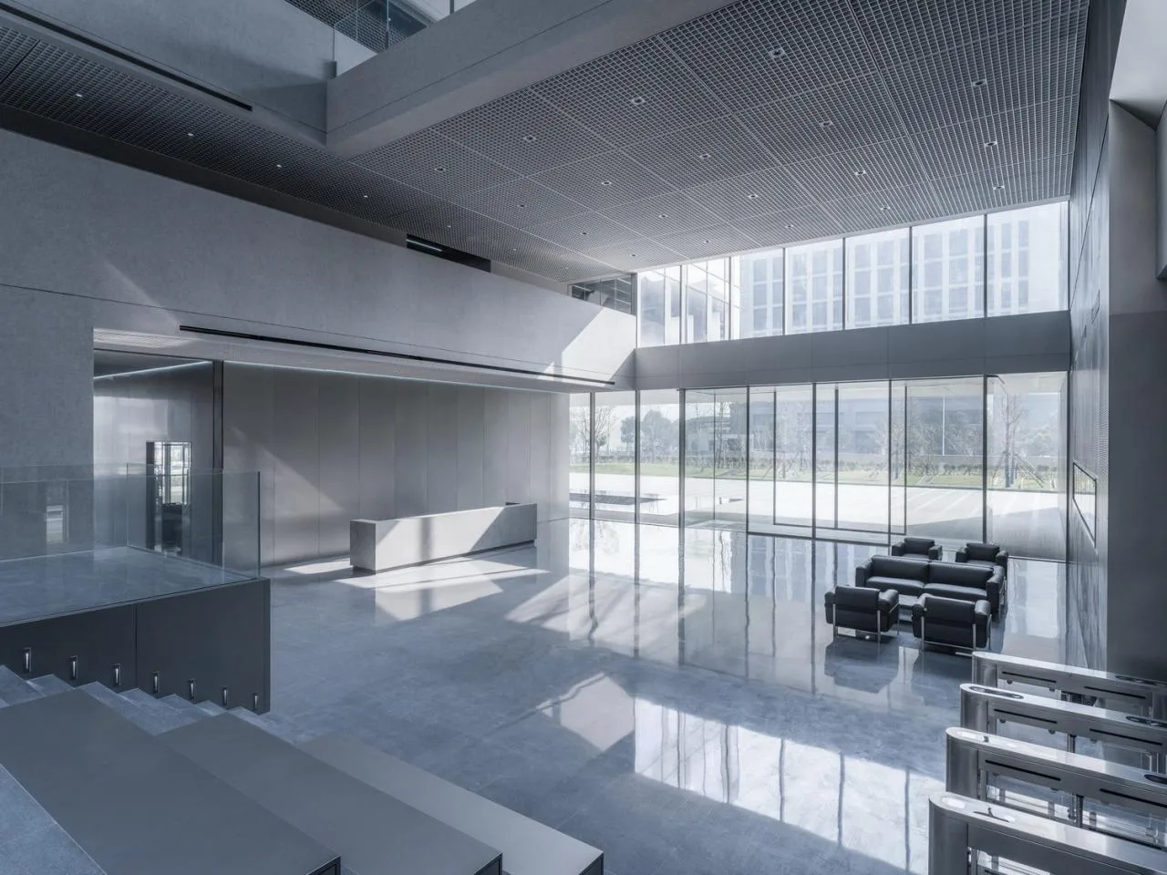
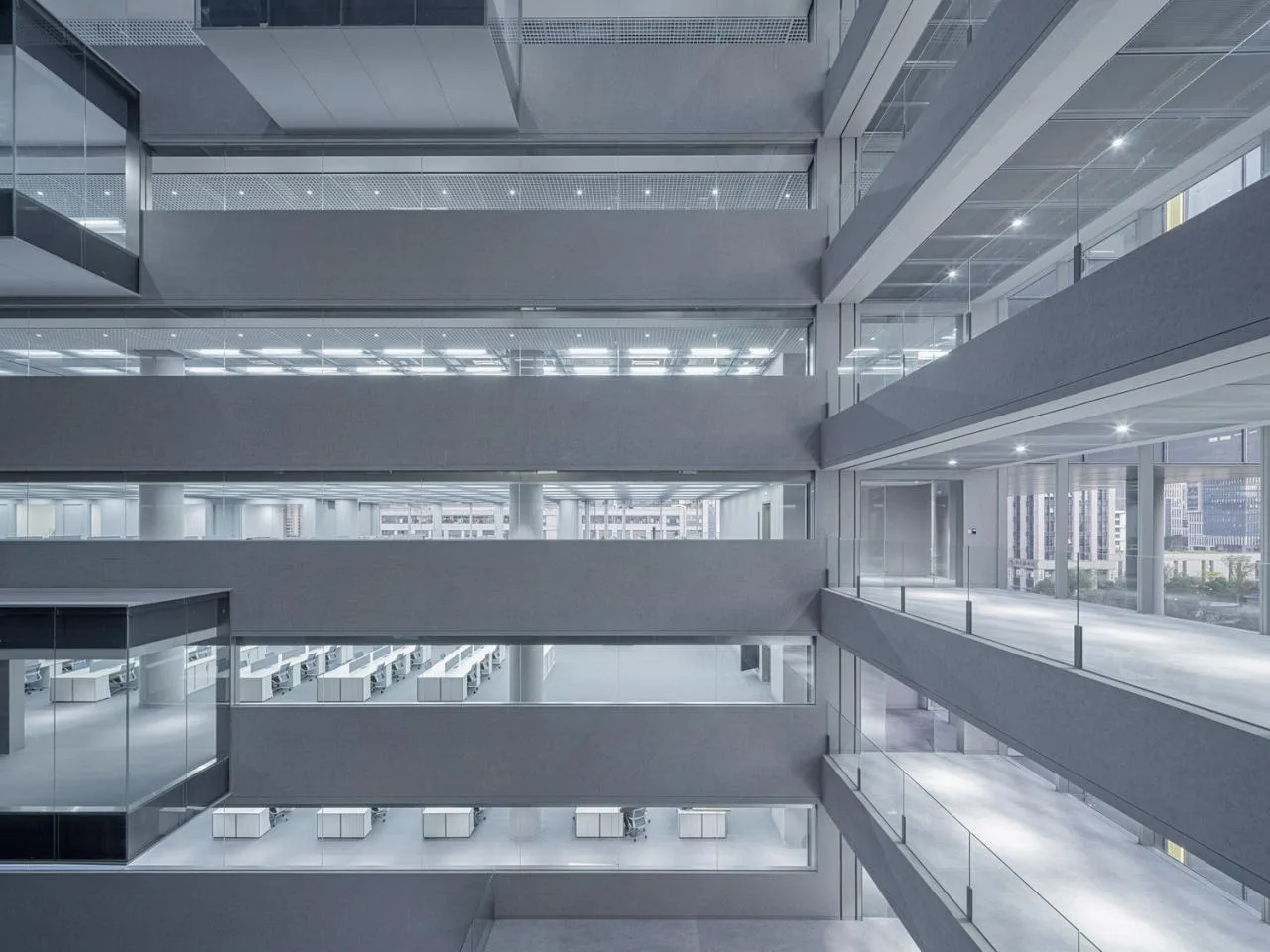
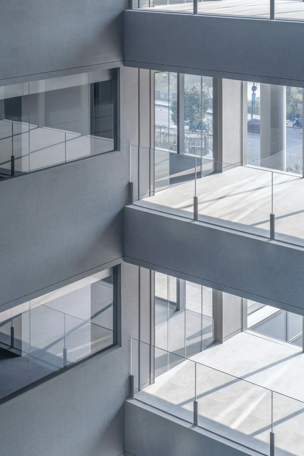
The 50-meter-high atrium introduces vertical daylight, fostering dialogue between the east and west volumes and blurring indoor and outdoor boundaries. Glass boxes for meetings and negotiations on each floor add multidimensional layers to the internal space.
Analysis of Atrium
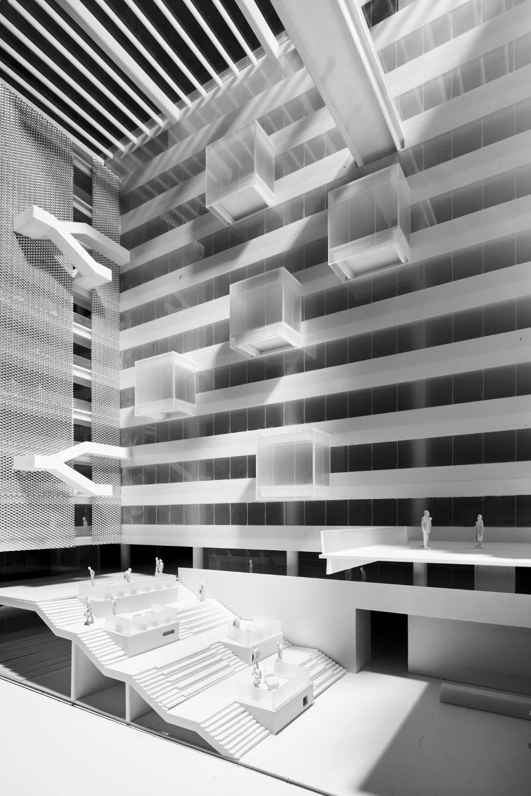
△ Conceptual Model
At the atrium’s base, the first-floor exhibition hall connects to the second-floor staff lounge via continuous steps, creating a versatile space for corporate exhibitions and employee interaction. A large stepped lecture hall is also integrated at the bottom.
By assigning forms to spatial volumes, we balanced pragmatism—optimizing building functions—with formal differentiation among volumes. This clarified architectural logic and strengthened the connection between building character and corporate identity.
#03 Construction Strategy: Collaborative Integration
“We prefer architects to use the term ‘construction,’ as the finest architecture comes from the ‘art of construction.’” — Mies van der Rohe
With years of practical experience, we regard construction as a core focus. We believe abstract formal language gains true meaning only through careful attention to materials and details.
3.1 Integration of Structure and MEP Coordination
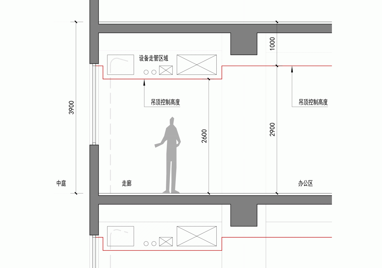
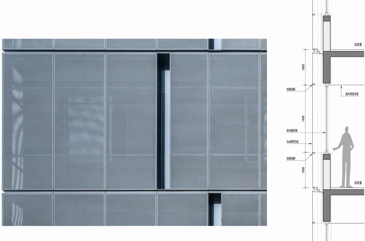
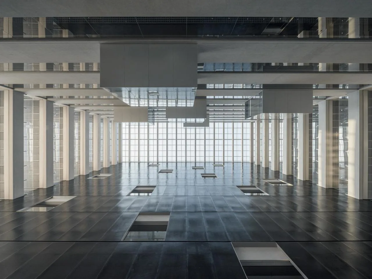
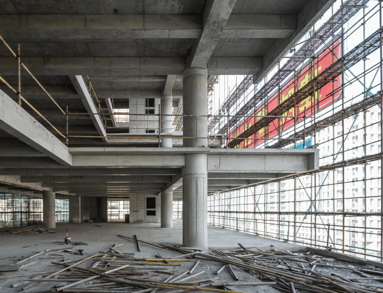
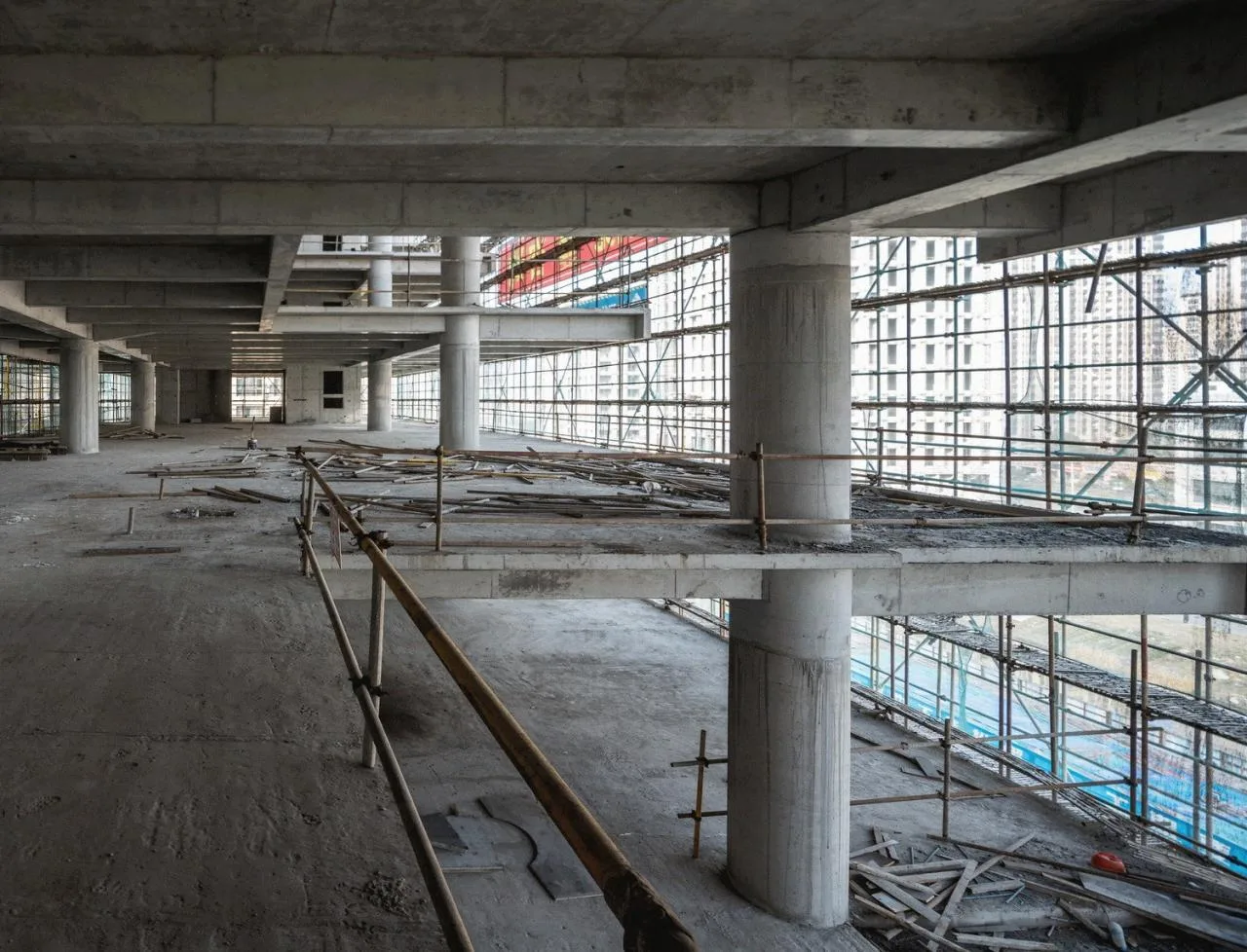
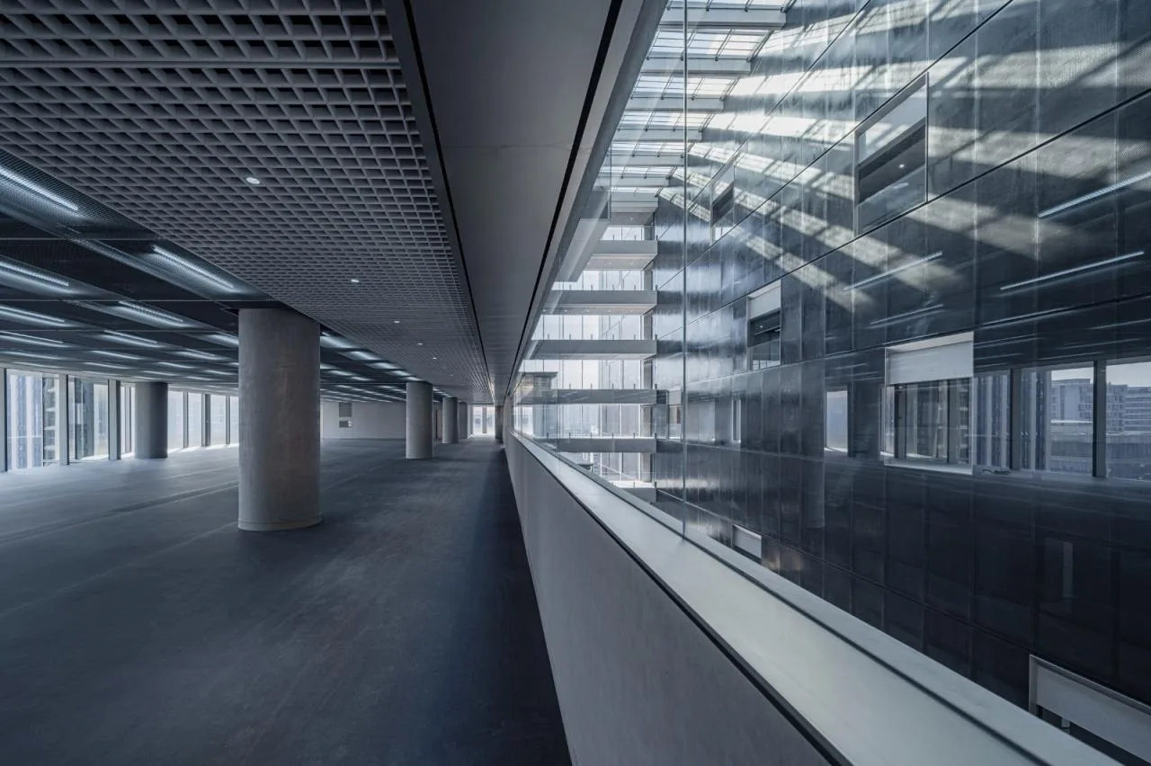
The 50-meter height limit and the 6-meter first-floor requirement compressed standard floor heights to 3.9 meters, below typical office standards. Increasing net ceiling height in low-floor-height, large-span spaces was a major challenge.
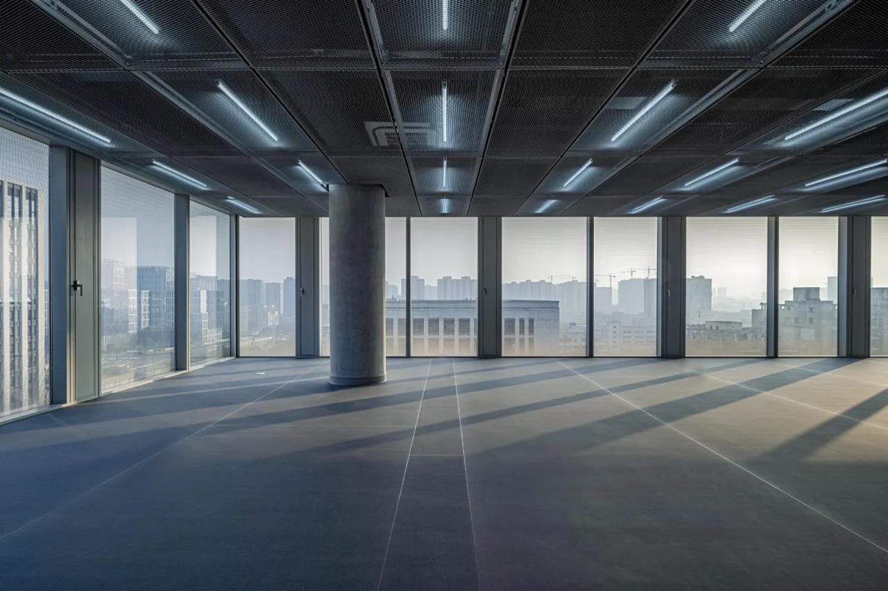
Through close collaboration with structural and MEP engineers, the maximum beam depth was limited to 700 mm. Large equipment pipelines were placed along edges, achieving a net height of 2.9 meters in core office spaces and 2.6 meters in secondary areas like corridors—matching a conventional 4.2-meter floor height.
Net Height Analysis in Office Area
The east side’s double-row column design ensures open, flexible office layouts. Tube structures at north and south ends, combined with steel diagonal support columns on floors 2-3, support the 10-meter cantilever on the first floor. After repeated discussions, slant support was chosen over diagonal tension for minimal spatial impact.
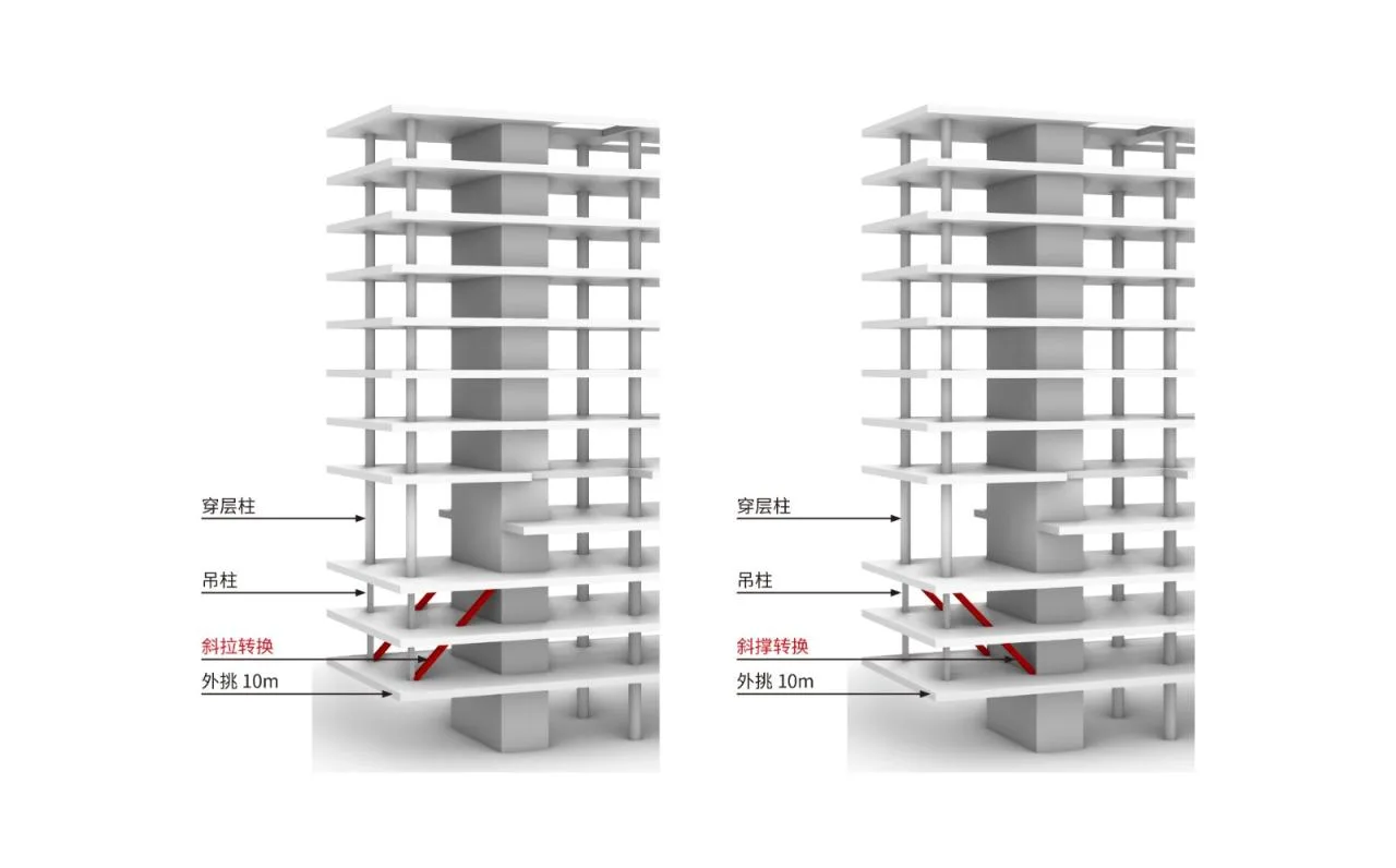
△ Structural Transformation Analysis (Slant Support Minimizes Spatial Impact)
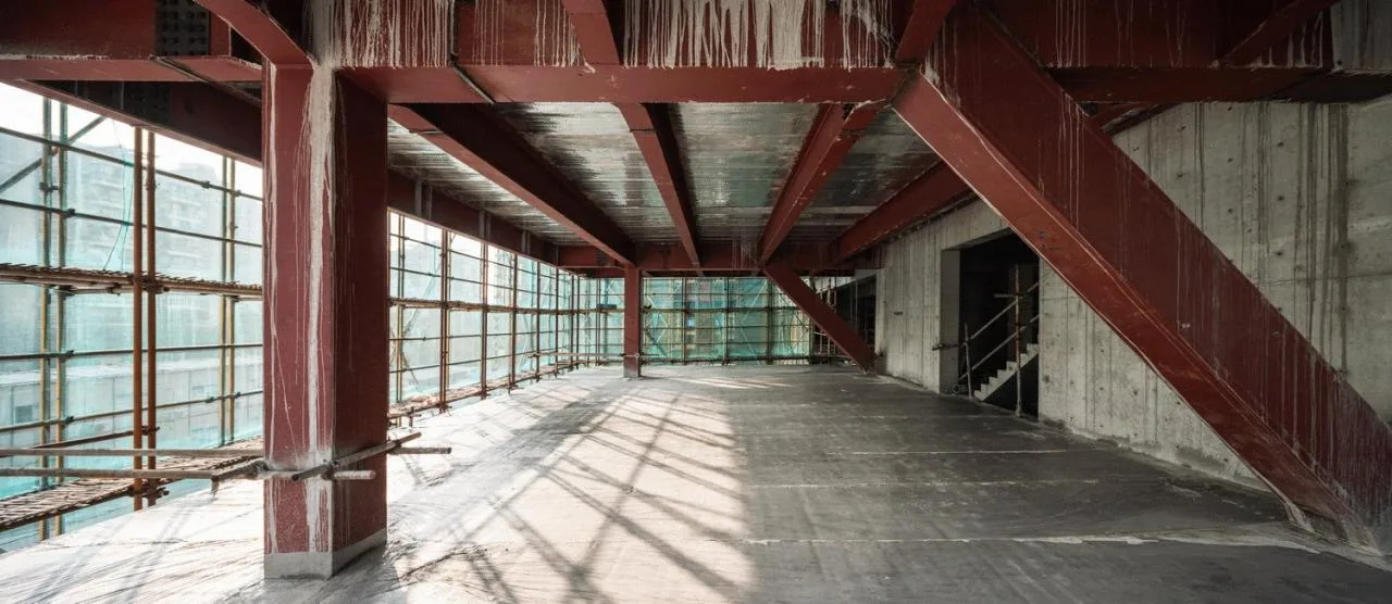
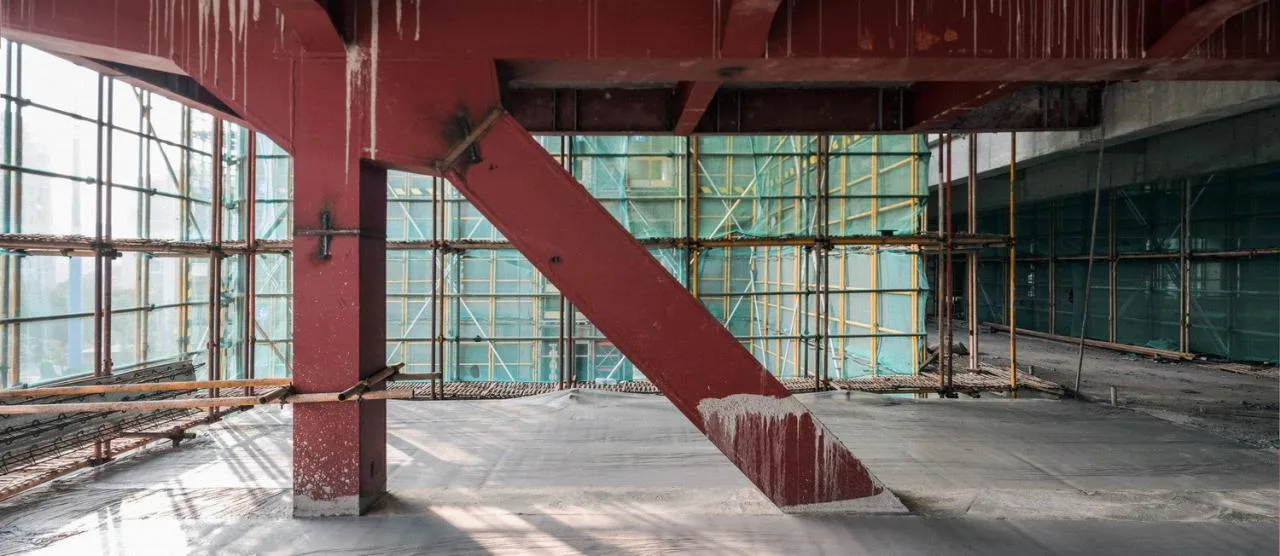
△ Construction Site Photos
3.2 Surface Construction
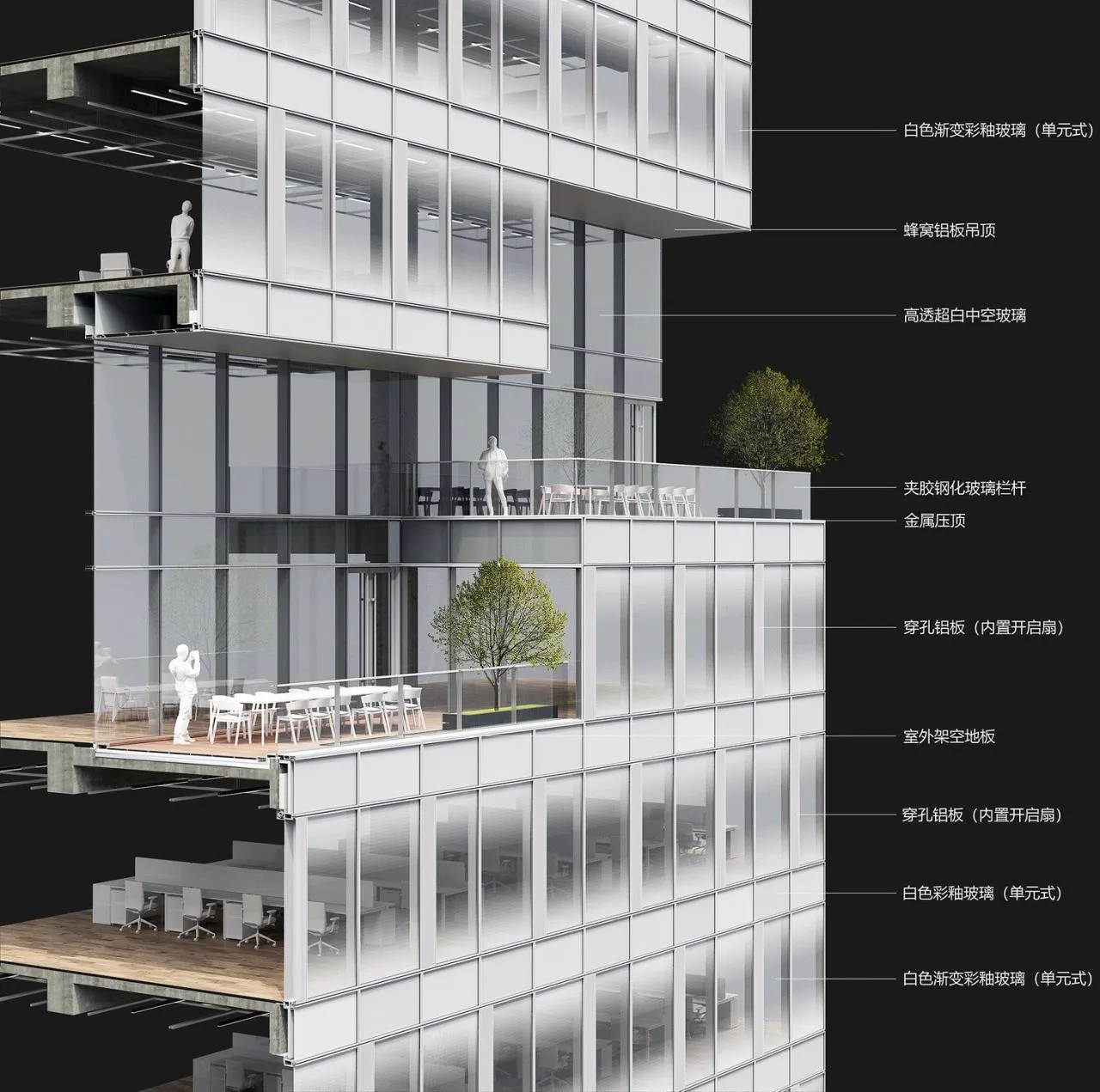
Despite strict cost controls, we remained committed to crafting refined, lasting facade details that highlight the client’s identity as a precision instrument manufacturer.
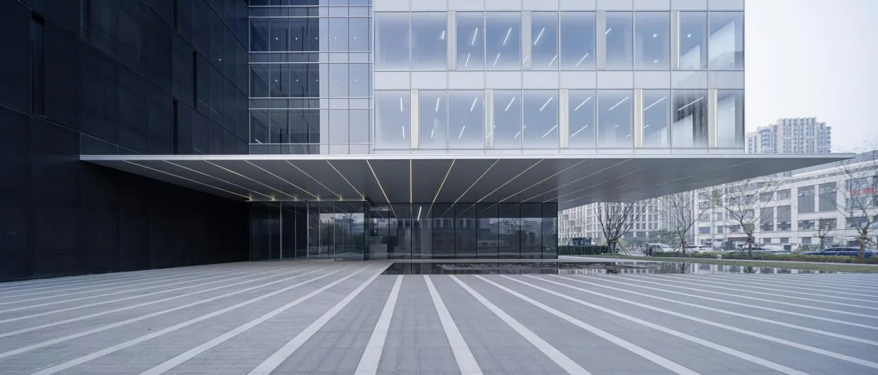
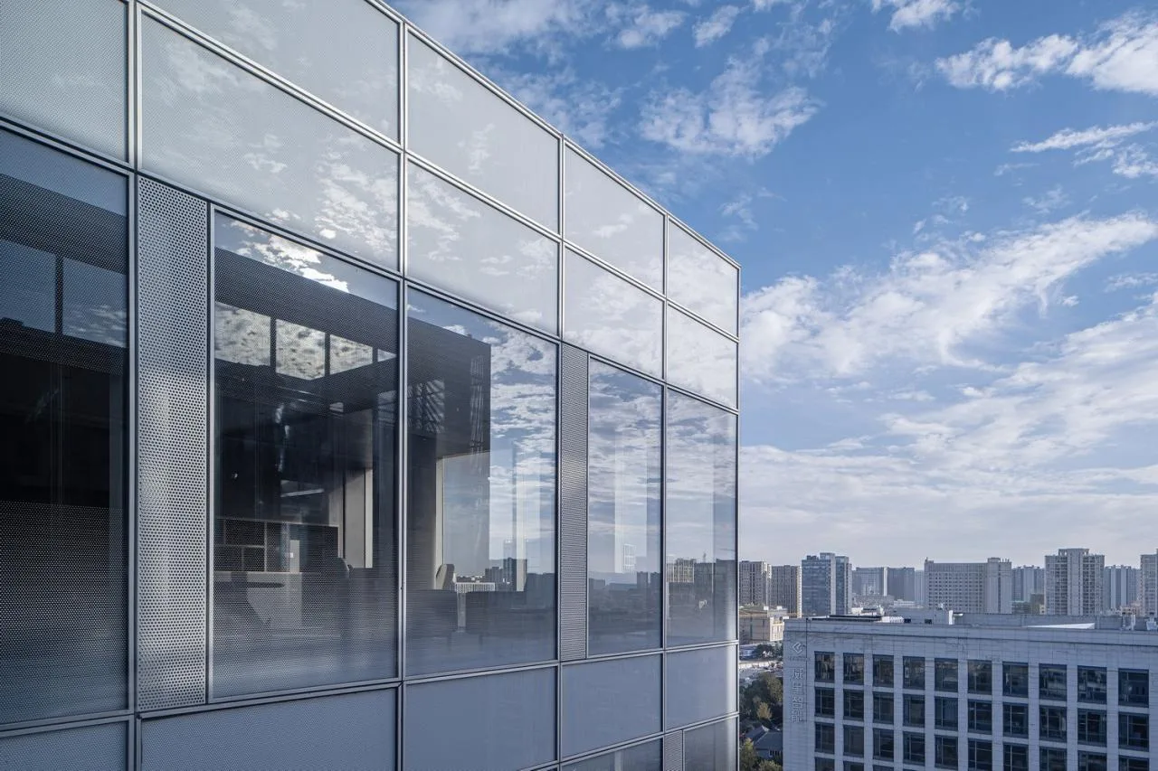
We adopted a pragmatic, economical approach by eliminating decorative elements, curtain wall variations, and louvers, resulting in a clean, flat modular glass curtain wall facade. Through detailed structural design, we created unique visual focal points and architectural imagery at conventional costs.
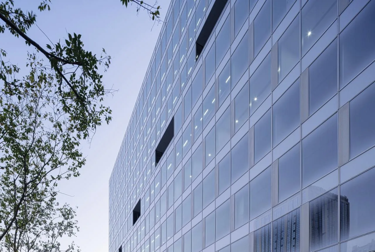
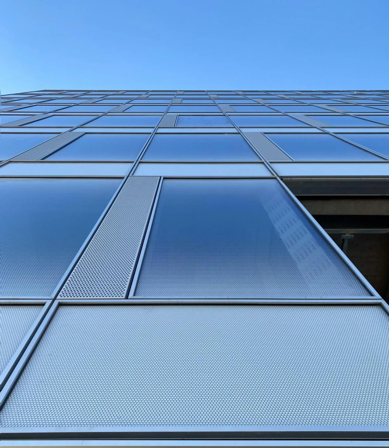
The white gradient glazed glass curtain wall features a logical arrangement of white glaze dots, establishing a distinctive identity within the urban context. The glaze dots gradually disperse from top and bottom toward eye level, reducing energy consumption while maintaining indoor visibility. The facade exhibits varying degrees of opacity, semi-transparency, and transparency depending on viewing angle.
△ Facade (left) and Section (right)
△ Curtain Wall Section
Early on, we extensively researched glaze dot patterns and conducted 1:1 scale printing to save time and costs before physical sampling. On-site mockups met expectations with a single sample. The glazed glass uses unit curtain wall construction technology, enabling standardized production and installation, which improves construction accuracy and efficiency—reflecting industrial intelligent manufacturing advantages.
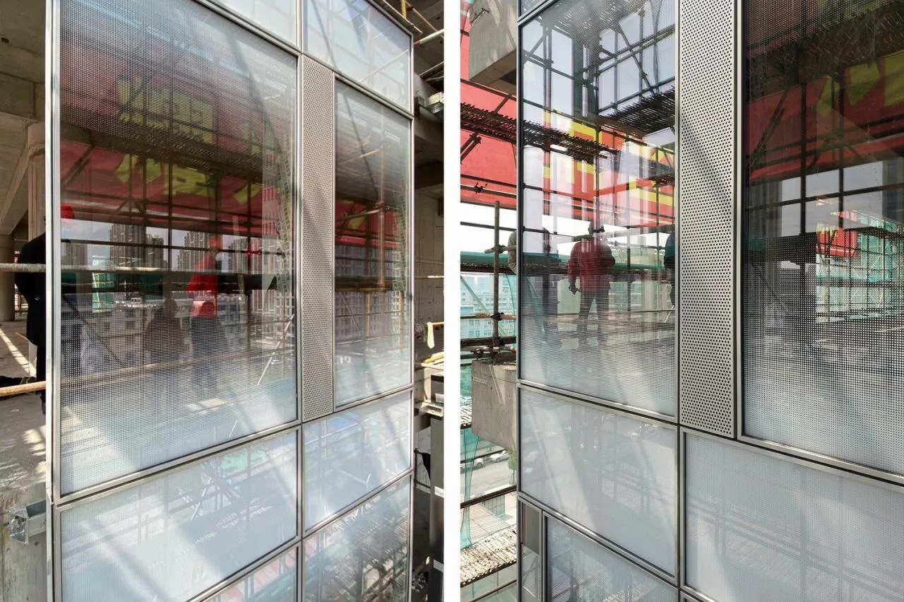
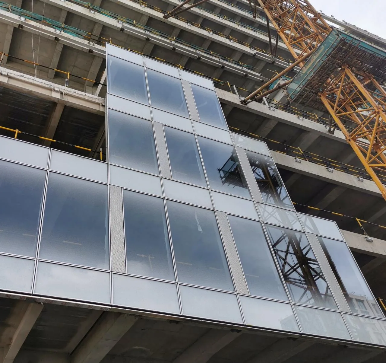
△ Curtain Wall Mockup
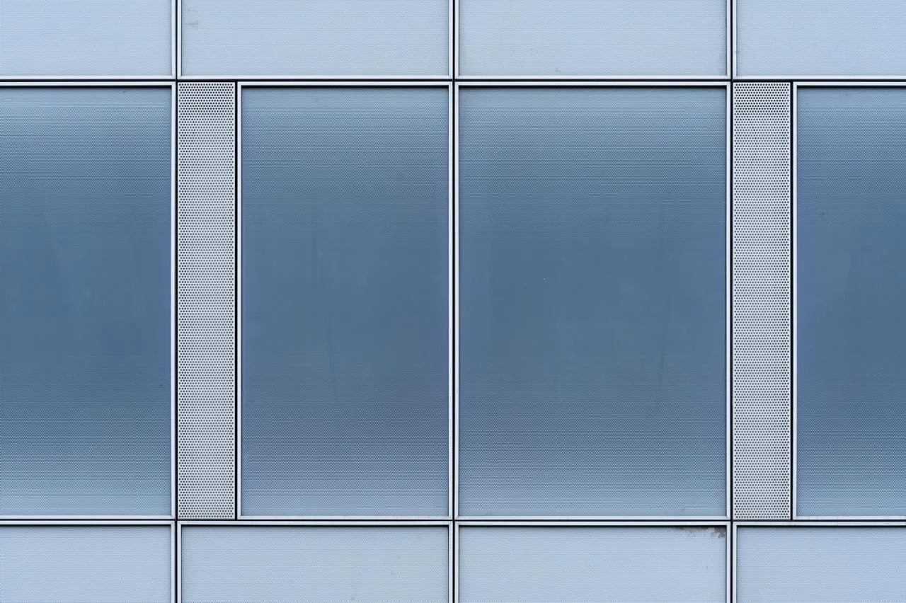
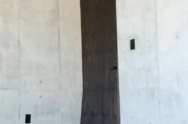
For the west service volume, we selected dark perforated panels, contrasting the refined glass volumes on the east. This juxtaposition emphasizes balance between heaviness and lightness, solidity and transparency. Achieving consistency between internal and external surfaces was critical, made possible by integrated interior and exterior design. We extended exterior materials, construction methods, and formal language indoors, creating a unified skin strategy. Window openings in the perforated panel align precisely with the curtain wall’s grid to avoid disrupting functional space.
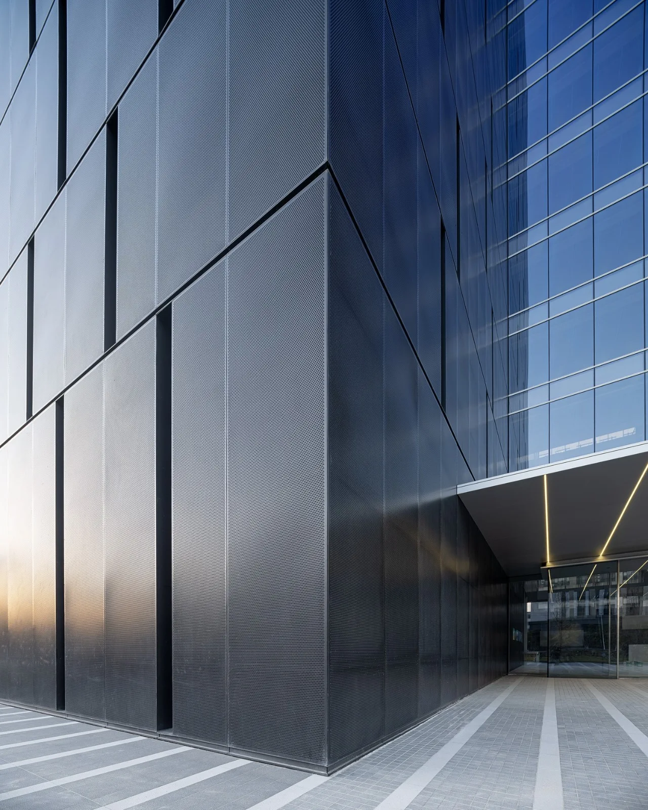
The perforated panel’s hole size and spacing balance indoor ventilation and lighting with exterior facade aesthetics. After extensive testing, a 12 mm hole diameter, 8 mm spacing, and 32.65% perforation rate were finalized. Initially, 8 mm thick metal sheets were specified for flatness but were reduced to 5 mm for cost efficiency, with double back ribs reinforcing stability and preserving design intent.
Schematic of Perforated Panel Back Reinforcement
The elevator hall, located centrally, aligns with the gap between the two office volumes on the west and serves as the only external window in the perforated panel facade.
Ultra-white, high-transparency glass is used on the atrium’s north and south facades to emphasize its public nature and blur indoor-outdoor boundaries.
To reduce atrium energy consumption, electric sunshades are strategically placed on the glass roof in combination with glass partitions, enhancing summer comfort. Drainage challenges at the large glass atrium’s top were resolved through collaboration among building, structural, and curtain wall teams. The glass roof elevation was lowered to 48.9 meters—aligned with the east-west building structure’s top plate—featuring a structural opening at the parapet wall flange for rainwater drainage. The roof slopes gently toward east and west, directing rainwater through structural openings into drainage channels, ensuring clean, concise volume transitions and formal continuity.
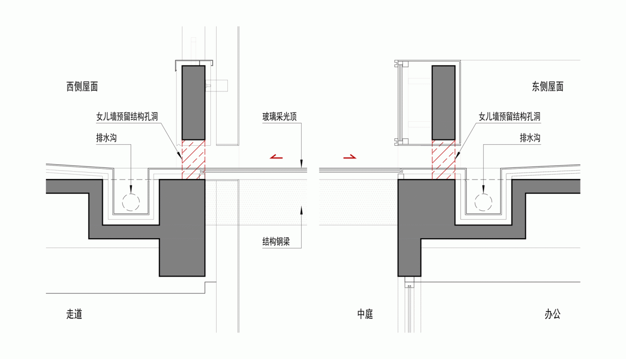
Lighting Roof Drainage Analysis
#04 Communication Strategy: Perseverance and Compromise
Thanks to high trust from the owners, the design phase progressed smoothly. However, during construction, disagreements arose regarding the implementation of two spaces.
4.1 North Corridor at Tong High School
The original plan featured perforated panel cladding and suspended staircases on floors 4-5 and 9-10. The designer worried that the low-quality neighboring building on the north side would detract from the entrance’s spatial atmosphere. The owner, however, felt the atrium might feel too enclosed without this design.
Initially, we resisted changes and sought to persuade the owner. Later, facing cost pressures, the owner requested design optimization to reduce expenses. After spatial simulations, we agreed to remove the perforated panel skin and two external staircases.
Although spatially interesting in theory, the low eye-level of entrance hall visitors limits visual interference from neighboring buildings. Retaining the original plan would blur the relationship between perforated panels on the corridor and west tower, weaken volume clarity, and reduce atrium lighting, creating an oppressive space. This compromise, driven by cost concerns, became a design correction.
Comparison of Original Design Rendering (left) and Completed Photo (right)
4.2 East River-facing Stepped Space
The plan included extending an external shared terrace inward to create a cohesive two-story shared space, linking interior and exterior. Later, the owner requested canceling the two-story interior height to facilitate future division and leasing flexibility. Due to budget concerns and owner needs, this elevated space was removed—a rare regret in this project’s design.
△ Original Two-story Indoor Elevated Construction Site
Compromises are inevitable during design and construction. Owners’ requests can positively influence design or cause setbacks due to changing realities. When conflicts arise, architects must rationally and comprehensively consider both owner and user perspectives. Professional ethics also require a degree of compromise in architectural practice.
#05 Integrated Strategy: Control
The Weixing Intelligent Headquarters exemplifies a comprehensive integration strategy. Architecture, interior, and landscape design cohesively align formal language, functional layout, and spatial atmosphere throughout the project lifecycle.
Continuous communication with the client fosters mutual understanding, enabling us to translate their needs into spatial solutions, reducing communication overhead, lowering construction costs, and ensuring high-quality implementation of design concepts.
5.1 Functional Zoning
Frequent office area adjustments are common in corporate headquarters design. Early on, auxiliary functions were consolidated into the west volume, allowing interior design to address uncertainties in office layouts with clear functional zoning.
Public amenities such as lecture halls, cafés, exhibition halls, and gyms are centralized on floors 1 and 2 for accessibility and efficient operations.
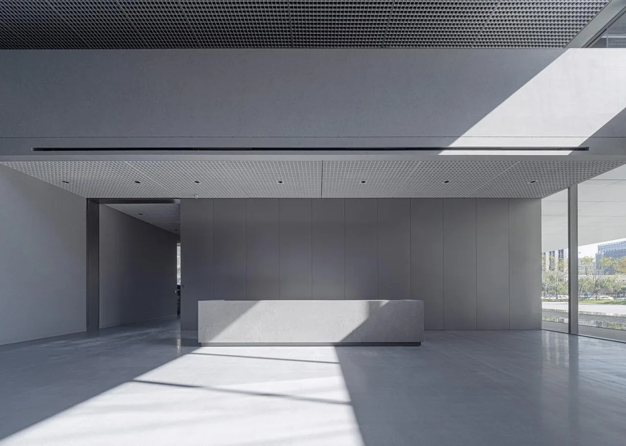
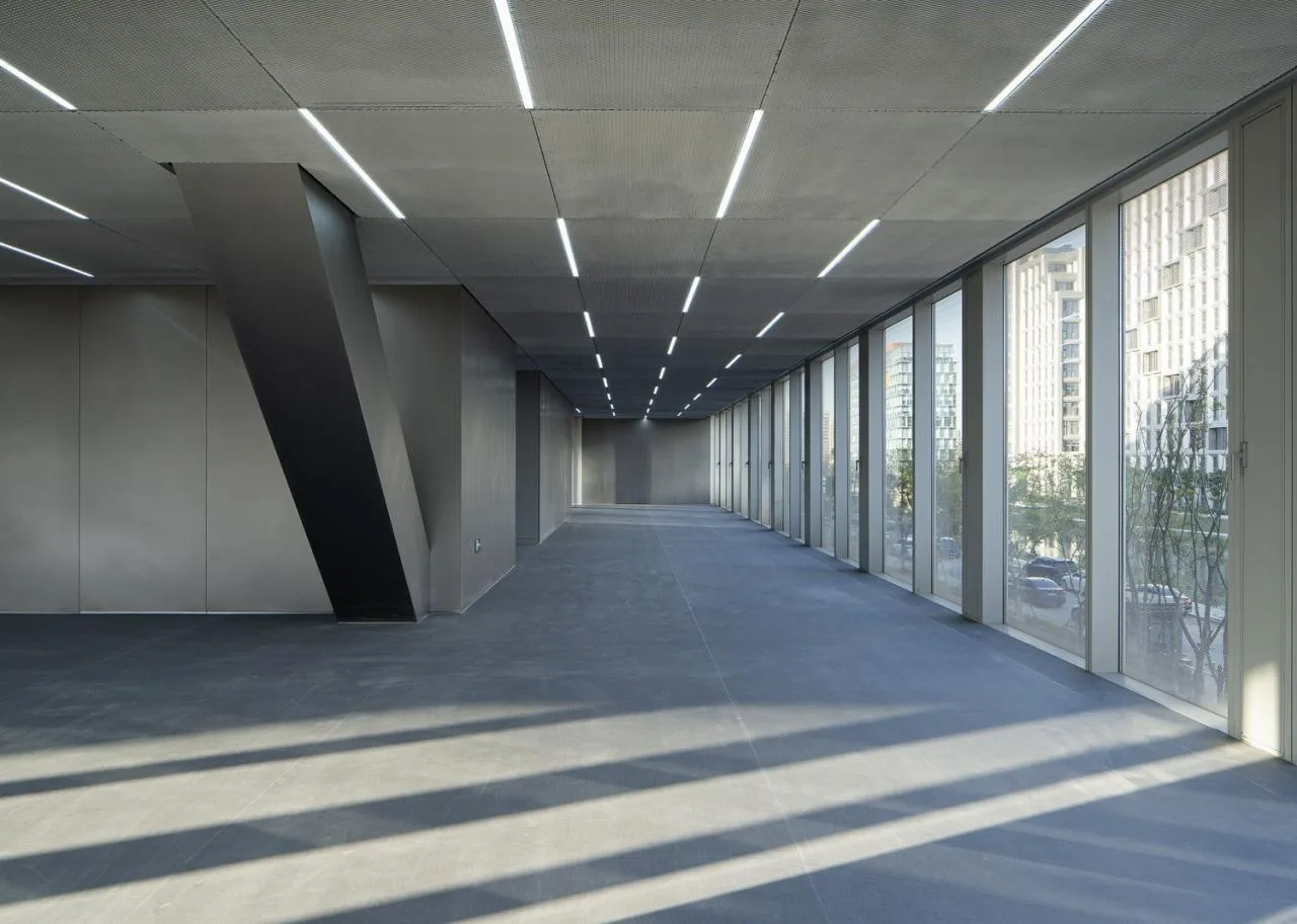
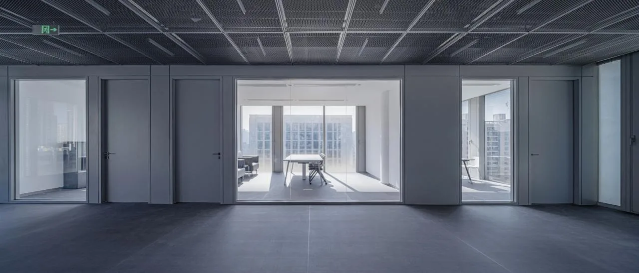
Standard office floors adopt a “mostly open office with some private offices” layout. Three glass curtain walls and ultra-white glass on the atrium side provide ample natural light, minimizing the impact of layout changes on design and schedule.
5.2 Precision in Modular Application
The modular curtain wall system governs the design of metal mesh panels for large office spaces and partitions for smaller areas, extending even to the entrance square’s landscape design. This modular approach ensures high-quality internal and external spaces and conveys the company’s precise and orderly corporate spirit.
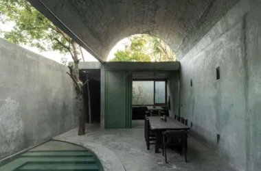
5.3 Blurring Inside and Outside
The atrium’s seamless indoor-outdoor character is reinforced by consistent interior and exterior facade materials and curtain wall units, integrating outdoor experiences. It promotes communication and interaction among staff through an aerial courtyard and shared space where landscape freely permeates through transparent glass.
Interior design reflects the contrasting atmospheres of the east and west volumes: the dark perforated panel volume houses industrial-feeling conference rooms, lecture halls, and auxiliary spaces with a calm palette; the glass volume contains bright, minimalist office areas. Materials interplay throughout, creating varied yet continuous spatial experiences.
Conclusion
Over four years, from design through construction to completion, we engaged in continuous dialogue with the client—not only about design concepts and technical solutions but also to help non-architectural professionals understand architectural language, incorporate their needs, and gradually realize their architectural vision. This established shared value recognition between both parties.
Guided by architectural design, we provided a bottom-up design approach, collaborated with multiple stakeholders, and facilitated project success. Effective communication has become a vital skill when working with non-professional clients.
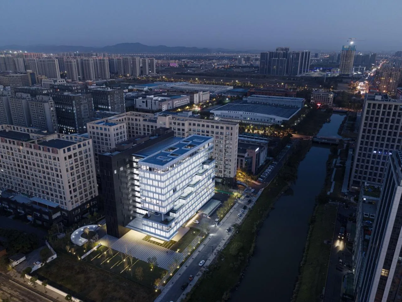
The new Weixing Intelligent Headquarters building is now complete. Without dramatic height, extravagant forms, or costly surfaces, it stands out through practical functions, innovative texture design, precise detailing, highly integrated interior-exterior spaces, and meticulous quality control. Within a conventional budget, technical challenges were overcome to create a unique architectural character and identity in its surroundings.
We believe good design combines passionate site-specific creativity with rational analysis and continuous adjustment based on objective conditions. Within a shared value framework with owners and collaborators, we apply scientific methods to control, analyze, explore, and refine every aspect, establishing inherent logical connections and balance among elements.
Project Drawings
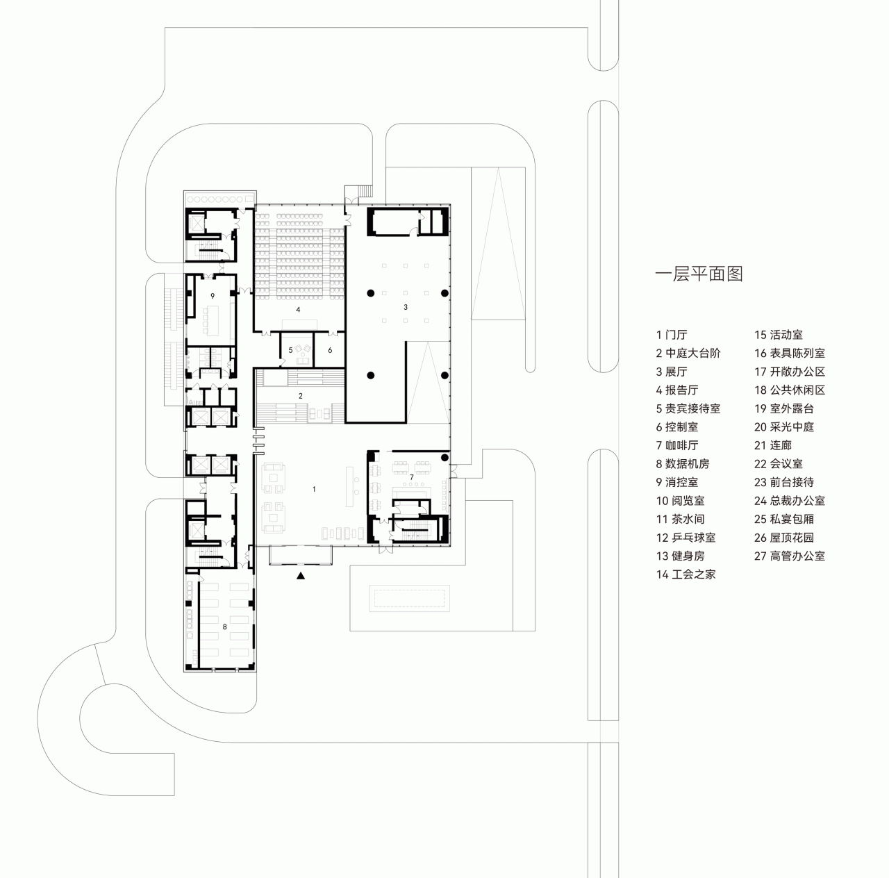
△ First Floor Plan
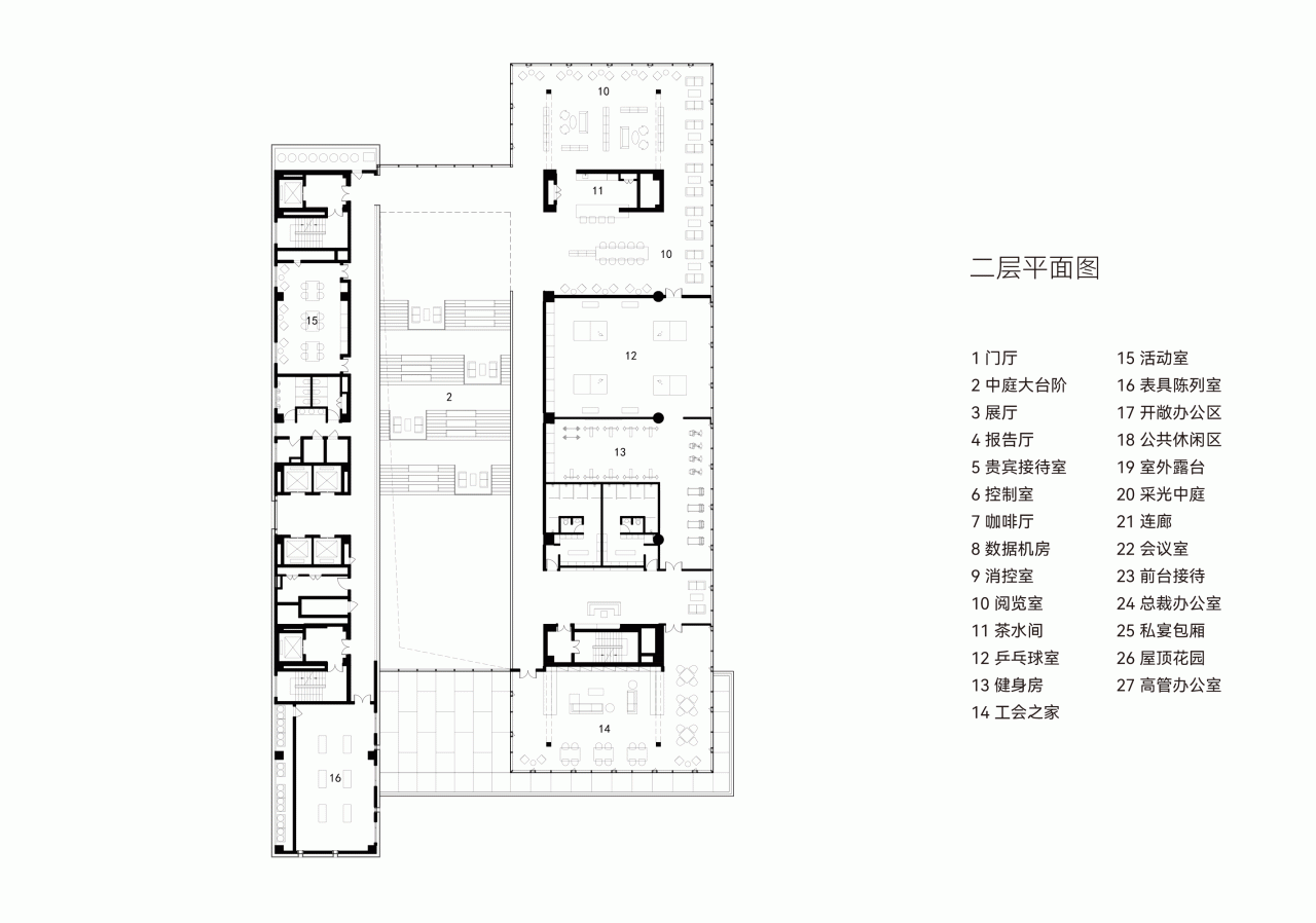
△ Second Floor Plan
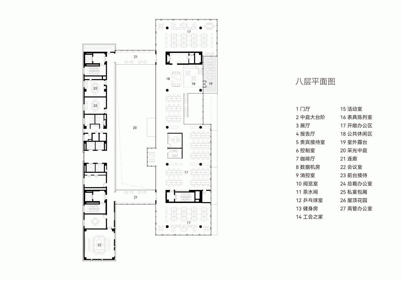
△ Eighth Floor Plan
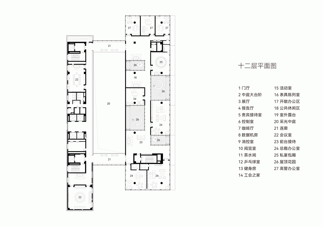
△ Twelfth Floor Plan
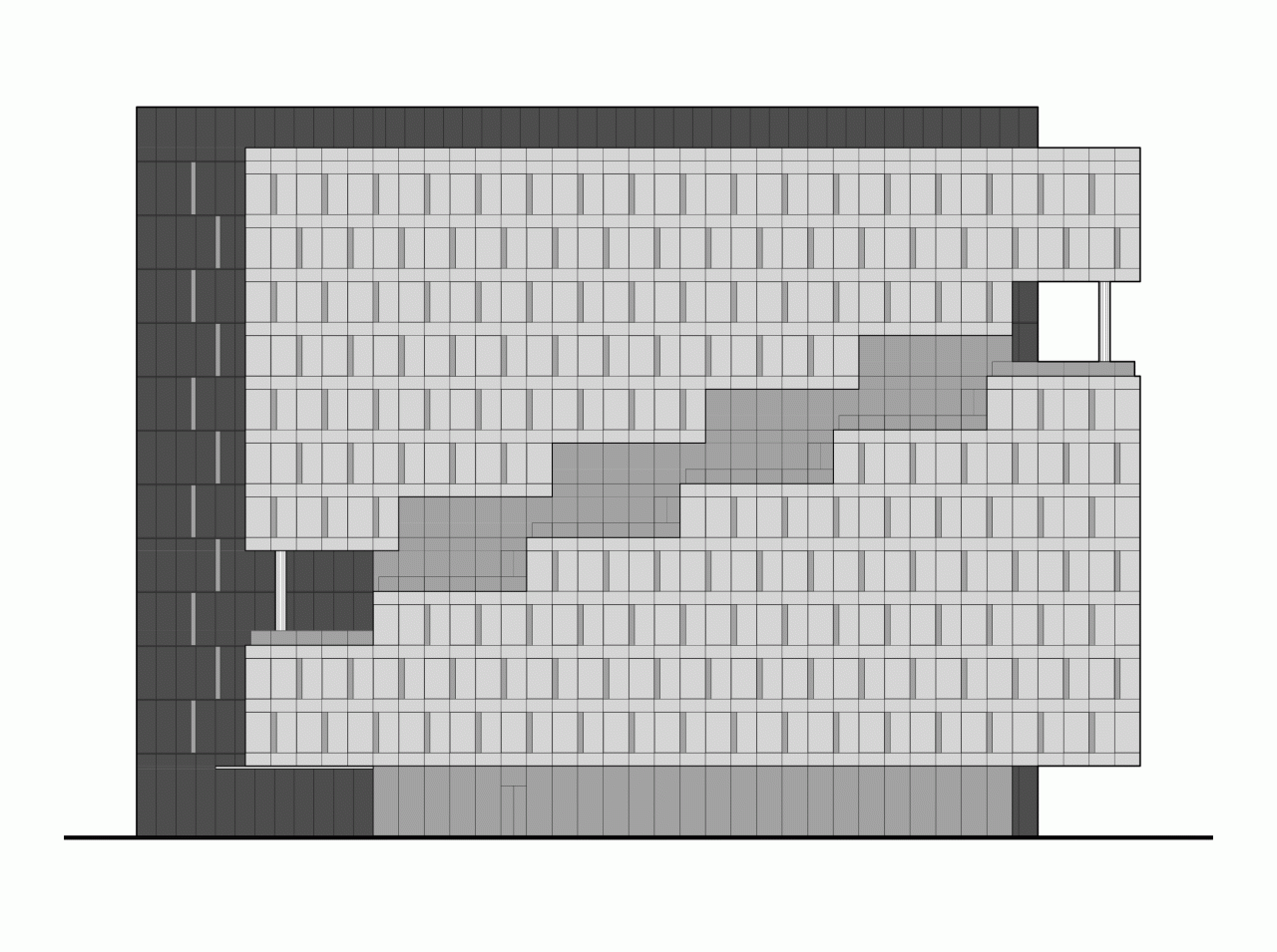
△ East Elevation View
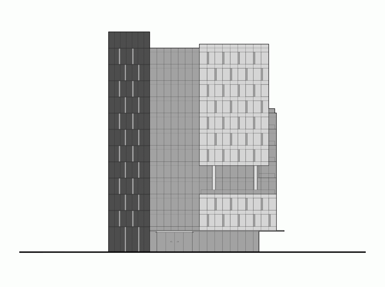
△ South Elevation View
Project Information
Project Name: Hangzhou Weixing Intelligent Headquarters
Location: Hangzhou, Zhejiang
Architectural Design: Gad, Line+ Architectural Firm
Interior and Landscape Design: Line+ Architectural Firm
Lead Architect / Project Creator: Meng Fanhao
Project Leaders: Li Xinguang (Architecture), Zhu Jun (Interior), Li Shangyang (Landscape)
Design Team: Li Xinguang, Huang Guangwei (Architecture); Zhu Jun, Deng Hao, Ge Zhenliang, Zhang Sisi, Qiu Limin, Chen Wen (Interior); Li Shangyang, Jin Jianbo, Chi Xiaomei (Landscape)
Structural, Mechanical, and Electrical Design: Zhejiang Greentown Architectural Design Co., Ltd
Design Team: Wu Yingdong, Wu Xuefeng (Structural); Cui Daliang, Fang Yuanyuan (HVAC); Wu Wenjian, Zhang Bin, Zhao Yaxuan (Water Supply and Drainage); Lao Xiaojing, Liu Rong (Electrical)
Curtain Wall and Lighting Consultant: Shanghai Yidu Curtain Wall Construction Consulting Co., Ltd
Building Area: 31,914.01 m² (21,497.49 m² above ground, 10,416.52 m² underground)
Design Period: July 2017 – December 2020
Construction Period: August 2018 – December 2021
Owner: Zhejiang Weixing Intelligent Instrument Co., Ltd
Structure: Frame shear wall system
Materials: White gradient glazed glass, dark perforated aluminum panels
Photography: Shiromio, Aaron & Rex, Chen Xi


Must log in before commenting!
Sign Up