This exhibition hall showcases TULLIO paint products from Italy. Situated near a secondary entrance of one of the area’s busiest material shopping malls, the surrounding storefronts feature advertising spaces, stainless steel, marble, glass, and other materials, creating a strong, traditional commercial atmosphere.


Before starting the project, we faced a significant challenge: two different brands and owners shared the site, dividing it into two separate storefronts operating independently. Our client was limited to a location with poor interior visibility. Technically, this was not a full storefront but only half, and the less desirable half at that. This situation posed a major design challenge and was the reason behind the owner’s hesitation to rent the space. Our task was to overcome the shortcomings of the original layout and create an attractive, functional design.
△ Location Map
△ Venue Relationship
Relationship with the Surrounding Environment
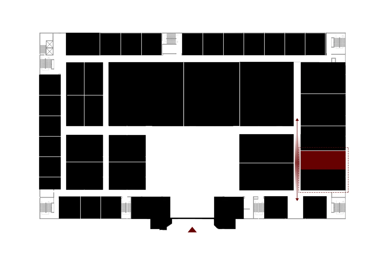
Due to the site’s poor location, our client negotiated with the other brand’s owner to move their space back, allowing our storefront to be visible to visitors entering the mall for the first time. This adjustment created a three-dimensional area that we emphasized in our design by using a pink shape, generating a strong visual attraction to compensate for the lack of visibility.
People often experience surprise when breaking free from routine, and creating unique, unexpected moments was a deliberate part of our design.
Visitors enter through the main entrance and exit via the secondary one. After passing the surrounding shops, the design offers a breathable space where people can discover something new, breaking away from the dense commercial atmosphere. The sensation is akin to suddenly encountering an endless meadow in the middle of a bustling city, evoking excitement and refreshment.
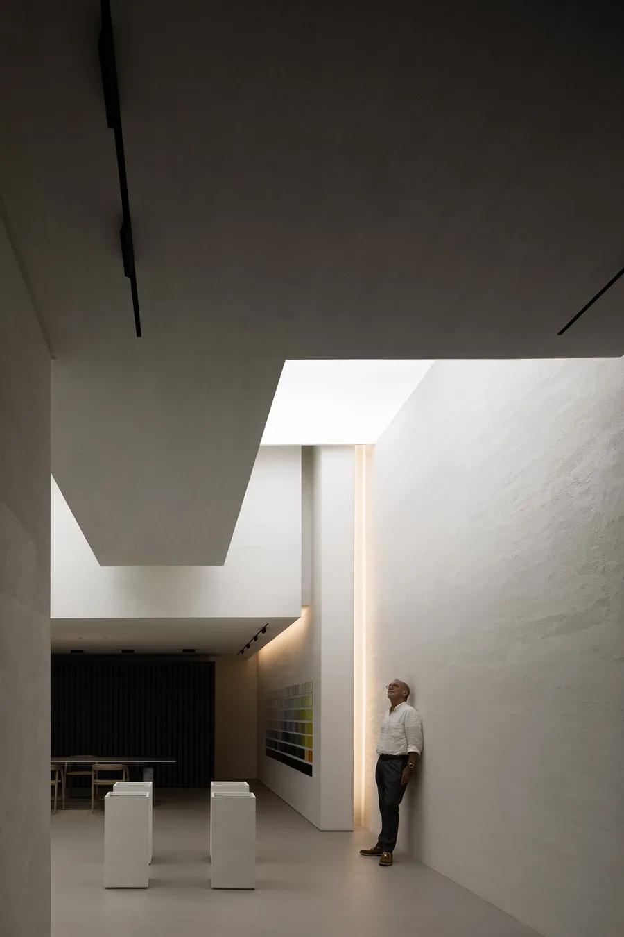
This approach creates a different aesthetic, reminiscent of an art museum exhibition hall. It emphasizes the artistic quality of the products while highlighting the seamless integration between the materials and the space.
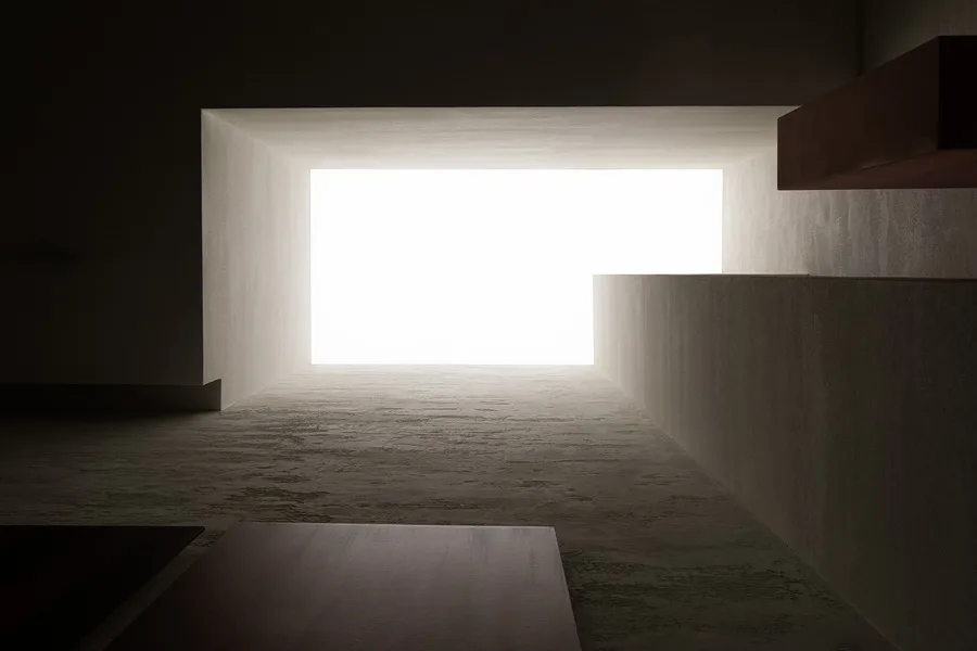
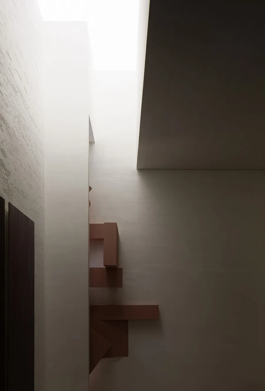
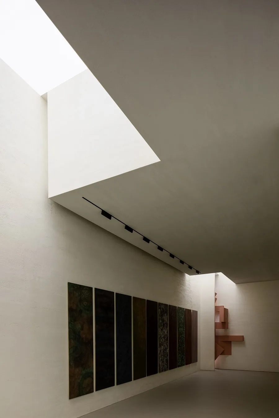
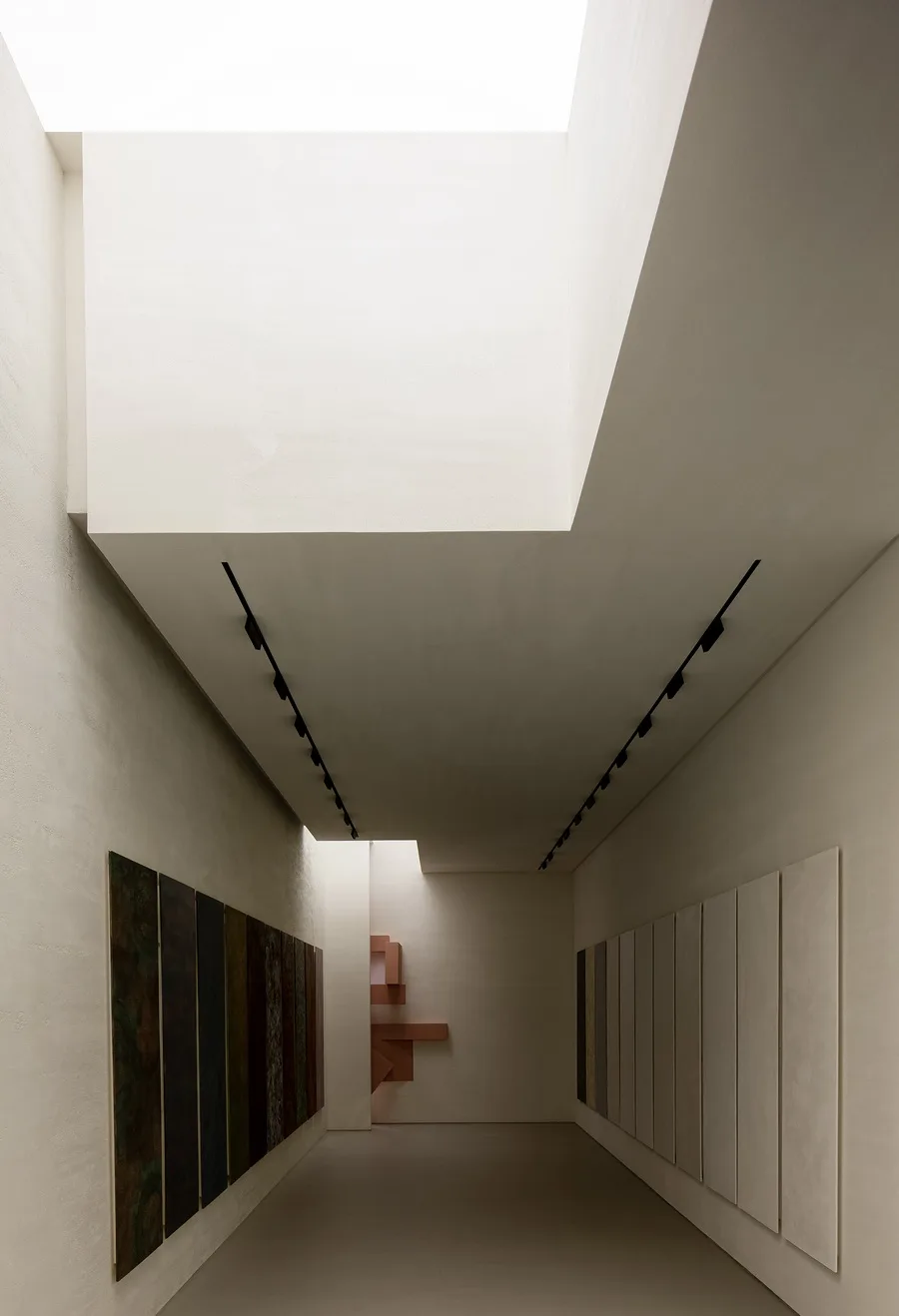
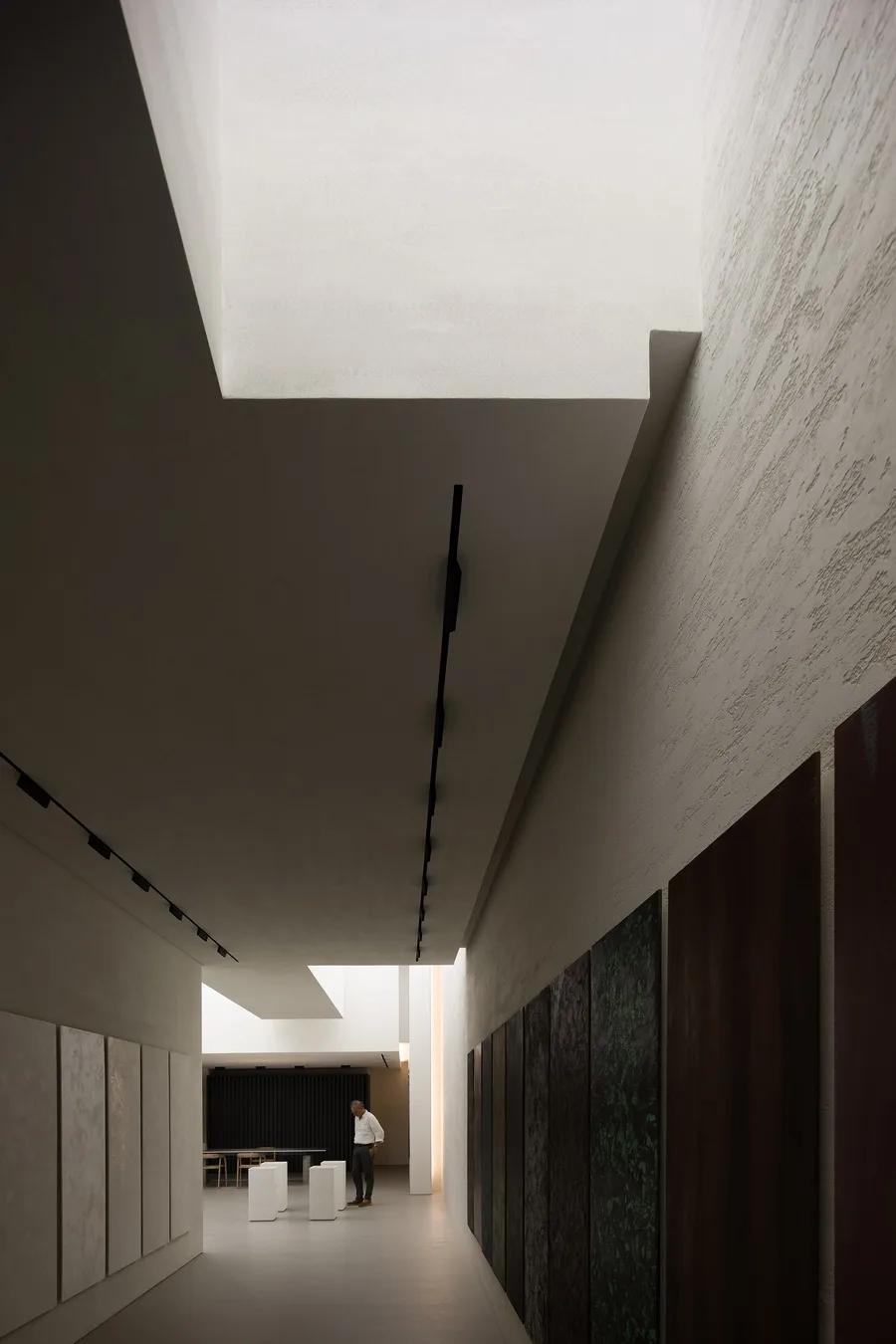
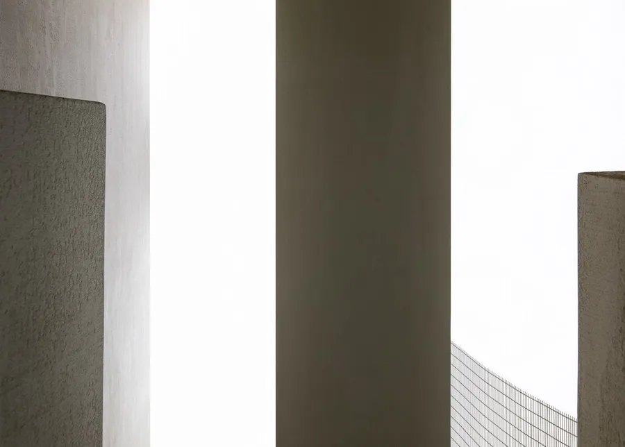
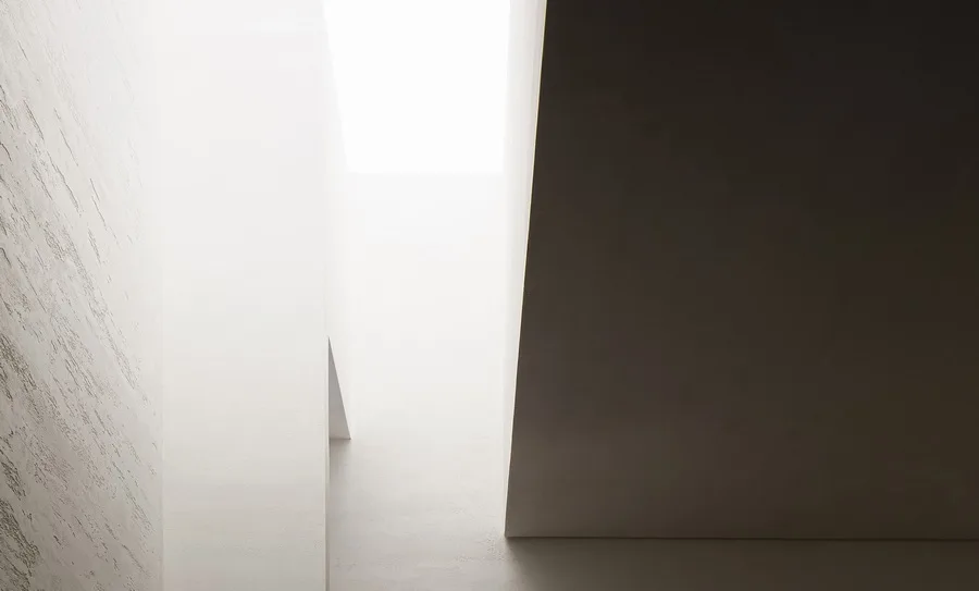
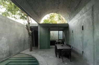
The main design challenge was to transform the oppressive original deep and narrow site into a breathable and open space. We divided the first half of the area into two sections to create a spatial effect that moves from small and confined to large and expansive, starting with a compressed introverted space which then opens up into a wider area.
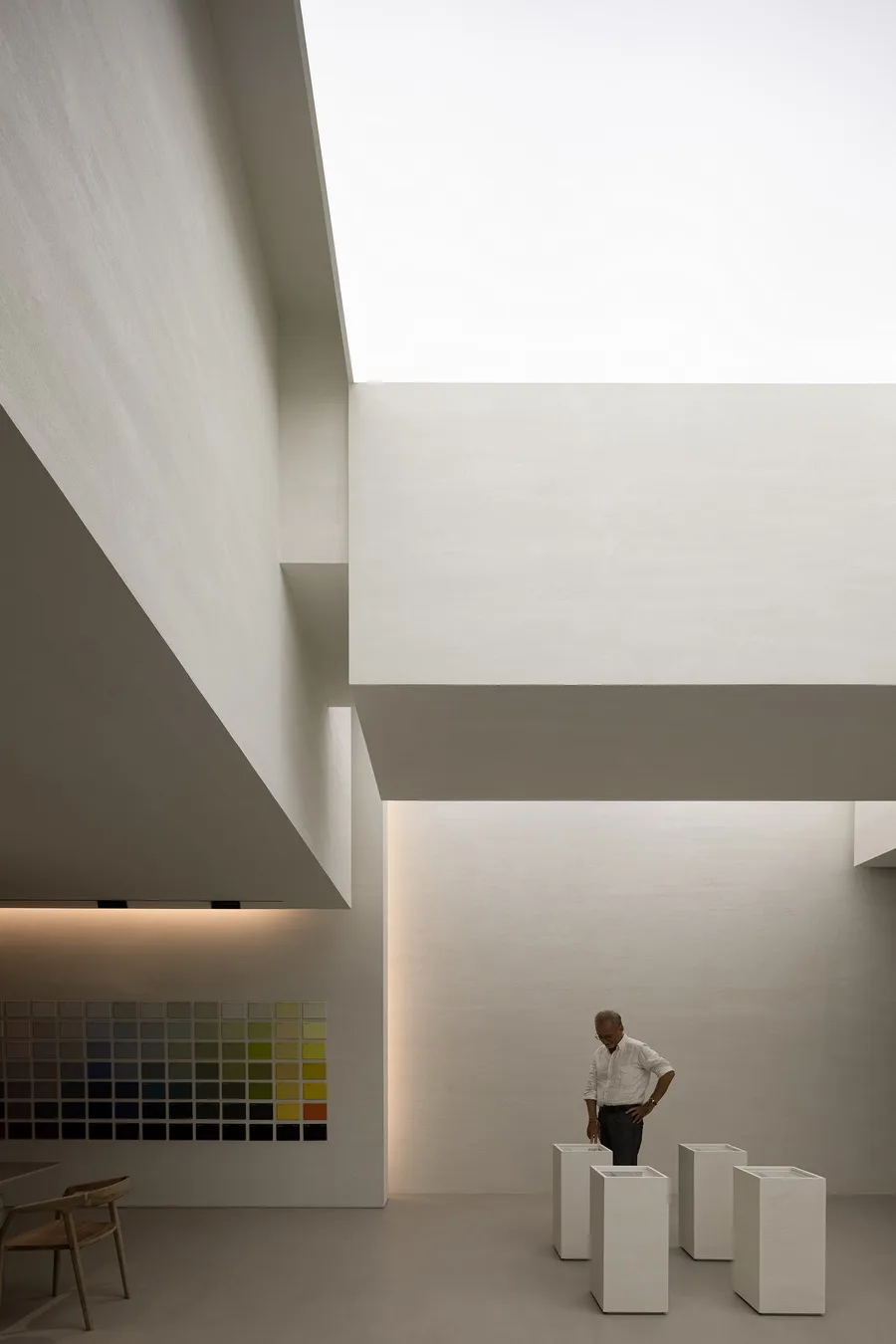
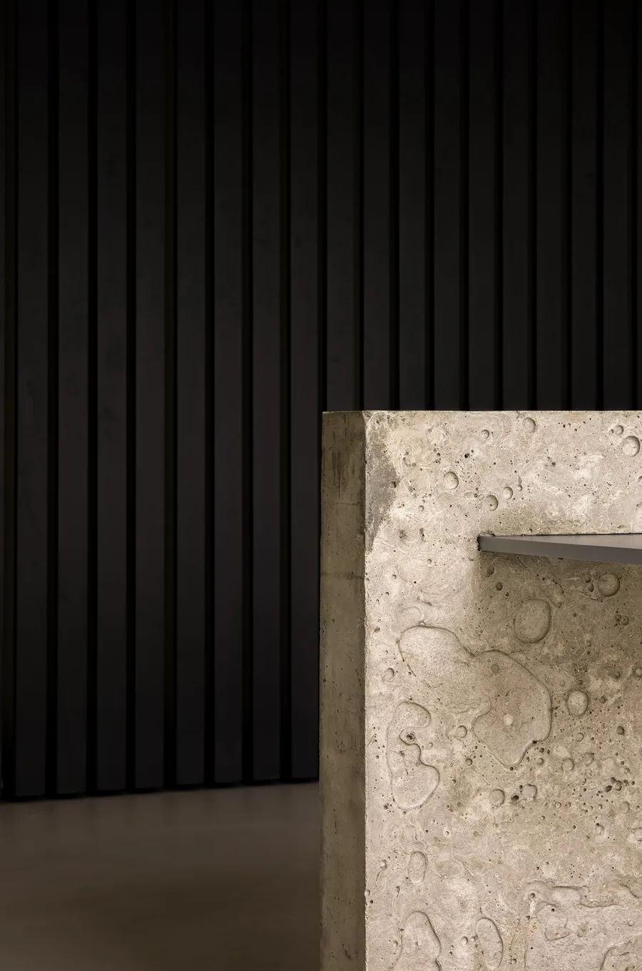
Our design for the reception desk is a bold and innovative approach in the commercial field, reflecting changes in contemporary checkout methods. We avoided decorative soft furnishings, opting instead for a material-focused experience where space, materials, and lighting evoke emotion. The only furniture in the reception area combines concrete with simulated aluminum paint, highlighting the tactile flexibility of the materials.
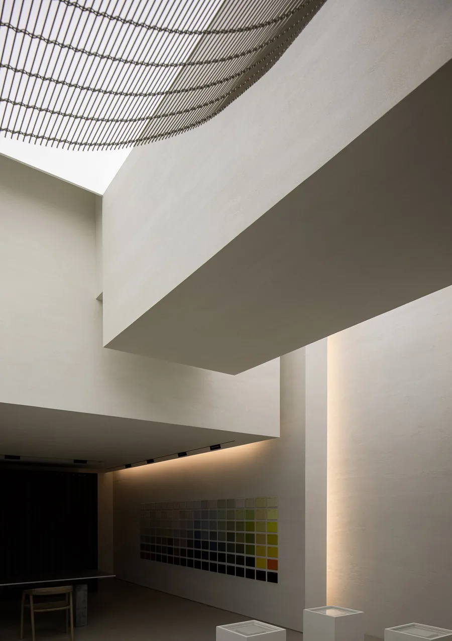
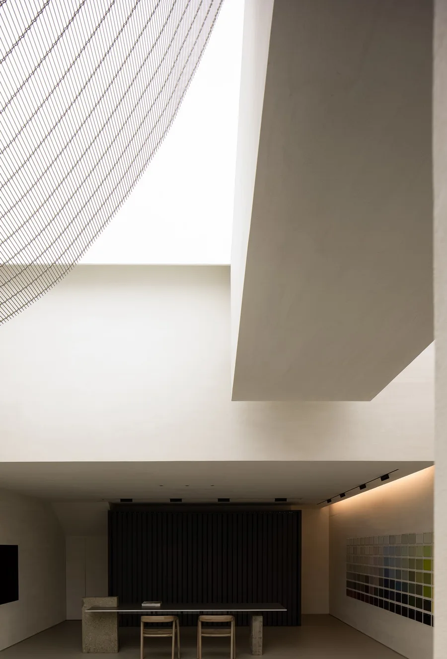
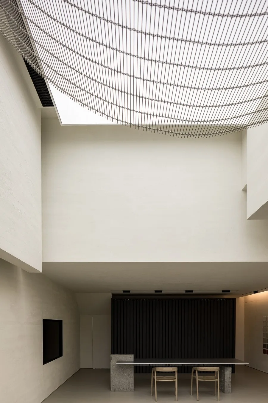
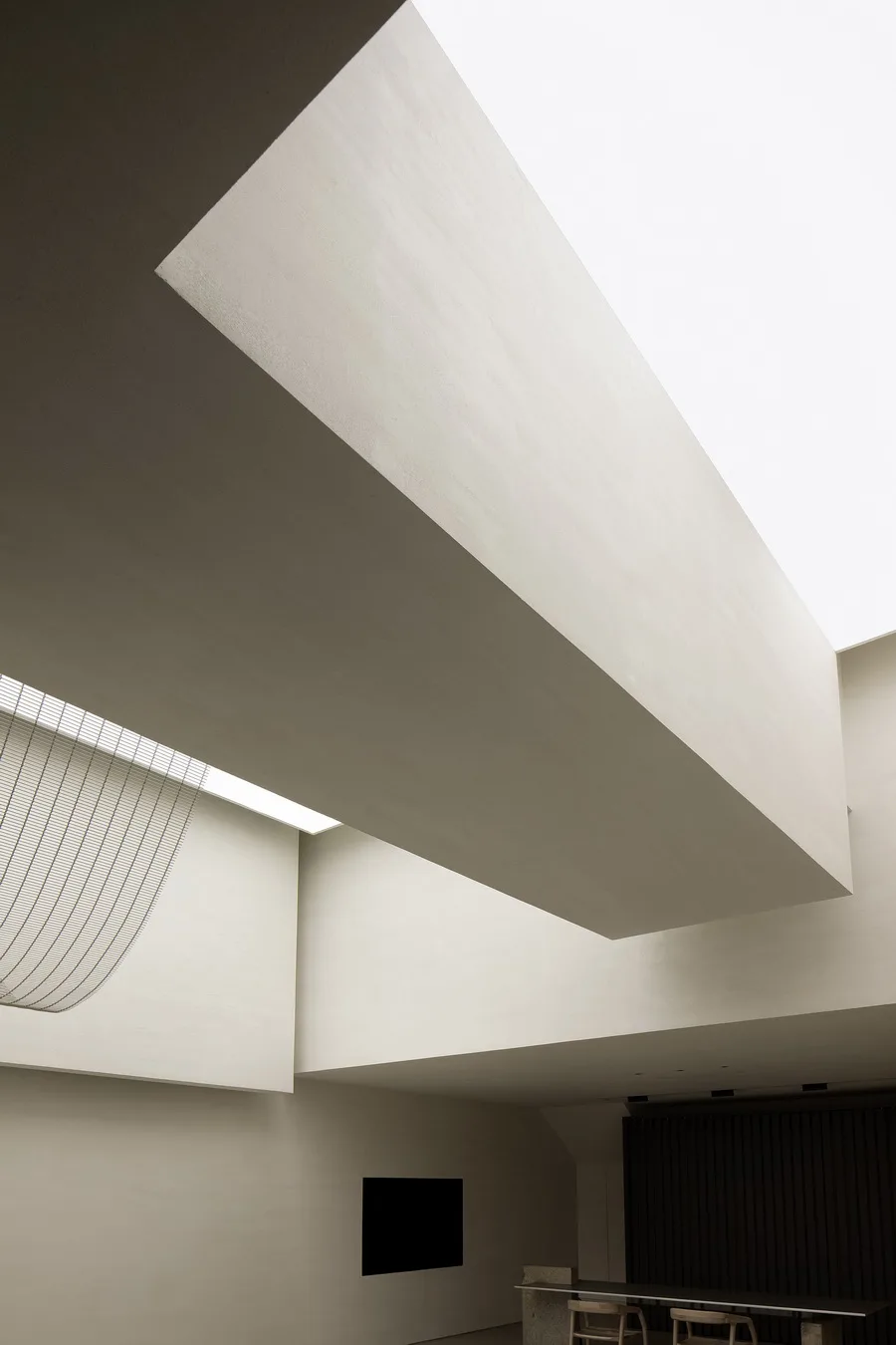
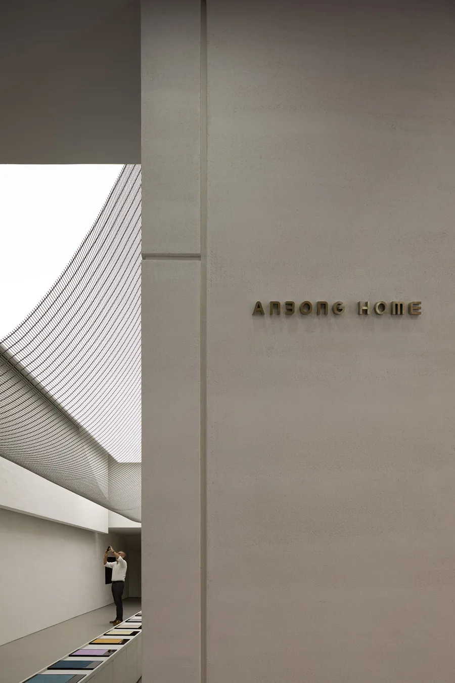
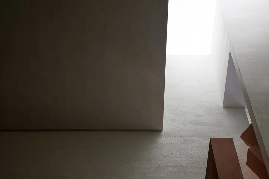
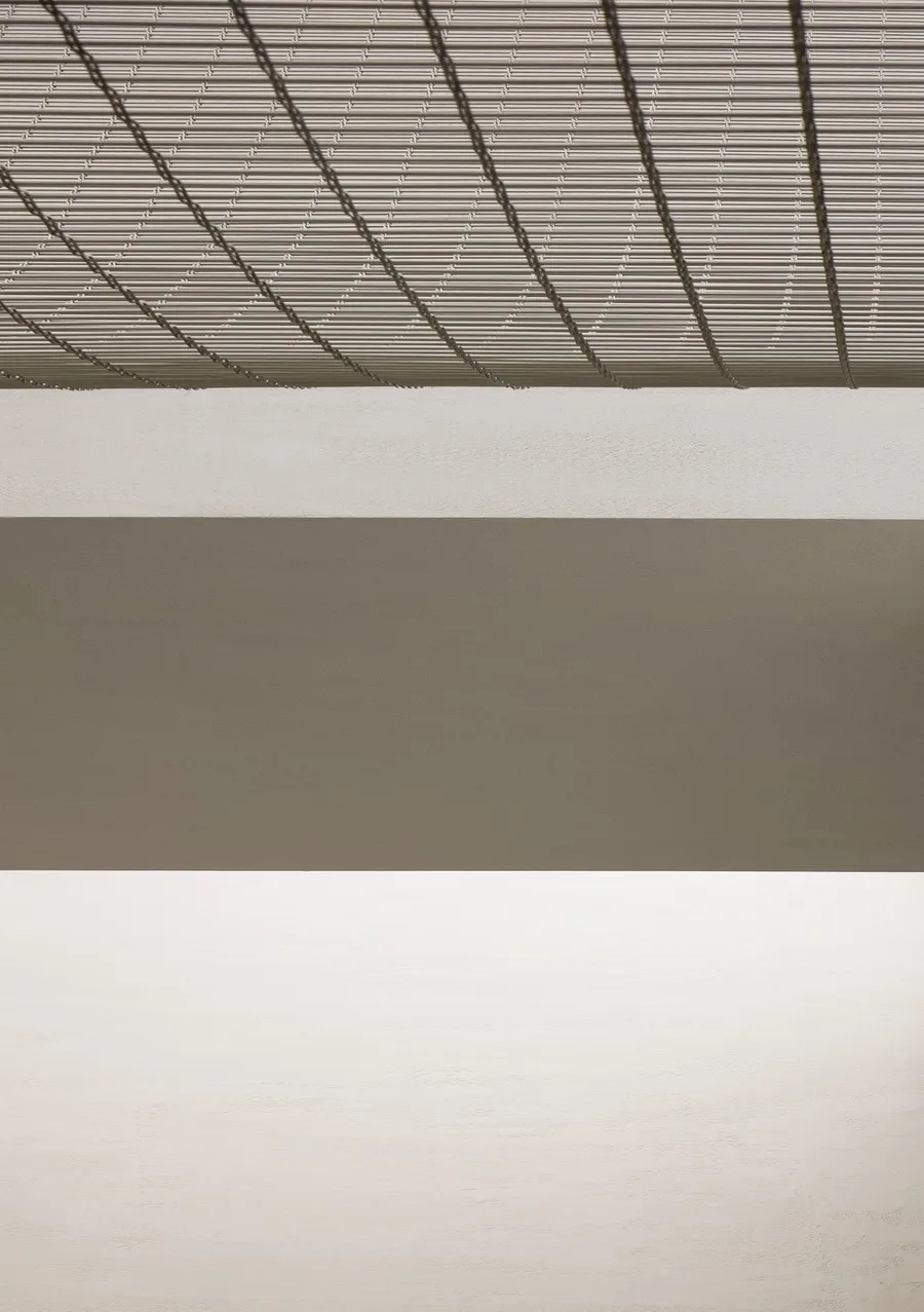
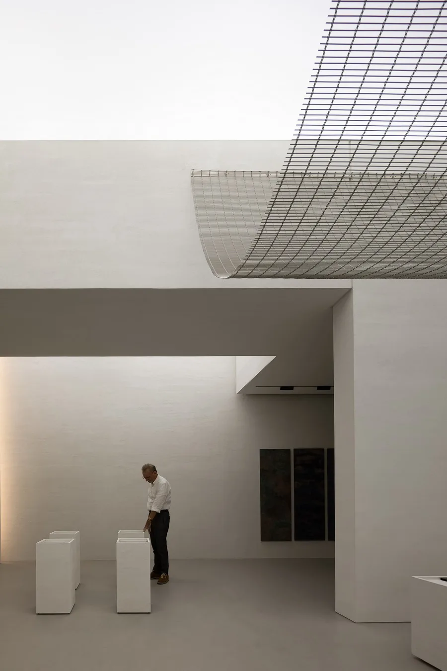
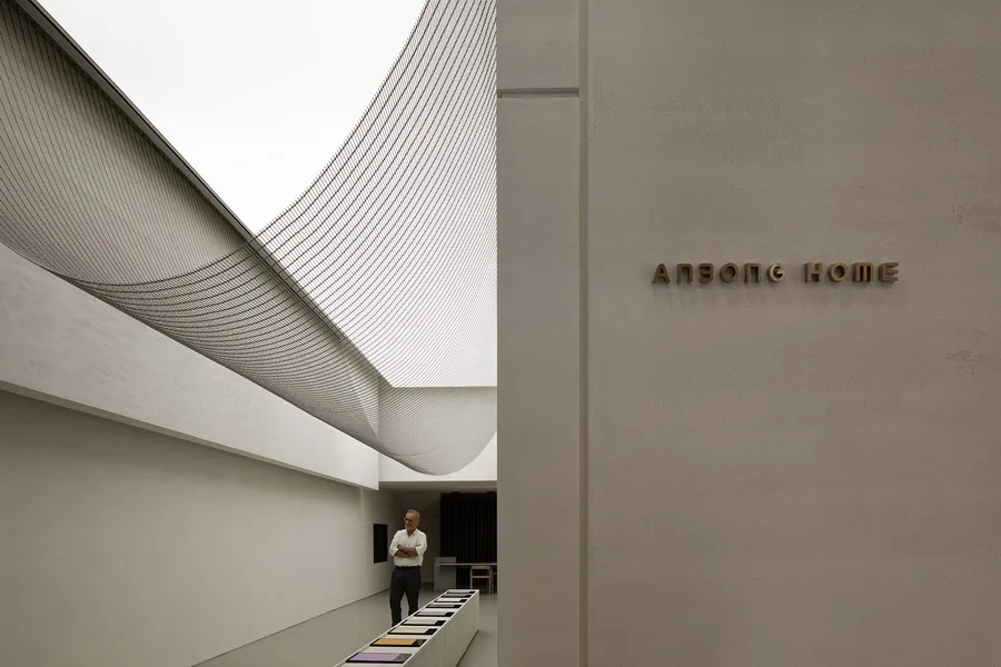
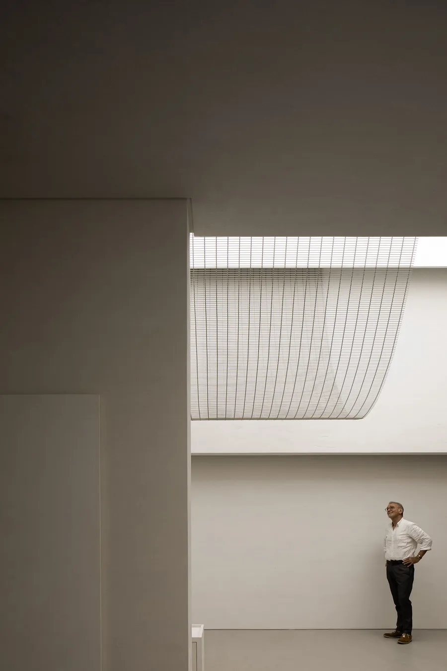
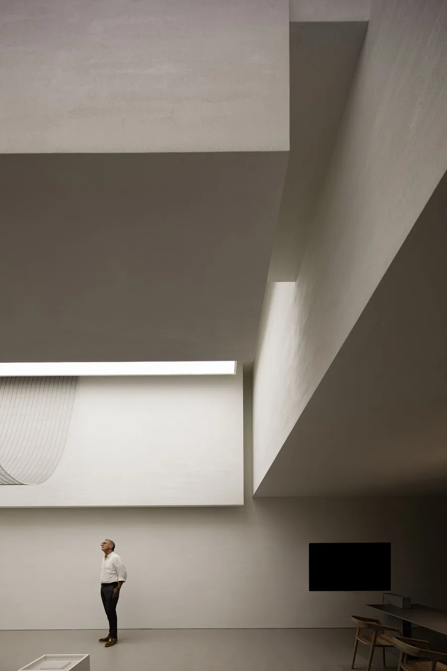
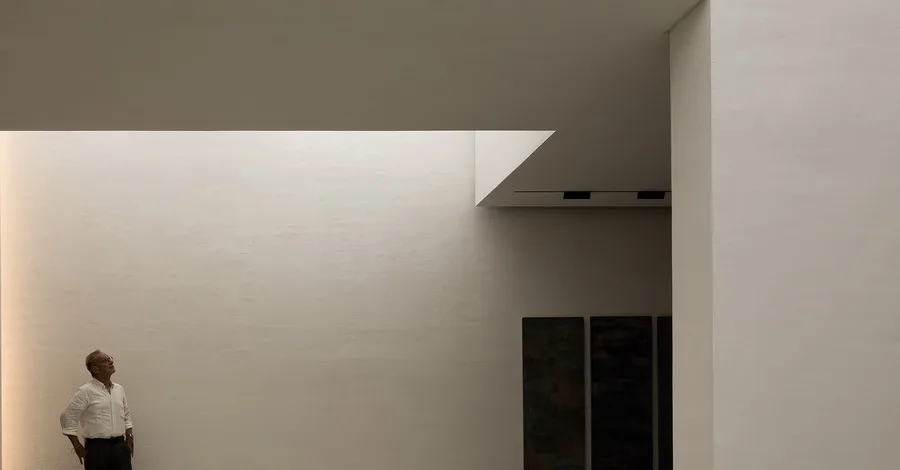
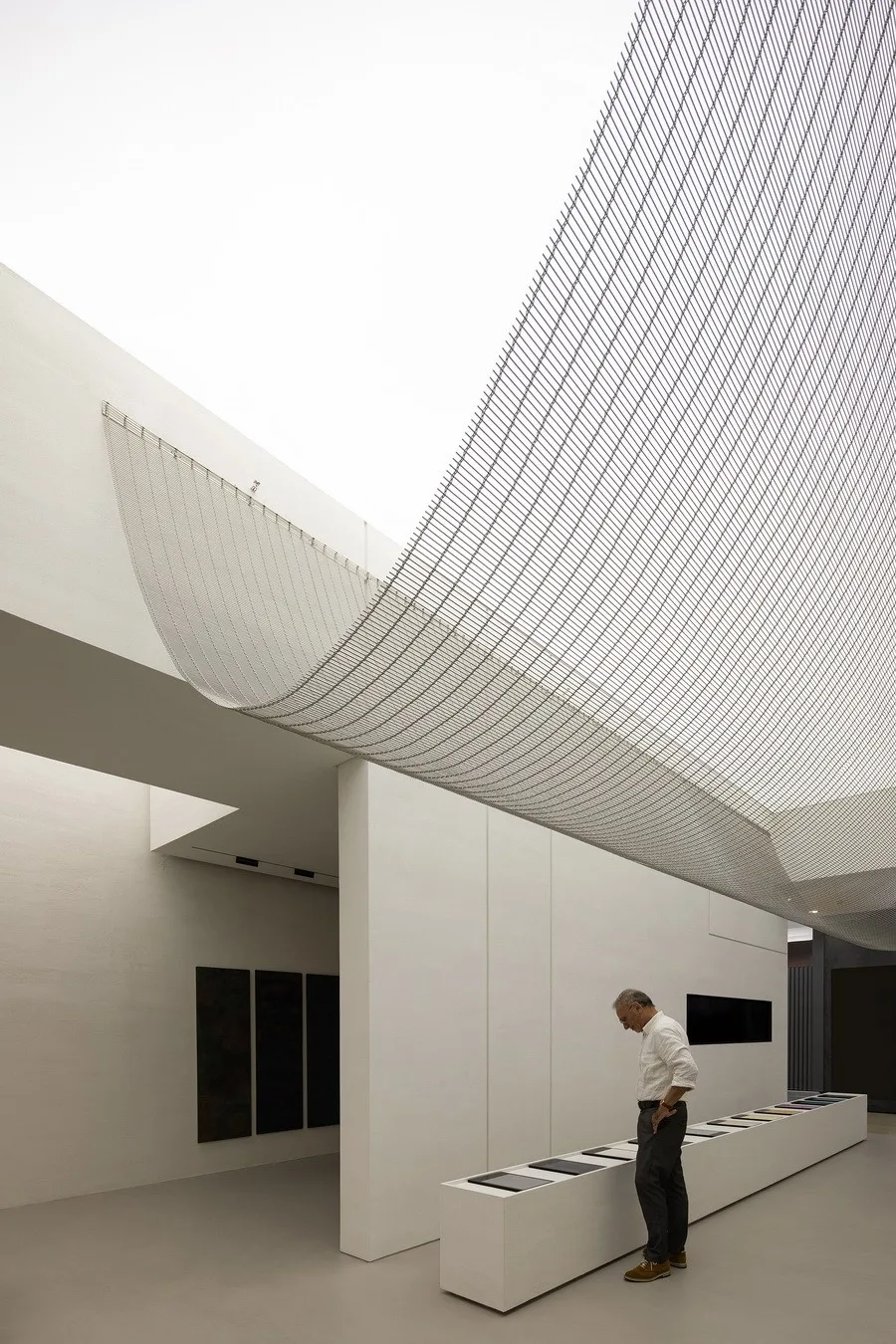
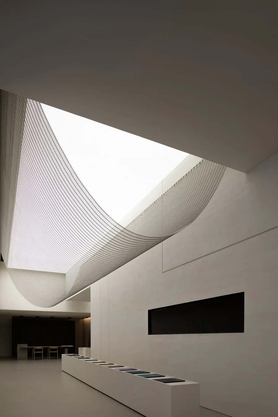
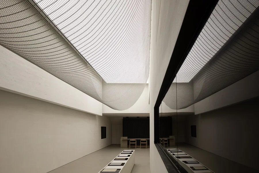
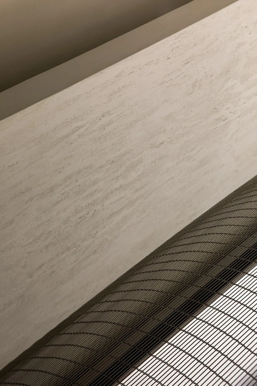
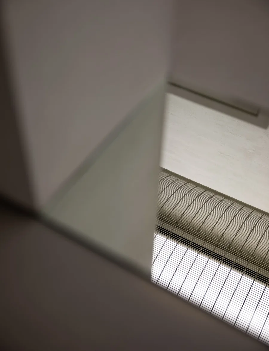
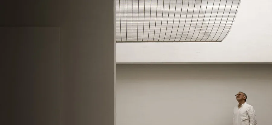
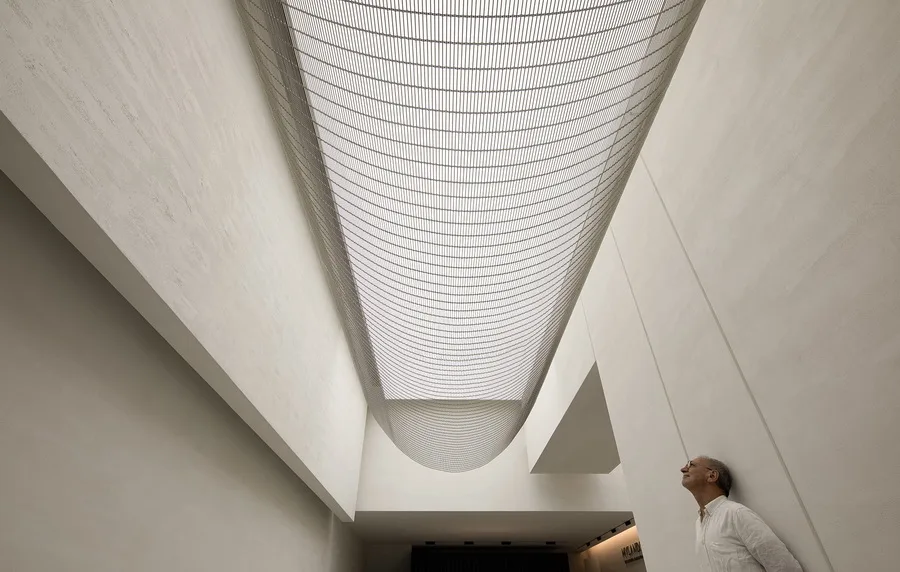
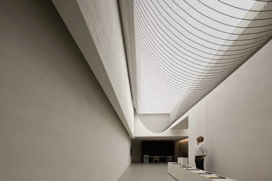
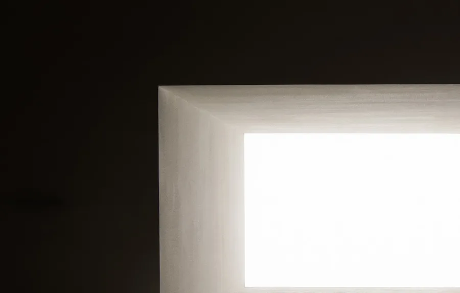
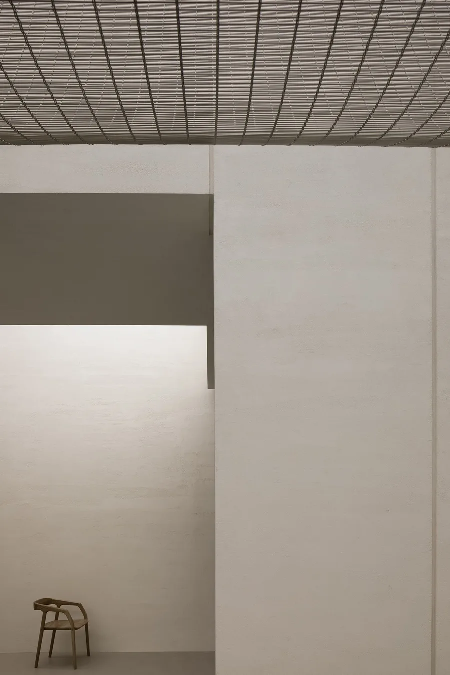
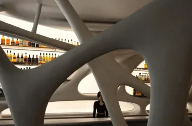
The integration of the ceiling’s physical structure and exposed piping creates the mall’s highest elevated storefront, transforming an originally cramped space into one that feels open and lofty. This clever design presents the space as high and uplifting. At the entrance, a curved metal mesh serves as a transitional element between the ceiling membrane and the facade, enriching the interplay of light and space and sparking curiosity and exploration.

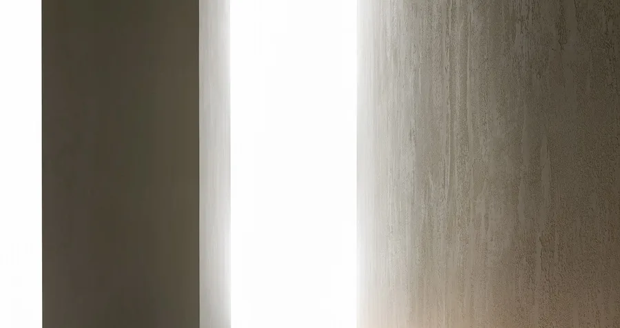
Space acts as a container, and here we explore the expression of handmade paint itself. The design encourages visitors to experience the inspiration of time within a calm environment, focusing first on the texture and charm of both the space and the products before interpreting the products themselves.
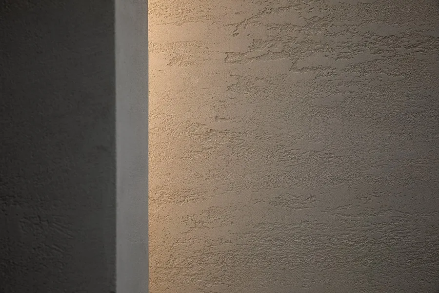
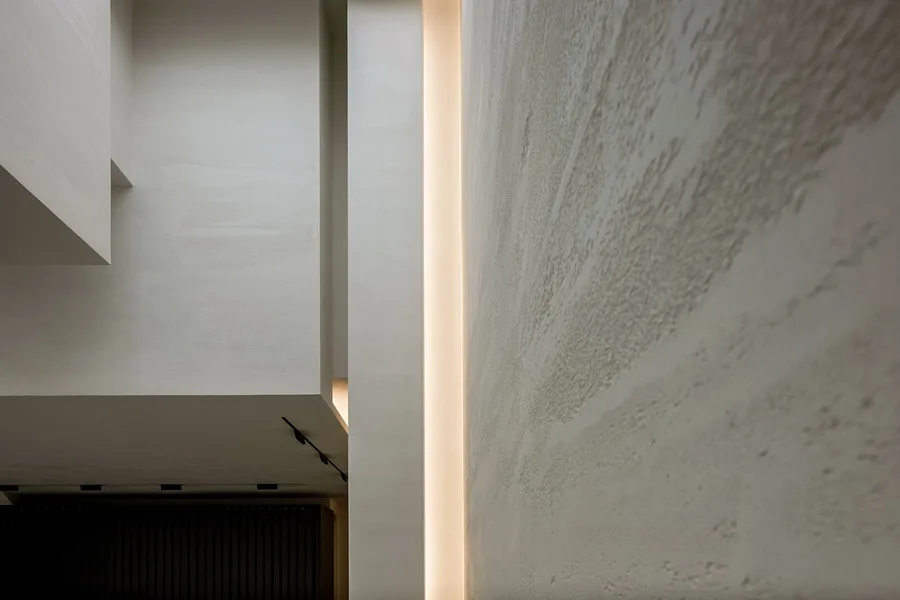
The space is spacious and bright, with natural textures and daylight providing the most authentic atmosphere. Our design emphasizes the interaction between space and people. We significantly altered the spatial layout and composition of the existing structure to facilitate harmony among spatial structure, materials, and colors, establishing a new flow between buildings and their surroundings.
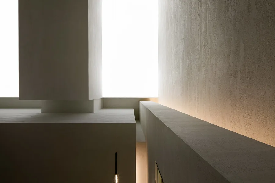
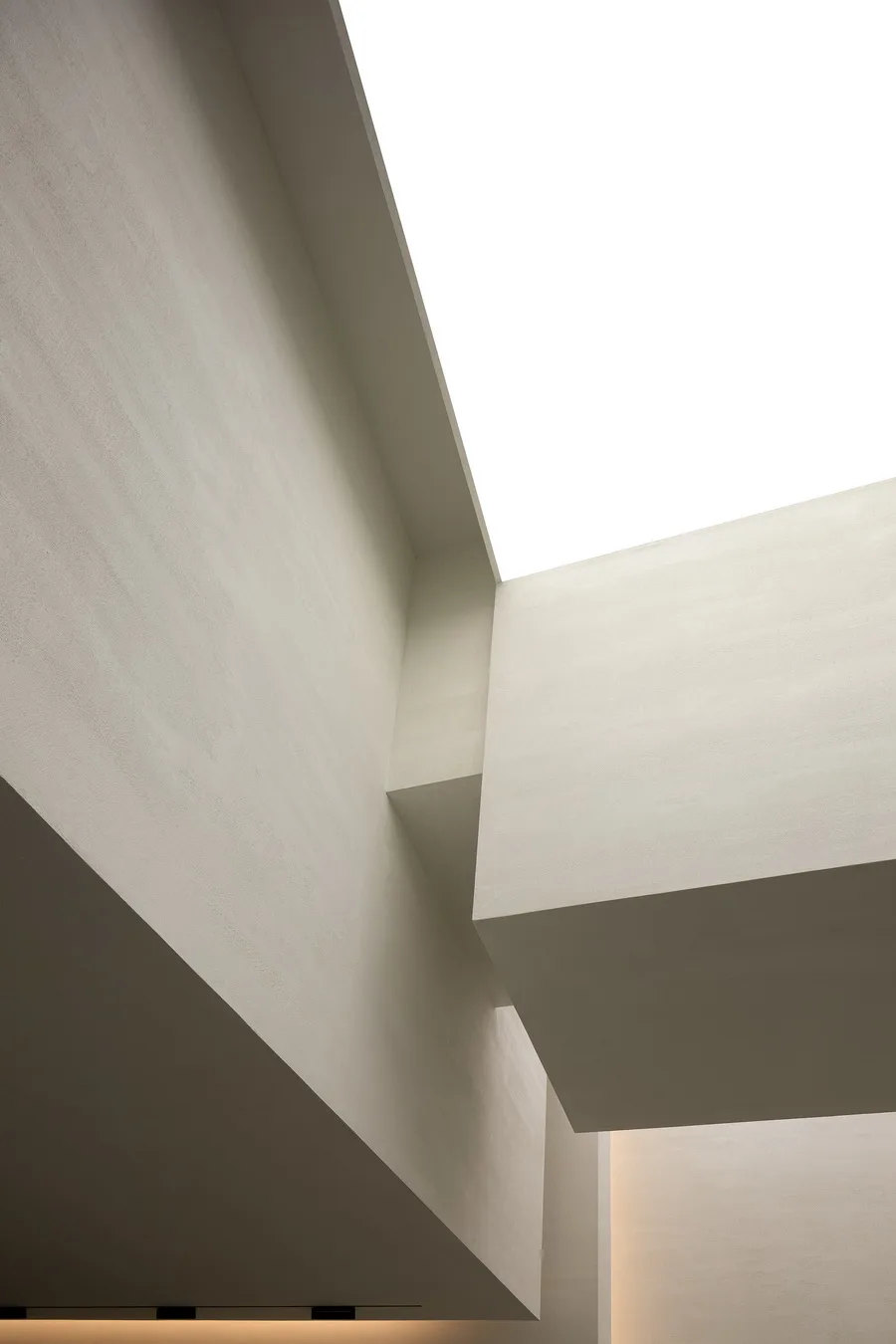
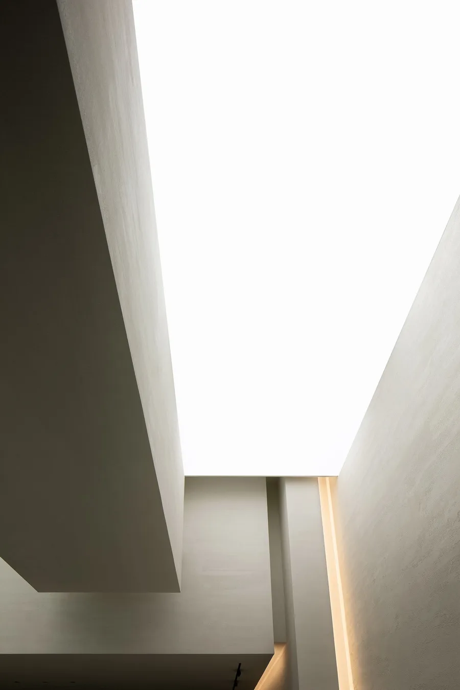
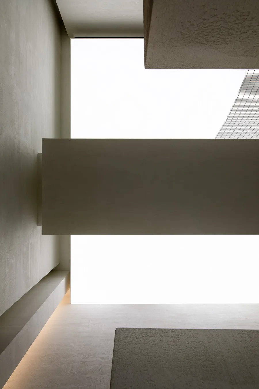
Through elegant and simple geometric shapes, the space’s form becomes tangible, offering a breathable texture that allows the environment to flow freely with a feeling of suspension.
This project is another example of the Aike architectural design team applying Western design order principles to express Eastern spatial emotions and philosophy.
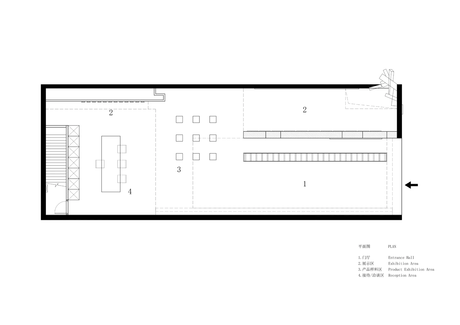
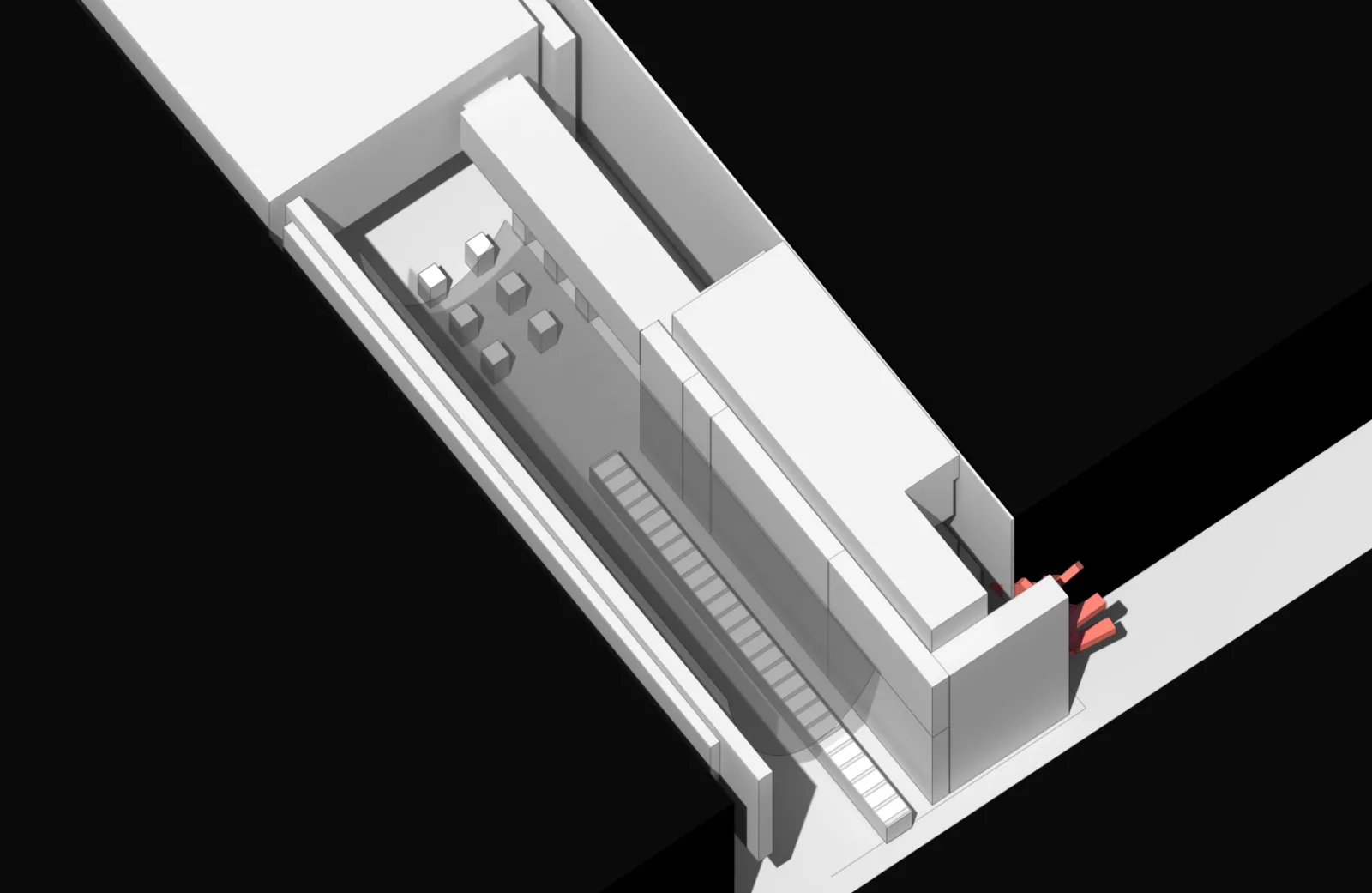
△ Plan View
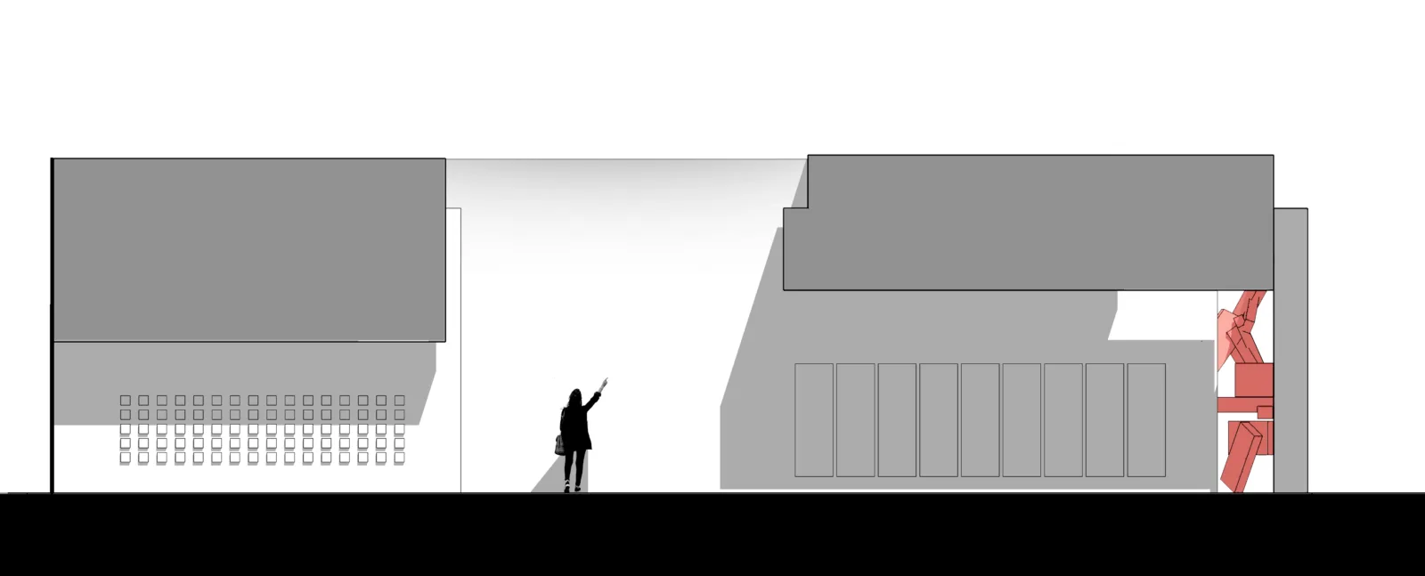
△ Section Diagram
Project Information
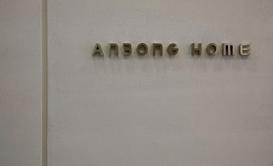
Project Name: ANBONG HOME Coatings Exhibition Hall
Owner: Mauro Malfatti
Design Agency: AD Architecture ∣ Aike Architectural Design
Company Official Website: __AI_ST_URL_0__
Official Email: __AI_C_SC_0__
Chief Designer: Xie Peihe
Design Team: Aike Architecture
Project Location: Shantou, Guangdong
Building Area: 200m²
Main Materials: Handmade paint, microcement, metal mesh, concrete, translucent film
Design Date: July 2020
Completion Date: November 2020
Photographer: Ouyang Yun


Must log in before commenting!
Sign Up